Vertical bar
Up to 12 categories. Best for revenue, survey, category breakdown.
An AI Graph Maker for marketers, analysts, and editors who need a clean chart visual fast. Create charts with AI from a written brief — bar, line, area, pie, scatter, and infographic blocks rendered as a designed image. Brief in plain English, ship a chart in under a minute.
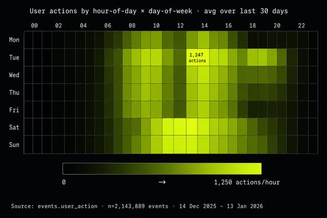
Every example below was rendered from one written brief. Bar, line, donut, area, heatmap — same workflow, same minute, no design pass.
Pixazo's AI Graph Maker turns a written brief into a chart image. Not a dashboard, not a spreadsheet — a way to make charts with AI as ready-to-publish PNGs that land cleanly in a deck, post, or report.
Describe the chart you need — type, data shape, axis labels, brand color — and the model renders it. You write the spec, the model handles the design. No charting library to learn, no CSV pipeline to wire, no designer queue to wait in.
This is a design tool. It is the right fit when you need an attractive, on-brand chart visual quickly and you are willing to describe the data verbally. For deeper image work, see the AI Image Generator; for the full Pixazo design suite, browse AI Tools.
It is the wrong fit when the source of truth is a live spreadsheet or BI dataset that must update on its own. For that workflow, generate the chart in Looker Studio, Tableau, or Datawrapper and use the Graph Maker for the social cut-down.
Every chart family the model is tuned for. Pick the family that fits your data shape and lift the brief from the description.
Numbered callouts on a sample bar chart — every element the AI Graph Maker lays out for you so you don't have to think about it.
Plain-English title pulled directly from the brief sentence.
Single-series legend chip in the brand accent — no rainbow palette.
Monospaced numerals so spacing reads predictably at any size.
Horizontal categorical labels with hairline tick rule beneath.
One color, consistent corner radius, generous gutter between bars.
The model is biased toward the design conventions on the left. If your brief points at the right column, the result will fight back.
Bounded axis, hairline gridlines, monospaced ticks for predictable spacing.
Too many series, too many hues, no scale to anchor the eye.
The model is tuned around the visual language of marketing, editorial, and sales — teams that need to create graphs with AI for decks, articles, and posts, not BI dashboards.
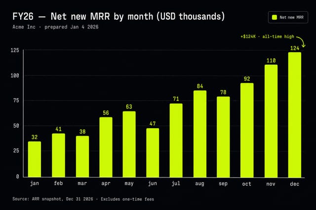
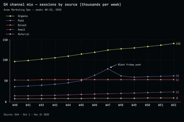
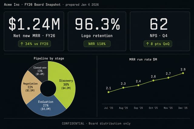
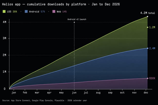
Campaign performance bars, growth curves, and KPI infographics for monthly reports and pitch decks.
Stat round-ups and chart illustrations for explainers. Pair with the AI Image Generator for matching hero artwork.
Single-graphic charts and 5-10 slide LinkedIn carousels that turn a number into a scroll-stopper.
ROI charts, comparison bars, and category breakdowns for sales decks, leave-behinds, and partner briefings.
The AI Graph Maker is a design tool, not data infrastructure. The honest limits live below — read them before you replace your BI workflow.
Seven questions we get most often. Linked from a contents rail rather than hidden behind accordion clicks — easier to scan, easier to deep-link.
No — the AI Graph Maker is a brief-driven design tool, not a data viz platform. You describe the shape of the data and the model produces a styled chart image. If you need to chart live data, export your dataset first and use the Graph Maker for the styled visual.
Bar, column, line, area, stacked area, pie, donut, scatter, bubble, and infographic-style stat cards. Specialized formats like Sankey and candlestick are limited.
Yes. Include hex codes in your brief — for example primary #D1FE17 — and the model will respect them.
PNG or JPG, sized for web, slide decks, and social. You can request square, landscape, or portrait aspect ratios in the brief.
Yes — every render from the AI Graph Maker includes a commercial license. Use the chart visuals in client decks, paid reports, ads, and product marketing without additional fees.
The model renders an illustrative chart that reflects the proportions you describe. Treat it as a designed visual, not a numerically audited chart. For decimal-precise reporting, render in Excel, Sheets, or a BI tool.
The AI Image Generator is general-purpose. The Graph Maker is tuned specifically for chart compositions — axis layout, legend placement, label legibility, and chart-appropriate color palettes.
Open the Pixazo Playground and make graphs with AI in under a minute — styled, on-brand, ready to ship.
Run a chart brief