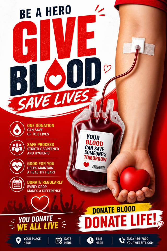
Blood Donation Poster : Create Free Blood Donation Posters in Minutes with AI
Create Custom Blood Donation Posters Quickly with Pixazo Best AI Blood Donation Poster Maker. Try for Free!
Get Started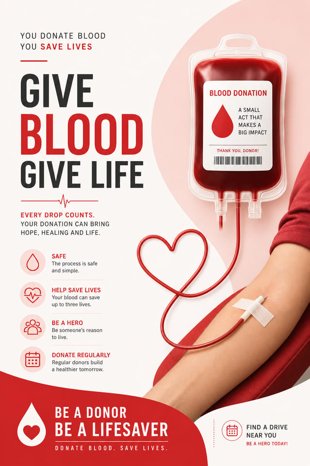
AI Blood-Donation Poster Workshop: Design Reimagined
Make blood-donation posters with real visual personality. The AI selects design elements that fit blood-donation aesthetics, not generic templates.
Create Your Blood Donation Poster FreeEmerging Blood-Donation Poster Patterns: What Is Popular Now
Hand-Drawn Elements
Illustrations, doodles, and hand-lettering bring a personal, approachable quality to blood-donation poster designs in an era of polished digital output.
Gradient Overlays
Smooth color transitions are being used as primary design elements in blood-donation poster work, adding depth without the complexity of photographic backgrounds.
Organic Shapes
Flowing, irregular forms are replacing sharp geometric shapes in blood-donation poster backgrounds and decorative elements for a softer visual feel.
Muted Earth Tones
Natural color palettes with warm neutrals and desaturated greens are replacing the bright neon trends of previous years in blood-donation poster work.
Retro Revival
Vintage aesthetics from the 1970s and 1990s are influencing blood-donation poster design with textured backgrounds, serif fonts, and warm gradients.
The Blood-Donation Poster Toolkit: Professional Features
Color Palette Intelligence
Colors are chosen with blood-donation style awareness. The AI builds palettes that fit blood-donation design conventions rather than selecting arbitrarily.
Commercial Use Rights
Designs generated with Pixazo are yours to use commercially. No additional licensing required for blood-donation poster projects.
Instant Iterations
Generate multiple blood-donation poster variations from a single prompt. Compare options and refine until the design matches your vision.
Context-Aware Design
Describe your blood-donation poster's purpose and audience. The AI adjusts visual weight, complexity, and clarity based on the intended use context.
Resolution Control
Specify output dimensions for your blood-donation poster. Get files sized for web display, social media, or large-format printing.
Get Your Blood-Donation Poster: From Start to Finish
Spell Out the Requirements
Write a prompt describing your blood-donation poster. Include style preferences, color direction, the most important text to display, and any specific visual elements you want. The more specific your description, the more targeted the output.
Watch It Come Together
Pixazo generates your blood-donation poster in seconds. Review the design and adjust your prompt to refine specific elements: change the color palette, shift the layout weight, or add visual elements you want included.
Hone the Details
Adjust your prompt to modify specific elements of the blood-donation poster. Change the color palette, shift typography weight, or reposition the compositional focus. Each iteration gets you closer to the final design.
Seal the Design
Get your final blood-donation poster file in one click. Choose your format, download at full resolution, and use the design immediately. No watermarks, no additional fees, no waiting.
Watch: Creating Blood Donation Poster designs step by step
Before You Start: Straight Answers
Describe your core design parameters in each prompt and vary only the specific elements that should change across the series. Maintaining consistent color palette, typographic approach, and compositional structure across blood-donation poster variations creates a coherent series.
Pixazo works in any modern mobile browser. The interface adapts to phone and tablet screens so you can generate blood-donation posters from anywhere. A dedicated mobile app is in development for an even smoother on-device experience.
Designs created with Pixazo are available for commercial use. You can use your blood-donation posters for client projects, product sales, advertising, and other commercial applications without additional licensing fees.
Pixazo generates single-page blood-donation poster designs per prompt. For multi-page projects, generate each page individually using consistent prompt language to maintain visual continuity across your blood-donation document set.
Everything in Blood-Donation Poster AI: Feature by Feature
Resolution Control
Export blood-donation posters at resolutions from web-optimized to print-quality 4K
Format Flexibility
Download your blood-donation poster as PNG, JPG, or PDF depending on your use case
Batch Generation
Create multiple blood-donation poster variations from a single prompt efficiently
The Reach of Blood-Donation Posters: From Hobby to Pro
Podcast and Media Branding
Generate blood-donation posters for podcast covers, episode artwork, and media channel identity. Consistent visual branding across audio and video platforms.
Personal Creative Work
Generate blood-donation posters for personal projects, home display, and creative experiments without spending production time on design execution.
Wedding and Celebration Planning
Create blood-donation posters for invitations, signage, and event branding. Cohesive visual systems that carry a celebration's theme across every touchpoint.
Interior Display
Generate blood-donation posters for home and office wall display. Get print-ready files that look considered rather than stock-photo generic.
Healthcare and Wellness
Design blood-donation posters for clinics, wellness centers, and health campaigns. Trustworthy visuals that communicate care and professionalism.
Getting Your Blood-Donation Poster Out: Format Guide
JPG
Compressed image format suited for blood-donation poster designs with photographic elements where smaller file size matters more than pixel-perfect edges.
TIFF
High-fidelity format for blood-donation poster files destined for professional printing, supporting CMYK color and lossless compression.
WEBP
Modern web format offering smaller file sizes than PNG or JPG for blood-donation poster images without significant quality loss.
PNG
Lossless image format ideal for blood-donation poster designs with transparency, sharp text, and web display at predictable file sizes.
SVG
Scalable format for blood-donation poster designs that need to render crisply at any resolution, commonly used for web and responsive layouts.
Blood-Donation Poster Generation: Speed and Quality
Blood-Donation Poster Generation: Prompt Templates
Copy any prompt below and paste it into Pixazo to generate your design instantly.
Blood-Donation poster with strong visual hierarchy, largest element reads clearly, supporting elements organized by importance, clean background treatmentRefined blood-donation poster, sophisticated color relationships, intentional whitespace, typefaces appropriate to blood-donation style, balanced compositionContemporary blood-donation poster design, grid-based layout, typographic precision, restrained color palette, no decorative excessGeometric blood-donation poster, structured grid system, angular composition, colors in blocks rather than gradients, modern clean finishClean blood-donation poster design, geometric structure, disciplined typography, color accent used selectively for emphasis, printer-optimized resolutionFull-bleed blood-donation poster, background treatment extends to edges, foreground elements positioned for compositional balance, strong central hierarchyWhat Blood-Donation Creators Built: Work in the Wild
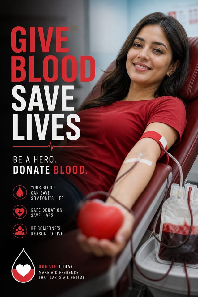
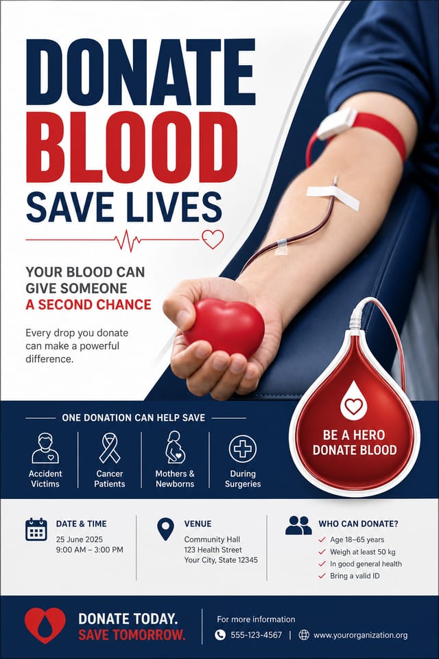
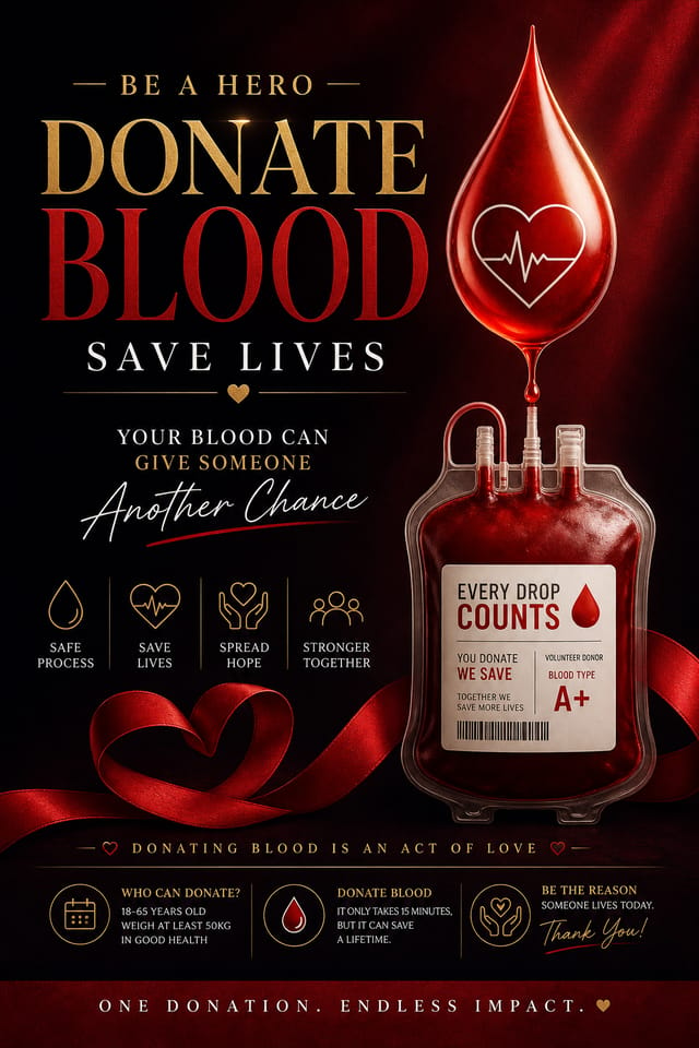
Real creators sharing their blood donation designs made with Pixazo AI.

Blood-Donation poster with Japanese minimalism influence, abundant whitespace, single focal element, restrained palette of black, white, and one accent
Playful blood-donation poster for a family audience, rounded typography, bright saturated colors, approachable and energetic tone
Bold blood-donation poster with strong central headline, supporting information at secondary scale, background treatment consistent with blood-donation designMastering Blood-Donation Poster Creation: What Professionals Know
Match Tone to Audience
A blood-donation poster for a corporate event needs a different visual tone than one for a music festival. Let the audience guide your style choices.
Prioritize Hierarchy
Every blood-donation poster needs a clear reading order. Make sure the most important information is the largest and most prominent element in the layout.
Test at Actual Size
Always preview your blood-donation poster at the dimensions it will be displayed. Design details that look fine at 100% can disappear or crowd at real-world scale.
Iterate with Variations
Generate 3-5 versions of your blood-donation poster before committing. Comparing variations side by side often reveals the strongest direction.
Use High Contrast for Readability
Whether your blood-donation poster is displayed on screen or in print, strong contrast between text and background ensures the message gets through at any size.
Blood-Donation Poster AI Boundaries: Trade-Offs to Know
Known limitations and trade-offs of AI-generated blood donation design. Understanding what the AI handles well and where it falls short helps you structure your blood-donation poster design workflow effectively.

