College Poster : Create Free College Posters in Minutes with AI
Create Custom College Posters Quickly with Pixazo Best AI College Poster Maker. Try for Free!
Get Started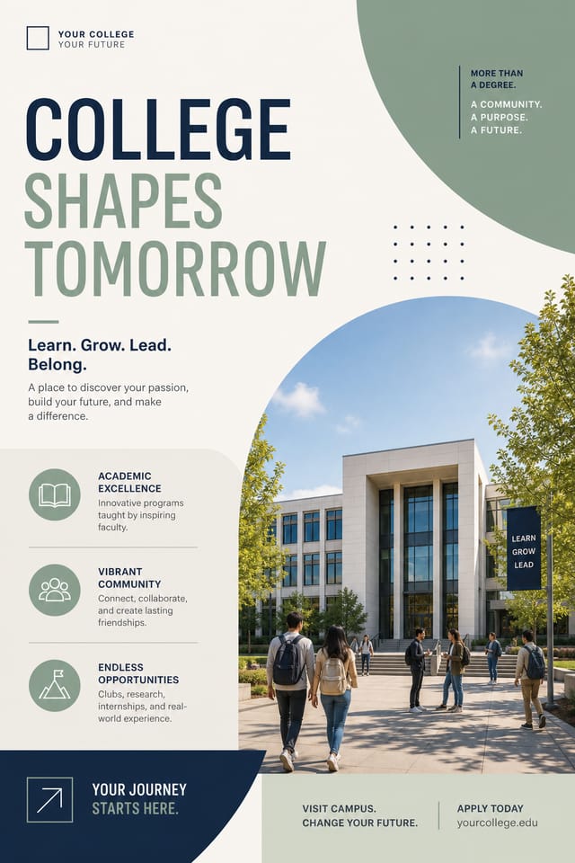

How College Poster Projects Flow: A Production Pipeline
Approve
Get stakeholder approval on the finished college poster. Verify all text is accurate and the design meets brand and technical requirements.
Generate
Use AI to produce multiple college poster variations based on your brief. Start broad and narrow down from the strongest options.
Brief
Establish the key message, dimensions, color preferences, and target audience for your college poster before any design work begins.
Review
Compare generated college poster options against your brief. Mark what works and note specific changes needed for the next iteration.
Research
Collect examples of effective college poster designs, note what works, and identify patterns relevant to your project goals.
What Separates Good College Design: Why It Matters
The College Design System Pixazo Uses
College poster design has its own visual conventions that differ significantly from other styles.
The AI recognizes these patterns and applies them when generating your design, rather than defaulting to a generic layout.
When you describe a college poster, Pixazo selects typography, color relationships, and compositional approaches appropriate to college aesthetics.
The result is a design that looks like it belongs in its context, not a repurposed template with the wrong visual DNA.
College Poster Design For: A Practical Guide
Lab and Department Displays
Design college posters for departmental hallways, lab open days, and campus exhibitions. Professional materials that represent research programs.
Thesis and Dissertation Defense
Design college posters for viva presentations and thesis defenses. Clear visual aids that support oral examination of research.
Conference Presentations
Create college posters for academic conferences, symposia, and research showcases. Designs that present complex findings in a scannable visual format.
Workshop and Seminar Notices
Generate college posters announcing guest lectures, skill workshops, and study groups. Practical materials for academic community notice boards.
College Poster Design Tool Landscape: Tools Compared
VistaCreate
Visual content platform with templates and a built-in asset library
PicMonkey
Photo editor and design tool with brand kit management
Pixazo
AI-powered college poster generator with prompt-based design and professional output quality
Snappa
Quick graphic creator focused on social media and marketing visuals
Piktochart
Infographic and presentation maker for data-driven visuals
What Powers College Poster Design: A Closer Look
Fast Generation
Complete college poster designs generate in seconds. No rendering queues, no waiting for batch processing.
Layered Style Application
Combine college style with other design parameters in a single prompt. The AI interprets complex requests and applies multiple style constraints simultaneously.
Color Palette Intelligence
Colors are chosen with college style awareness. The AI builds palettes that fit college design conventions rather than selecting arbitrarily.
Print-Ready Output
Generated college posters are sized and structured for professional printing. Download high-resolution files ready for production.
Subcategory Awareness
The AI distinguishes between design subcategories. A college poster request produces college-appropriate output, not a generic design with college text added.
Compositional Structure
Layout and hierarchy decisions reflect college design patterns. The proportions and arrangement match how college designs are conventionally structured.
College Poster Style Movements: Current Directions
Organic Shapes
Flowing, irregular forms are replacing sharp geometric shapes in college poster backgrounds and decorative elements for a softer visual feel.
Brutalist Design
Raw, intentionally unpolished college poster aesthetics with stark contrasts and unconventional layouts are carving a niche in creative industries.
Bold Typography
Oversized type and expressive fonts are dominating college poster design, turning headlines into visual centerpieces rather than just text.
Hand-Drawn Elements
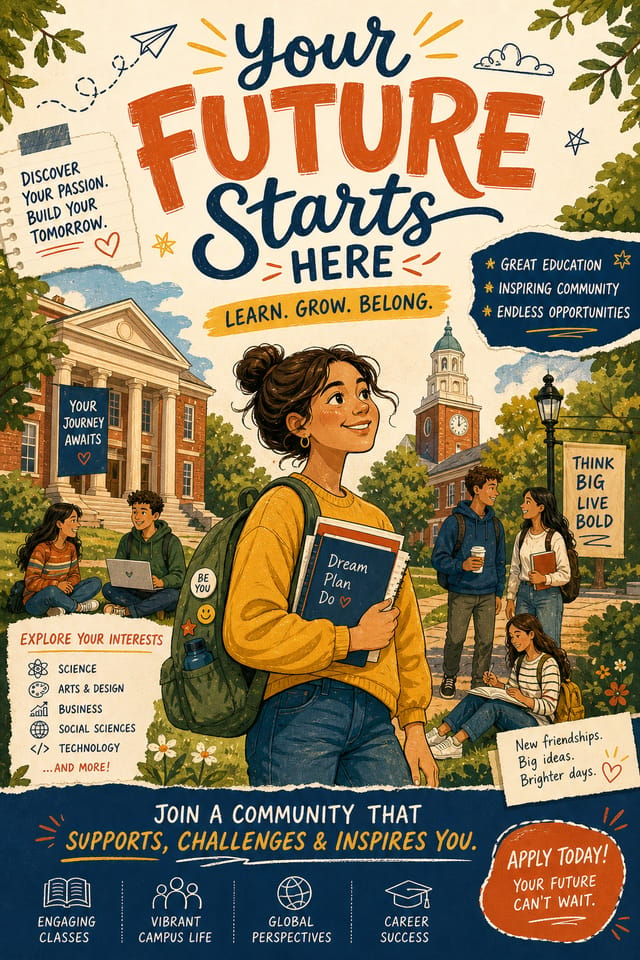
Illustrations, doodles, and hand-lettering bring a personal, approachable quality to college poster designs in an era of polished digital output.
Getting Started with College Posters: What People Ask
Adjust your prompt to change any element of the design. If a generated college poster is close but not quite right, describe what you want changed and regenerate. The AI responds to specific direction about individual elements like color, layout, or typographic weight.
Include the target language in your prompt when generating college posters with non-English text. The AI selects typographic approaches appropriate for the language and applies college design conventions to the overall layout regardless of language.
Canva uses fixed templates you customize manually. Pixazo generates original college poster designs from your description, so every output is unique. For college work specifically, the AI applies style-specific design decisions rather than offering generic drag-and-drop templates.
Team accounts allow multiple users to share prompts, saved college poster designs, and brand kits within a shared workspace. Team members can iterate on each other's college poster designs and maintain consistent output across projects.
The College Poster Process: The Workflow Explained
Lead with the Concept
Write a prompt describing your college poster. Include style preferences, color direction, the most important text to display, and any specific visual elements you want. The more specific your description, the more targeted the output.
Examine the Render
Your college poster generates immediately after submission. Evaluate the design against your requirements and refine the prompt to correct any elements that don't match your intent.
Rework Specific Parts
Adjust your prompt to modify specific elements of the college poster. Change the color palette, shift typography weight, or reposition the compositional focus. Each iteration gets you closer to the final design.
Capture the Final Design
Get your final college poster file in one click. Choose your format, download at full resolution, and use the design immediately. No watermarks, no additional fees, no waiting.
Watch: Creating College Poster designs step by step
Visual Quality in College Posters: Professional Standards
Repetition and Consistency
Repeating visual elements in college poster design creates cohesion. Consistent use of shapes, colors, and spacing makes the design feel unified rather than assembled from random parts.
White Space as Luxury
The most expensive-looking college poster designs have the most unused space. Crowded layouts signal low quality. Let each element breathe.
Texture and Depth
Subtle texture in college poster design adds visual interest without competing with content. Surface treatments create depth and suggest quality when used sparingly.
Current College Poster Limits: Current Boundaries
Known limitations and trade-offs of AI-generated college design. Every AI design tool has boundaries. Knowing these limits before you start helps you get the most out of college poster generation.
Effective College Poster Design Prompts
Copy any prompt below and paste it into Pixazo to generate your design instantly.
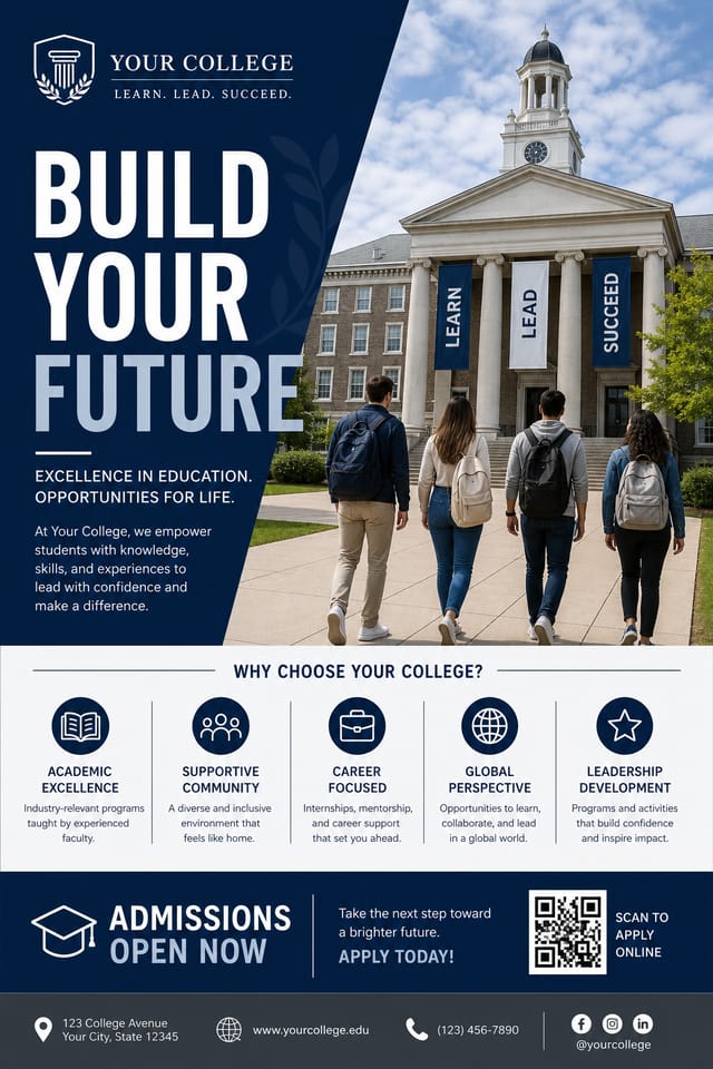
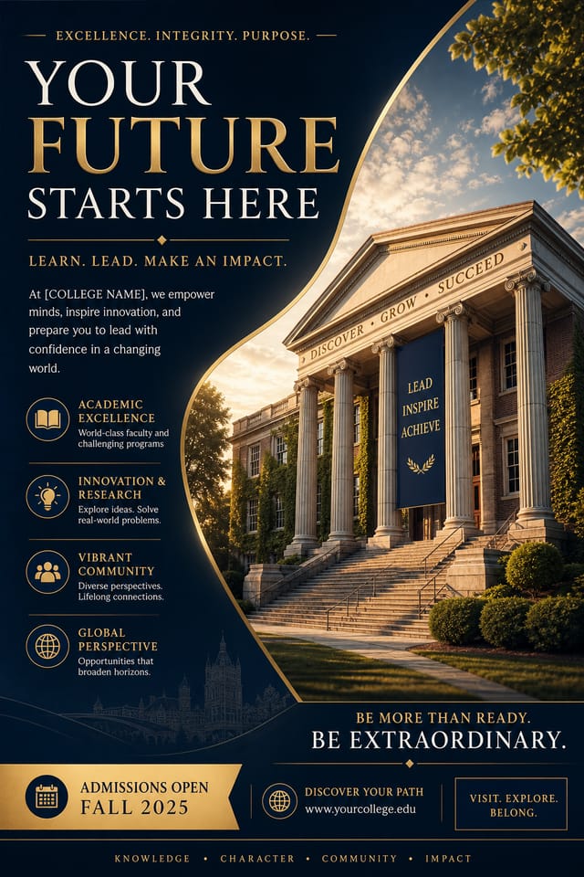
Clean college poster design, geometric structure, disciplined typography, color accent used selectively for emphasis, printer-optimized resolutionMonochromatic college poster, single-hue palette with value variation for contrast, typographic hierarchy creates visual interest without color complexityCollege poster for digital display, optimized proportions for screen viewing, colors calibrated for RGB output, legible at typical viewing distanceFull-bleed college poster, background treatment extends to edges, foreground elements positioned for compositional balance, strong central hierarchyTwo-color college poster design, high contrast between primary and secondary color, clean separation between graphic and text zonesCollege Poster Community: A Design Gallery
Real creators sharing their college designs made with Pixazo AI.

Playful college poster for a family audience, rounded typography, bright saturated colors, approachable and energetic tone
Portrait college poster for social sharing, vertical 4:5 ratio, headline in upper third, supporting content below centerline
College poster at 1080x1920 pixels for Instagram stories, bold sans-serif headline centered, gradient background in college tones, call-to-action at bottom
