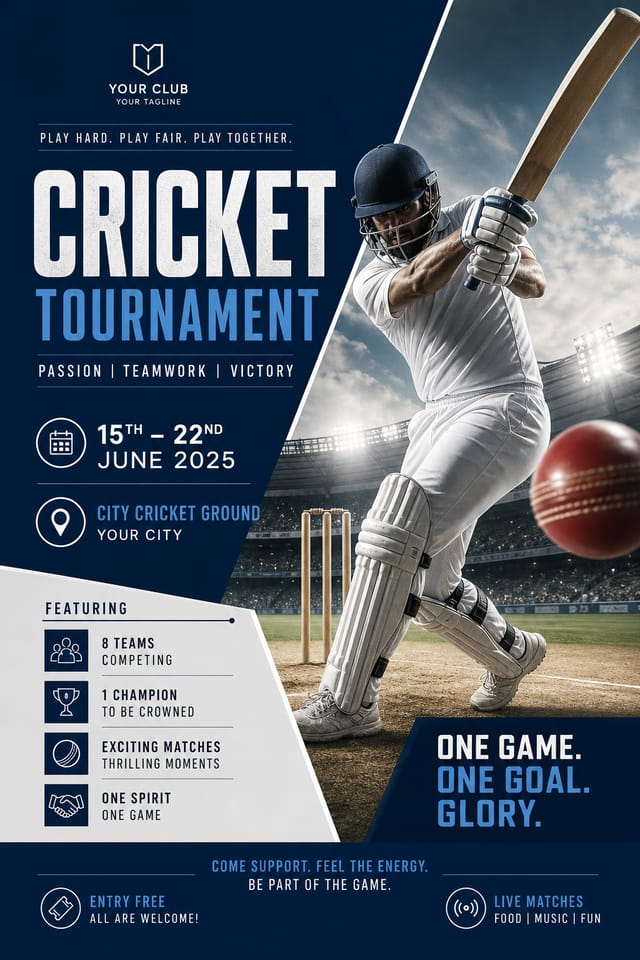
Cricket Poster : Create Free Cricket Posters in Minutes with AI
Create Custom Cricket Posters Quickly with Pixazo Best AI Cricket Poster Maker. Try for Free!
Get Started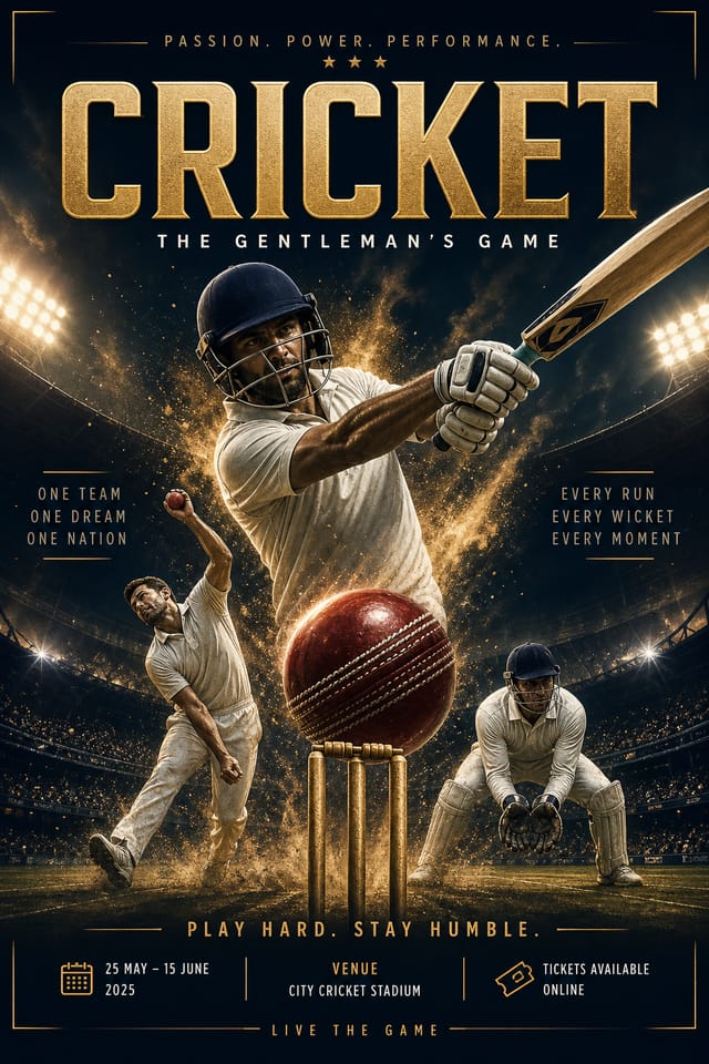
The Evolution of Cricket Poster Design: Trend Report
Gradient Overlays
Smooth color transitions are being used as primary design elements in cricket poster work, adding depth without the complexity of photographic backgrounds.
Bold Typography
Oversized type and expressive fonts are dominating cricket poster design, turning headlines into visual centerpieces rather than just text.
Brutalist Design
Raw, intentionally unpolished cricket poster aesthetics with stark contrasts and unconventional layouts are carving a niche in creative industries.
Muted Earth Tones
Natural color palettes with warm neutrals and desaturated greens are replacing the bright neon trends of previous years in cricket poster work.
Minimalist Layouts
Stripped-back cricket poster designs with generous white space and limited elements are gaining favor for their clarity and elegance.
Dark Mode Aesthetics
Dark backgrounds with high-contrast accents are increasingly common in cricket poster design, reducing visual fatigue and adding sophistication.
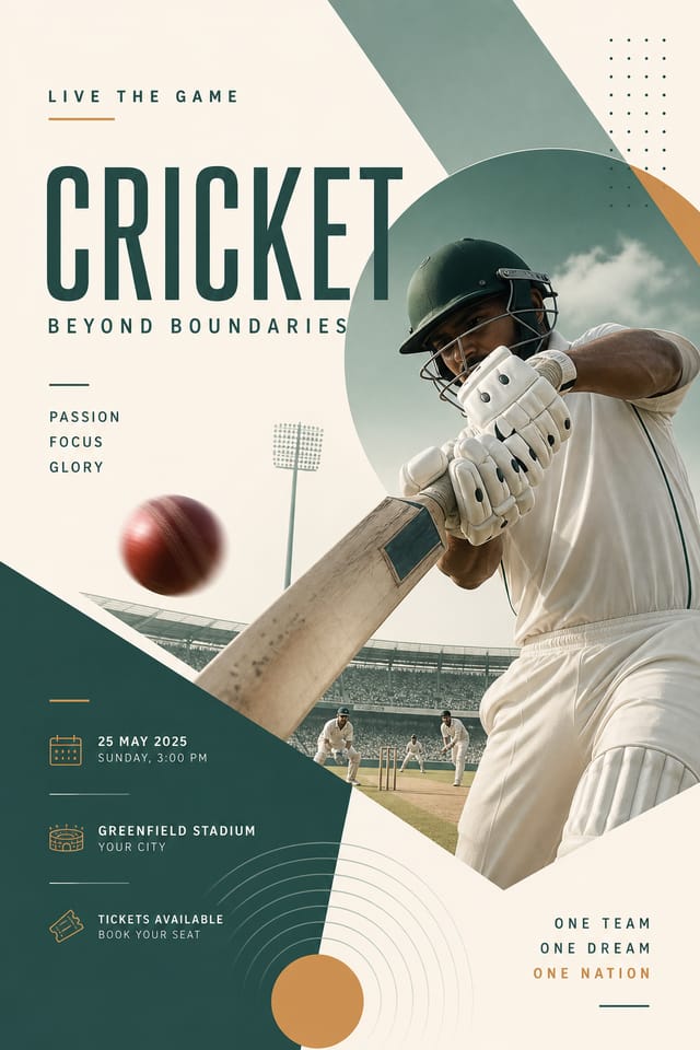
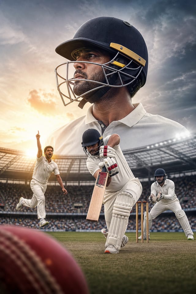
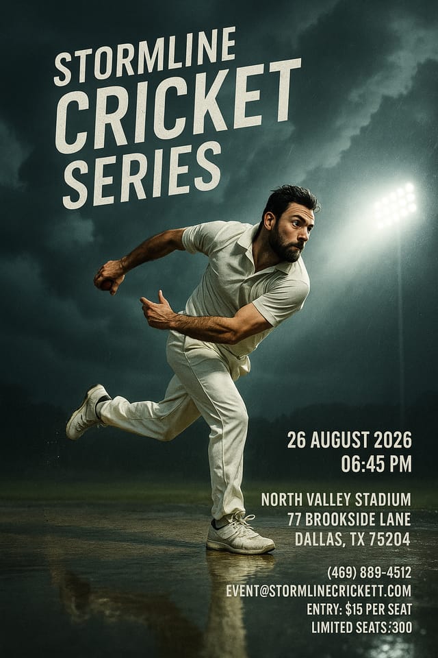
Cricket Makers: A Design Gallery
Real creators sharing their cricket designs made with Pixazo AI.
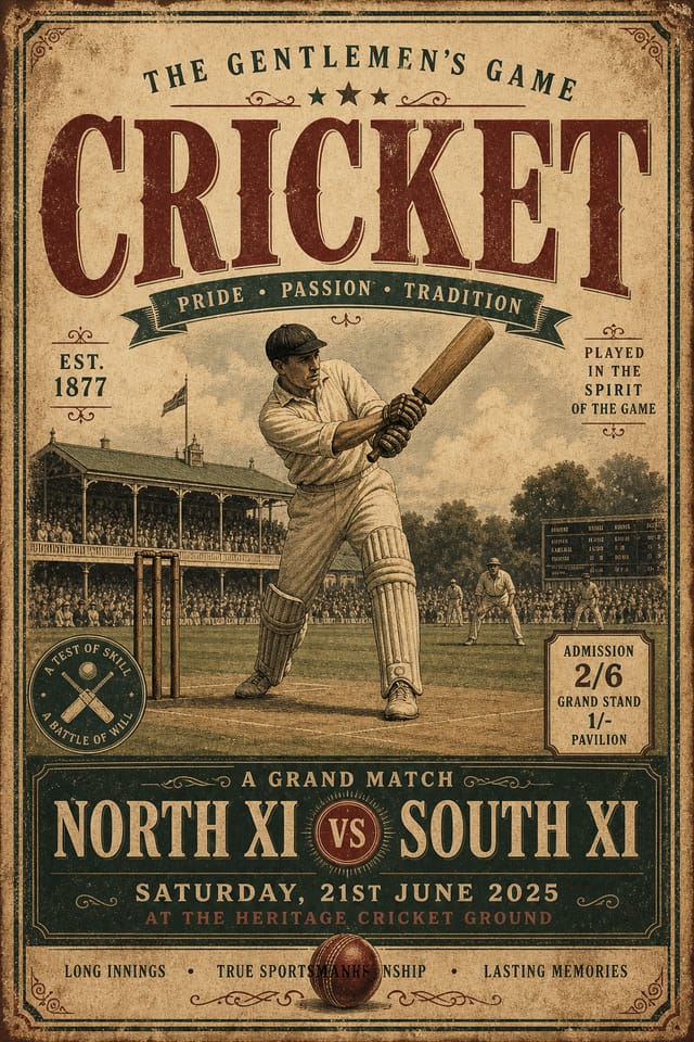
Cricket poster with retro 1970s color palette, warm oranges and browns, groovy display type, textured paper background feel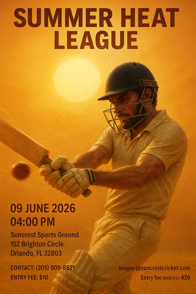
Refined cricket aesthetic poster, sophisticated color relationships, intentional negative space, type selection matching cricket conventions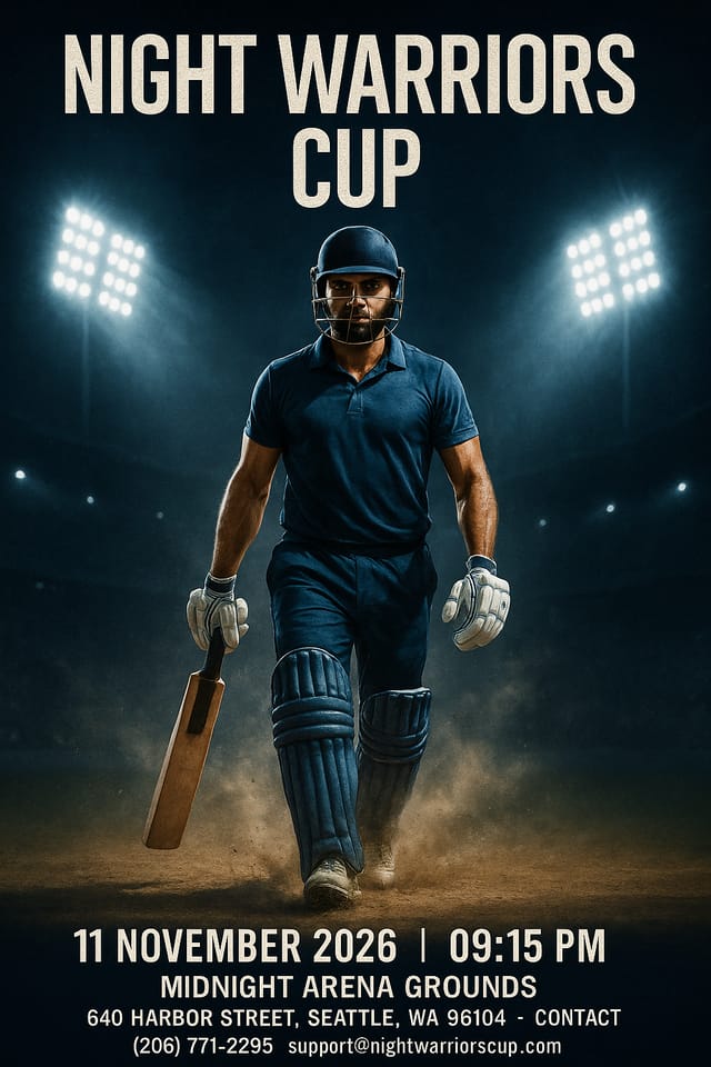
Cricket poster in 18x24 inch print format, museum-quality composition, generous margins, elegant serif headline, muted earth tonesCricket Poster Maker Capabilities: Technical Breakdown
Fast Generation
Complete cricket poster designs generate in seconds. No rendering queues, no waiting for batch processing.
Instant Iterations
Generate multiple cricket poster variations from a single prompt. Compare options and refine until the design matches your vision.
Export Flexibility
Download your cricket poster in formats suited for your use case. Web-optimized versions for digital display, high-DPI files for print.
Prompt Refinement
Adjust your description to refine any aspect of the cricket poster design. The AI responds to specific direction about colors, layout, or content.
Text Placement Options
Describe where you want text elements positioned in your cricket poster. The AI follows compositional direction about headline placement and body copy layout.
Compositional Structure
Layout and hierarchy decisions reflect cricket design patterns. The proportions and arrangement match how cricket designs are conventionally structured.
Cricket Poster Generation: Behind the Scenes
Open with Your Idea
Describe what you want your cricket poster to look like. Include the mood, color palette, typography preference, and content hierarchy. Pixazo reads all of this and uses it to generate an appropriate design.
Get Your First Draft
The AI produces a cricket poster based on your description. If the first result isn't exactly right, adjust the prompt to address what needs changing. Most designs reach the target within a few iterations.
Retrieve the Finished File
Export your cricket poster in the format you need. PNG for web and social, PDF for print production, JPG for email and lightweight sharing. The file is yours to use commercially without restrictions.
Cricket Poster Specifications
Watch: Creating Cricket Poster designs step by step
Cricket Poster Applications: A Practical Guide
Team and Club Promotions
Produce cricket posters for team merchandise, membership drives, and club identity campaigns. Visual materials that strengthen team brand loyalty.
Award and Achievement Displays
Generate cricket posters celebrating player milestones, team records, and season achievements. Commemorative designs for trophy cabinets and social media.
Fan Zone Signage
Design cricket posters for fan areas, viewing parties, and supporter events. Large-format prints that create atmosphere around cricket events.
Sports Event Sponsorship
Produce cricket posters for sponsors and partners of cricket events. Co-branded materials that satisfy both event organizers and corporate partners.
Tournament Brackets and Schedules
Design cricket posters displaying tournament draws, league tables, and fixture schedules. Clear information hierarchy for quick reference.
What Separates Strong Cricket Posters: The Essentials
Pro Tips for Cricket Poster Design: What Professionals Know
Leave White Space
Resist the urge to fill every area of your cricket poster. Breathing room around key elements makes the overall design more effective.
Check Alignment Carefully
Misaligned elements are one of the most common signs of amateur cricket poster design. Use grid lines and snap-to features to keep things precise.
Keep Typography Simple
Use no more than two typefaces per cricket poster. One for headlines, one for body text. Consistency in typography signals professionalism.
Test at Actual Size
Always preview your cricket poster at the dimensions it will be displayed. Design details that look fine at 100% can disappear or crowd at real-world scale.
Iterate with Variations
Generate 3-5 versions of your cricket poster before committing. Comparing variations side by side often reveals the strongest direction.
Sample Cricket Poster Prompt Techniques
Copy any prompt below and paste it into Pixazo to generate your design instantly.
Contemporary cricket poster design, grid-based layout, typographic precision, restrained color palette, no decorative excessEditorial-style cricket poster, text-dominant design, typographic treatment carries visual weight, layout proportions inspired by print publication designCricket poster design, clean layout, strong typography hierarchy, appropriate color palette for cricket aesthetic, high contrast between headline and backgroundCricket poster with strong visual hierarchy, largest element reads clearly, supporting elements organized by importance, clean background treatmentPortrait-orientation cricket poster, vertical composition, headline at natural reading entry point, supporting information flows downward logicallyAtmospheric cricket poster, background treatment supports the headline without competing with it, visual weight distributed intentionallyUnderstanding Cricket Posters: Straight Answers
Common sizes include 1080x1080 for Instagram feed, 1080x1920 for stories and reels, 1200x628 for Facebook links, 1500x500 for Twitter headers, and 1080x1350 for Pinterest. Specify the platform in your prompt and Pixazo optimizes cricket layout for that format.
Individual cricket posters generate in seconds. For batch production, you can submit multiple prompts in sequence and download results as they complete. A series of ten cricket poster variations typically takes under five minutes total.
Pixazo works in any modern mobile browser. The interface adapts to phone and tablet screens so you can generate cricket posters from anywhere. A dedicated mobile app is in development for an even smoother on-device experience.
You can generate as many variations as your account tier allows. Refine your prompt with each iteration to move toward your target design. Most users find the right direction within three to five generations.
What Cricket Poster AI: Needs Human Help
Known limitations and trade-offs of AI-generated cricket design. Transparency matters when using AI for cricket poster design. The points below describe where you may need to supplement AI output with manual work.

