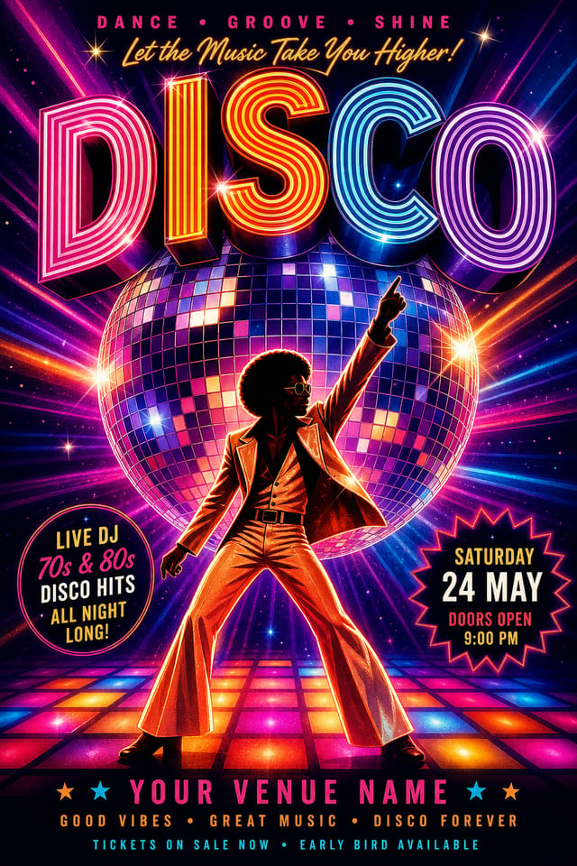
Disco Poster : Create Free Disco Posters in Minutes with AI
Create Custom Disco Posters Quickly with Pixazo Best AI Disco Poster Maker. Try for Free!
Get Started
Design Intelligence for Disco Posters: The Design System
Design Intelligence for Disco Posters
Creating a convincing disco poster requires understanding disco as a design vocabulary, not just as a label.
The color relationships, the type choices, the spatial organization.
These elements work together to create the impression of intentional disco design.
Pixazo's generation model recognizes disco design patterns and applies them systematically.
The Path to Your Disco Poster: What Actually Happens
Paint the Picture in Words
Start with a text description of your disco poster concept. Specify the visual style, colors, layout direction, and key text. Detailed prompts produce more accurate disco poster designs than general ones.
Watch: Creating Disco Poster designs step by step
Disco Poster AI: Design Powers
Text Placement Options
Describe where you want text elements positioned in your disco poster. The AI follows compositional direction about headline placement and body copy layout.
No Design Software Required
Create professional disco posters without Photoshop, Illustrator, or other design applications. The AI handles all technical production.
Fast Generation
Complete disco poster designs generate in seconds. No rendering queues, no waiting for batch processing.
Subcategory Awareness
The AI distinguishes between design subcategories. A disco poster request produces disco-appropriate output, not a generic design with disco text added.
Inside the Disco Community: Showcase Gallery
Real creators sharing their disco designs made with Pixazo AI.


Where Disco Posters Shine: Who Uses Them
Content Creation Workflow
Incorporate disco poster generation into a content production workflow. Fast output enables higher publishing frequency.
Retail and Hospitality
Produce disco in-store and venue posters that communicate quality through design. Disco aesthetics signal attention to customer experience.
Non-Profit Campaigns
Create compelling disco campaign posters without allocating budget to design production. Focus resources on mission-critical activities.
Trade Show and Conference Materials
Generate disco posters for booth displays, attendee handouts, and event signage. Professional materials that represent your brand in competitive environments.
Religious and Spiritual Organizations
Create disco posters for worship services, community outreach, and faith-based events. Respectful designs that reflect the organization's character.
Getting More from Disco Poster AI: From Experienced Designers
Consider the Context
Think about where your disco poster will appear. A design optimized for social media needs different proportions and density than one for a physical bulletin board.
Get Feedback Early
Share your disco poster draft with someone outside the project. Fresh eyes catch issues you have become blind to after hours of refinement.
Start with a Clear Brief
Before generating any disco poster, write down the core message, target audience, and intended use. A focused brief produces better results than iterating from a vague idea.
Leave White Space
Resist the urge to fill every area of your disco poster. Breathing room around key elements makes the overall design more effective.
Test at Actual Size
Always preview your disco poster at the dimensions it will be displayed. Design details that look fine at 100% can disappear or crowd at real-world scale.
Exploring Disco Poster Directions: What Works Best
Atmospheric Disco
Disco poster design where mood takes priority. Color and composition work together to create a specific feeling.
Editorial Disco
Text-dominant disco poster layout inspired by print publication design. Typographic variety creates visual rhythm.
Contemporary Disco
Current disco design sensibility with updated proportions, modern typefaces, and contemporary color relationships.
Minimalist Disco
Stripped-back disco approach. Fewer elements, more negative space, typography carries more visual weight.
Download Your Disco Poster: Choosing the Right Format
TIFF
High-fidelity format for disco poster files destined for professional printing, supporting CMYK color and lossless compression.
PNG
Lossless image format ideal for disco poster designs with transparency, sharp text, and web display at predictable file sizes.
WEBP
Modern web format offering smaller file sizes than PNG or JPG for disco poster images without significant quality loss.
SVG
Scalable format for disco poster designs that need to render crisply at any resolution, commonly used for web and responsive layouts.
Disco Poster Engine: Capabilities at a Glance
Disco Poster Starter Prompt Ideas
Copy any prompt below and paste it into Pixazo to generate your design instantly.
Portrait-orientation disco poster, vertical composition, headline at natural reading entry point, supporting information flows downward logicallySeries-compatible disco poster design, visual language that extends to multiple formats, consistent design system across variantsGeometric disco poster, structured grid system, angular composition, colors in blocks rather than gradients, modern clean finishHigh-impact disco poster, immediate visual read at thumbnail size, clear headline dominance, supporting information structured logicallyEditorial-style disco poster, text-dominant design, typographic treatment carries visual weight, layout proportions inspired by print publication designUnderstanding Disco Posters: Key Things to Know
Generate your initial disco poster, review the output, then modify your prompt to adjust specific elements. Each regeneration produces a fresh design incorporating your changes. Most users reach their final disco poster design within two to four iterations.
Specific prompts produce better results than vague ones. Include the visual style you want, any color preferences, the most important text to display, and the intended use. For disco design specifically, noting whether you want a contemporary or classic interpretation of disco style helps the AI make the right design decisions.
Canva uses fixed templates you customize manually. Pixazo generates original disco poster designs from your description, so every output is unique. For disco work specifically, the AI applies style-specific design decisions rather than offering generic drag-and-drop templates.
Pixazo generates complete disco poster designs from text prompts. Custom image uploads for compositing are on the product roadmap. Currently, the AI creates all visual elements based on your description rather than incorporating external assets.
Individual disco posters generate in seconds. For batch production, you can submit multiple prompts in sequence and download results as they complete. A series of ten disco poster variations typically takes under five minutes total.
Current Disco Poster Limits: Capabilities and Caveats
Known limitations and trade-offs of AI-generated disco design. Being specific about what AI poster generation can and cannot do helps you plan your workflow and set accurate expectations.

