Election Poster : Create Free Election Posters in Minutes with AI
Create Custom Election Posters Quickly with Pixazo Best AI Election Poster Maker. Try for Free!
Get Started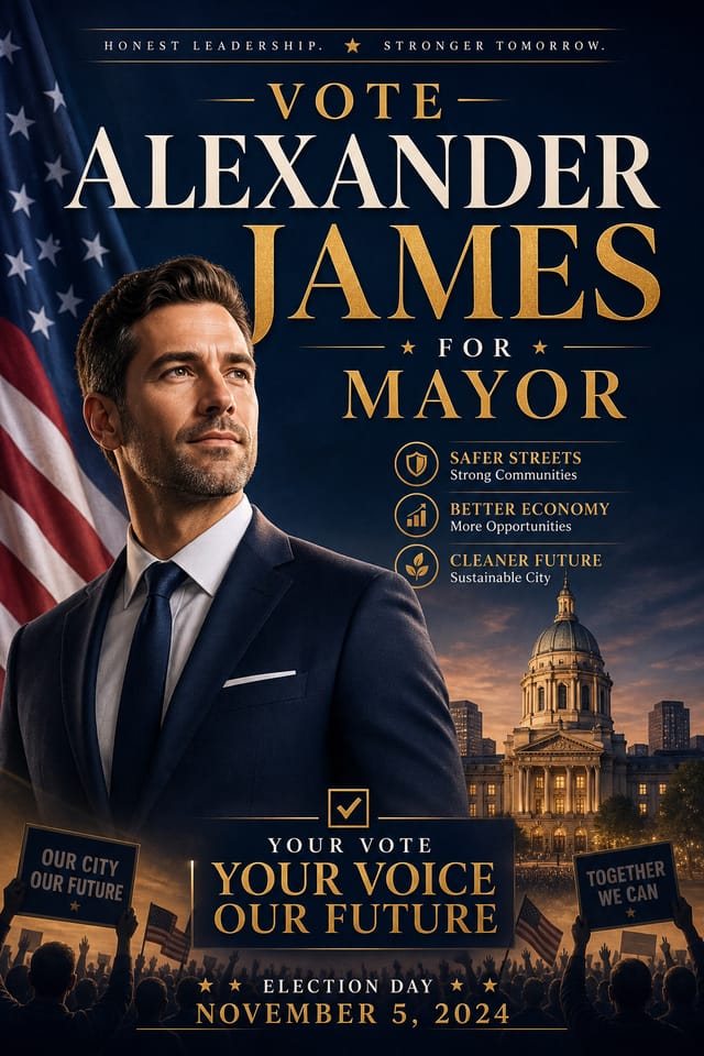
AI Election Poster Maker: Design Reimagined
Pixazo AI builds election posters from your description. Describe the look you want and get a design that fits your exact context.
Create Your Election Poster FreeWhat Makes Election Poster Design Work: What the AI Understands
Understanding Election Poster Design Conventions
Election poster design has its own visual conventions that differ significantly from other styles.
The AI recognizes these patterns and applies them when generating your design, rather than defaulting to a generic layout.
When you describe a election poster, Pixazo selects typography, color relationships, and compositional approaches appropriate to election aesthetics.
The result is a design that looks like it belongs in its context, not a repurposed template with the wrong visual DNA.
The Reach of Election Posters: Across Industries
Travel and Tourism Promotion
Design election posters for destinations, tour packages, and hospitality brands. Aspirational visuals that inspire booking decisions.
Professional Projects
Create election posters for client work, commercial campaigns, and professional applications where quality and style accuracy matter.
Non-Profit Campaigns
Create compelling election campaign posters without allocating budget to design production. Focus resources on mission-critical activities.
Healthcare and Wellness
Design election posters for clinics, wellness centers, and health campaigns. Trustworthy visuals that communicate care and professionalism.
Political and Advocacy Campaigns
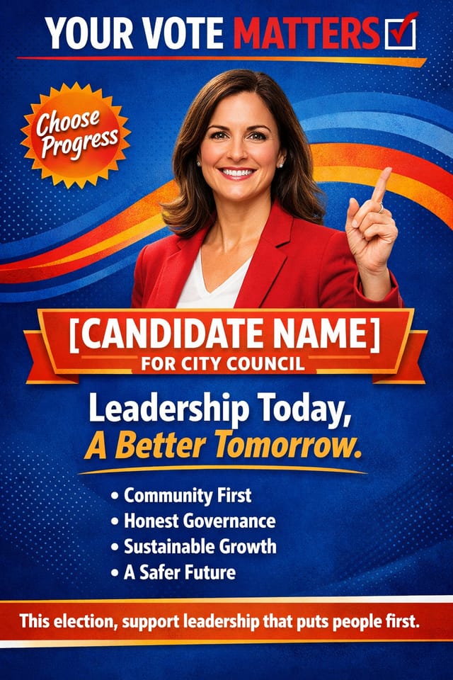
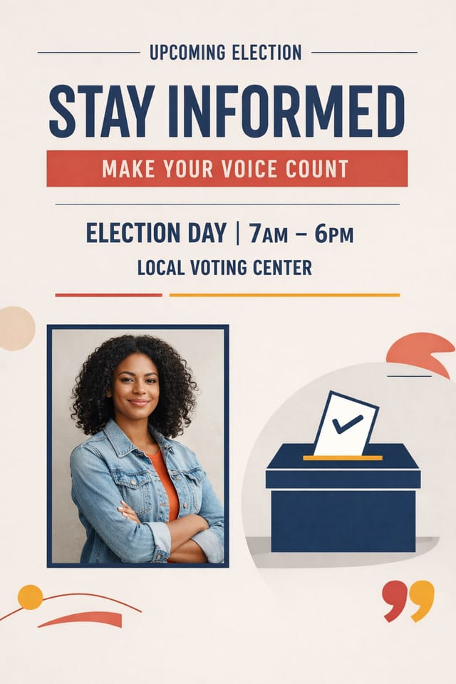
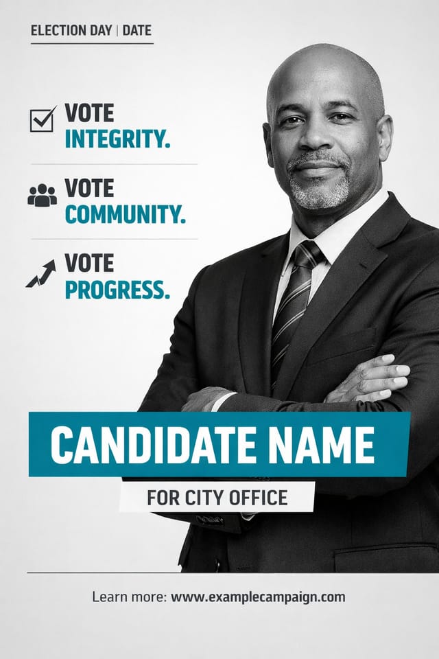
Create election campaign posters for candidates, ballot measures, and social causes. Persuasive designs that mobilize and inform.
The Election Poster Toolkit: A Closer Look
Print-Ready Output
Generated election posters are sized and structured for professional printing. Download high-resolution files ready for production.
Prompt Refinement
Adjust your description to refine any aspect of the election poster design. The AI responds to specific direction about colors, layout, or content.
No Design Software Required
Create professional election posters without Photoshop, Illustrator, or other design applications. The AI handles all technical production.
Resolution Control
Specify output dimensions for your election poster. Get files sized for web display, social media, or large-format printing.
Election Poster Maker: Straight Answers
Generated designs that miss the mark usually need more specific prompts. Add details about the visual hierarchy you want, the feeling the election poster should create, or specific elements to include or avoid. More context in the prompt produces more targeted output.
Templates apply a fixed visual structure with placeholder content. AI generation produces original designs based on your specific description. Two election posters generated from different prompts will have genuinely different layouts, not just different text in the same box positions.
Longer, more detailed prompts generally produce more accurate results for election poster design. Include all the relevant information: style direction, color preferences, content to display, intended use, and any specific design elements you want. There is no strict character limit.
Pixazo supports PNG, JPEG, and PDF export for election posters. PNG preserves transparency if your design uses it. JPEG works well for web and social media. PDF is the preferred format for print production of election posters.
Specify the dimensions in your prompt. Common formats like A3, 18x24 inches, or 1080x1920 pixels for social media stories all work. The AI generates a election poster composition appropriate for the specified aspect ratio and use case.
Get Your Election Poster: What Actually Happens
Capture Your Intent
Write a prompt describing your election poster. Include style preferences, color direction, the most important text to display, and any specific visual elements you want. The more specific your description, the more targeted the output.
Screen the Design
Your election poster generates immediately after submission. Evaluate the design against your requirements and refine the prompt to correct any elements that don't match your intent.
Ship the Final File
Export your election poster in the format you need. PNG for web and social, PDF for print production, JPG for email and lightweight sharing. The file is yours to use commercially without restrictions.
Watch: Creating Election Poster designs step by step
Election Poster Output Options: Format Guide
TIFF
High-fidelity format for election poster files destined for professional printing, supporting CMYK color and lossless compression.
SVG
Scalable format for election poster designs that need to render crisply at any resolution, commonly used for web and responsive layouts.
Print-ready format for election poster files that preserves fonts, colors, and layout across different devices and print services.
JPG
Compressed image format suited for election poster designs with photographic elements where smaller file size matters more than pixel-perfect edges.
PNG
Lossless image format ideal for election poster designs with transparency, sharp text, and web display at predictable file sizes.
Emerging Election Poster Patterns: Design Movements
Gradient Overlays
Smooth color transitions are being used as primary design elements in election poster work, adding depth without the complexity of photographic backgrounds.
Data-Driven Visuals
Incorporating charts, statistics, and structured data directly into election poster layouts helps communicate complex messages at a glance.
Motion-Ready Design
Static election poster designs are being created with animation in mind, using layered elements that translate smoothly to motion graphics.
Hand-Drawn Elements
Illustrations, doodles, and hand-lettering bring a personal, approachable quality to election poster designs in an era of polished digital output.
The Art of Election Poster Design: Standards That Matter
Working with Election Poster AI: What It Cannot Do
Known limitations and trade-offs of AI-generated election design. Transparency matters when using AI for election poster design. The points below describe where you may need to supplement AI output with manual work.
Election Poster Prompts: Prompt Inspiration
Copy any prompt below and paste it into Pixazo to generate your design instantly.
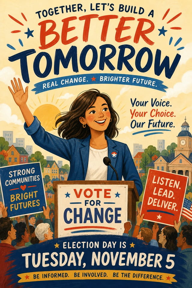
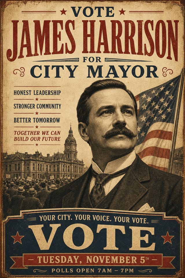
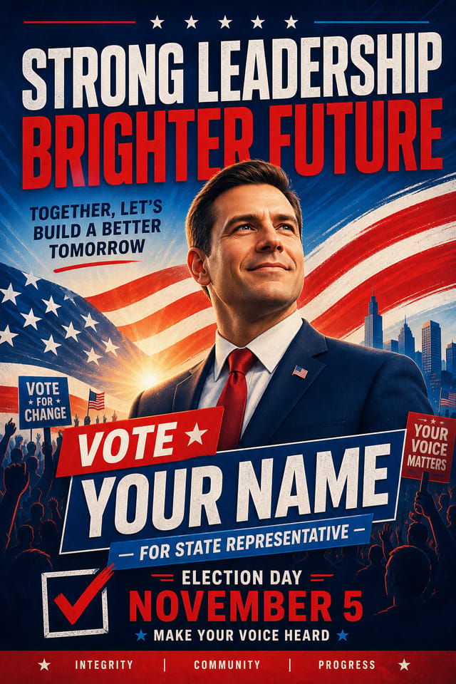
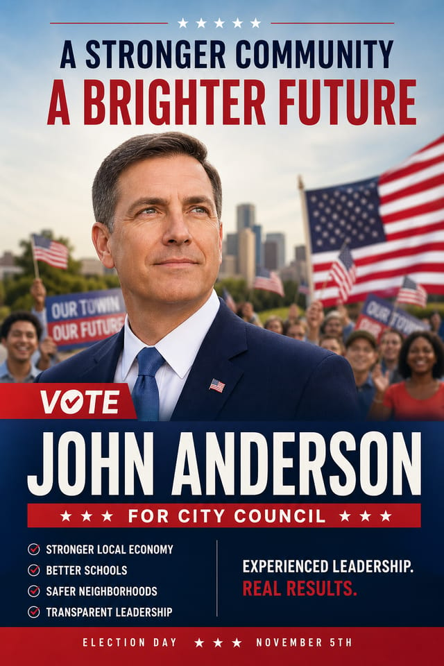
Textured election poster, surface treatment adds depth without obscuring legibility, texture consistent with election aestheticElection aesthetic poster, palette drawn from election design tradition, layout proportions consistent with election conventions, purposeful use of each elementLarge-format election poster design, elements sized for visibility at print scale, no fine detail that would be lost in productionElection poster with strong visual hierarchy, largest element reads clearly, supporting elements organized by importance, clean background treatmentAtmospheric election poster, background treatment supports the headline without competing with it, visual weight distributed intentionallyRefined election poster, sophisticated color relationships, intentional whitespace, typefaces appropriate to election style, balanced compositionCommunity Election Poster: Spotlights and Showcases
Real creators sharing their election designs made with Pixazo AI.