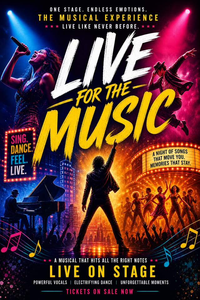
Musical Poster : Create Free Musical Posters in Minutes with AI
Create Custom Musical Posters Quickly with Pixazo Best AI Musical Poster Maker. Try for Free!
Get Started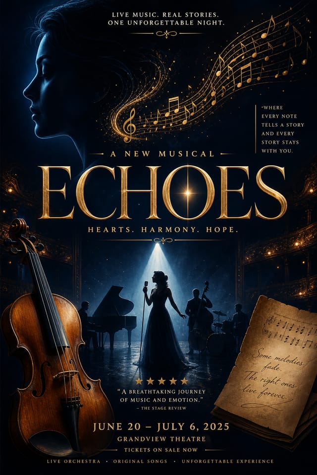
What Makes Musical Poster Design Work: What the AI Understands
How Pixazo Reads Musical Style Cues
Effective musical poster design depends on understanding what makes musical work visually.
Color relationships, typographic choices, and spatial arrangement all carry different weight depending on the design style.
Pixazo's AI has been trained to recognize these distinctions.
The practical result is that a musical poster prompt produces designs that fit musical conventions rather than generic poster layouts.
Musical Poster Maker Comparison: Tools Compared
| Tool | Description |
|---|---|
| Adobe Express | Streamlined creative tool backed by Adobe's design ecosystem |
| Crello | Template-based design tool with animation and video support |
| Pixazo | AI-powered musical poster generator with prompt-based design and professional output quality |
| Canva | Drag-and-drop editor with a large template library and collaboration features |
| Stencil | Lightweight image creator optimized for fast social media graphics |
Musical Posters Across Fields: Where They Fit
Fan Community Materials
Create musical posters for fan clubs, viewing groups, and appreciation events. Designs that celebrate fandom and community.
Merchandise and Collectibles
Generate musical posters intended for print on merchandise, limited editions, and collectible items. Designs with commercial print production in mind.
Social Media Event Promotion
Design musical posters sized for Instagram, Twitter, and Facebook event pages. Platform-optimized materials that maximize reach.
Venue and Festival Signage
Generate musical posters for venue lobbies, festival grounds, and event spaces. Large-format prints that create atmosphere.
Release Day Announcements
Design musical posters for album drops, film releases, and premiere events. Launch-day materials that build buzz across channels.
Musical Makers: Community Creations
Real creators sharing their musical designs made with Pixazo AI.
Handmade-feel musical poster with brush stroke textures, imperfect edges, warm color palette, artisanal craft aesthetic
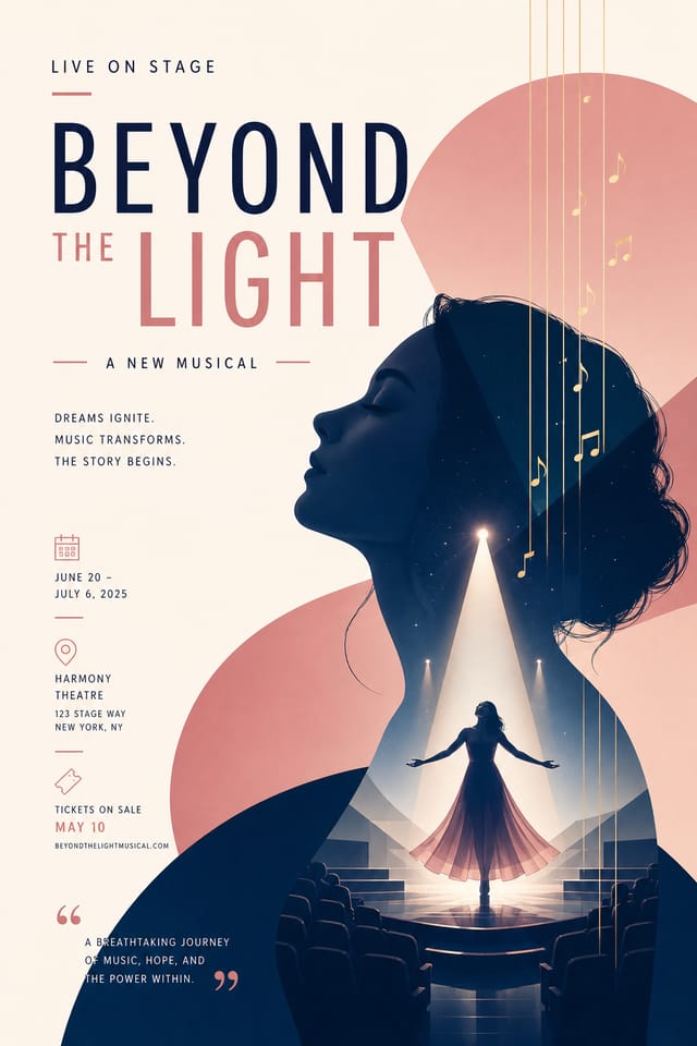
Musical poster with Japanese minimalism influence, abundant whitespace, single focal element, restrained palette of black, white, and one accent
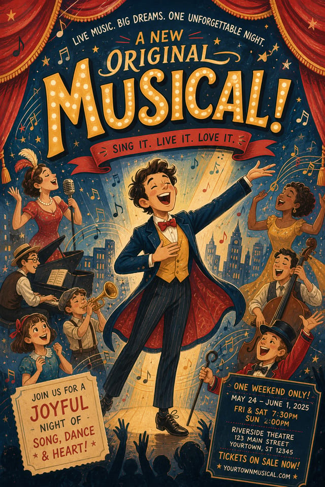
Playful musical poster for a family audience, rounded typography, bright saturated colors, approachable and energetic toneEffective Musical Poster Strategies: Rules Worth Following
Test with real content
Never finalize a musical poster with placeholder text. Real copy often has different lengths and line breaks that affect the design.
Use grids and alignment
Structured layouts in your musical poster create a sense of order and professionalism that unstructured designs cannot match.
Maintain brand alignment
Keep your musical poster design consistent with existing brand colors, fonts, and visual language for a cohesive identity.
Skip proofreading
Typos and grammatical errors on a musical poster undermine credibility instantly. Always have someone else review the final text.
Overcrowd the layout
Filling every pixel of your musical poster with content makes it harder to read and reduces the impact of every individual element.
Forget the call to action
A musical poster without a clear next step for the viewer is a missed opportunity. Always include direction on what to do next.
Ignore accessibility
Low-contrast text and tiny font sizes in your musical poster exclude a significant portion of your potential audience.
The Musical Poster Feature Set: What It Can Do
Fast Generation
Complete musical poster designs generate in seconds. No rendering queues, no waiting for batch processing.
No Design Software Required
Create professional musical posters without Photoshop, Illustrator, or other design applications. The AI handles all technical production.
Prompt Refinement
Adjust your description to refine any aspect of the musical poster design. The AI responds to specific direction about colors, layout, or content.
Print-Ready Output
Generated musical posters are sized and structured for professional printing. Download high-resolution files ready for production.
Resolution Control
Specify output dimensions for your musical poster. Get files sized for web display, social media, or large-format printing.
Compositional Structure
Layout and hierarchy decisions reflect musical design patterns. The proportions and arrangement match how musical designs are conventionally structured.
Build a Musical Poster: The Workflow Explained
Watch: Creating Musical Poster designs step by step
The Fundamentals of Musical Poster: Key Principles
Where Musical Poster AI: Known Limitations
Known limitations and trade-offs of AI-generated musical design. Every AI design tool has boundaries. Knowing these limits before you start helps you get the most out of musical poster generation.
Effective Musical Poster Prompt Inspiration
Copy any prompt below and paste it into Pixazo to generate your design instantly.
Musical style poster, bold headline placement, supporting text at appropriate scale, color palette consistent with musical design conventionsRefined musical poster, sophisticated color relationships, intentional whitespace, typefaces appropriate to musical style, balanced compositionPortrait-orientation musical poster, vertical composition, headline at natural reading entry point, supporting information flows downward logicallyMusical aesthetic poster, palette drawn from musical design tradition, layout proportions consistent with musical conventions, purposeful use of each elementProfessional musical poster, minimalist musical approach, negative space used intentionally, readable at multiple viewing distances, print-ready compositionHigh-impact musical poster, immediate visual read at thumbnail size, clear headline dominance, supporting information structured logicallyMusical Poster AI: A Quick FAQ
Yes. Set up separate brand kits for each client or brand, then switch between them when generating musical posters. Each brand kit stores its own colors, fonts, and logo so the AI applies the correct identity to every musical poster without manual reconfiguration.
Canva uses fixed templates you customize manually. Pixazo generates original musical poster designs from your description, so every output is unique. For musical work specifically, the AI applies style-specific design decisions rather than offering generic drag-and-drop templates.
Generated designs that miss the mark usually need more specific prompts. Add details about the visual hierarchy you want, the feeling the musical poster should create, or specific elements to include or avoid. More context in the prompt produces more targeted output.
Common sizes include 1080x1080 for Instagram feed, 1080x1920 for stories and reels, 1200x628 for Facebook links, 1500x500 for Twitter headers, and 1080x1350 for Pinterest. Specify the platform in your prompt and Pixazo optimizes musical layout for that format.
Brand kits let you save your logo, fonts, and color palette so every musical poster you generate stays on brand. Once configured, the AI applies your brand parameters automatically alongside musical style conventions.
Pixazo offers a free tier that lets you generate musical posters with standard resolution output. Paid plans unlock higher resolution, priority generation, and additional export formats. You can try musical poster generation without entering payment details.

