Reminder Poster : Create Free Reminder Posters in Minutes with AI
Create Custom Reminder Posters Quickly with Pixazo Best AI Reminder Poster Maker. Try for Free!
Get Started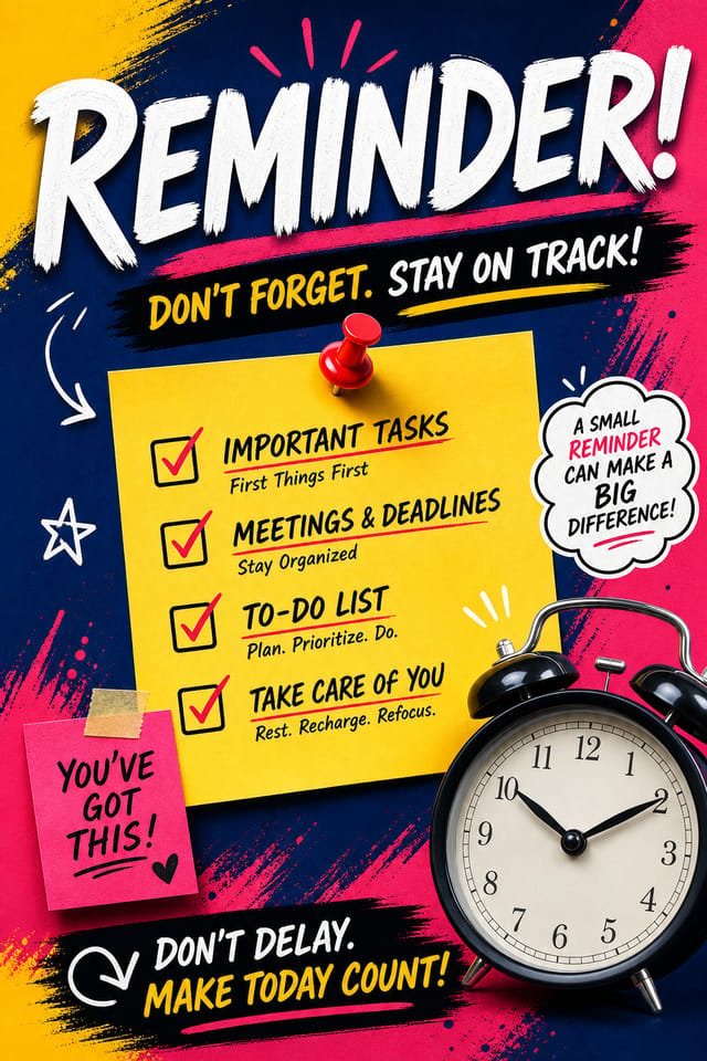
AI Reminder Poster Platform: Built for Creators
Professional reminder poster design without the complexity. Pixazo generates layouts, selects palettes, and handles typography in seconds.
Create Your Reminder Poster FreeReminder Poster Design Insights: Practical Guidance
Use High Contrast for Readability
Whether your reminder poster is displayed on screen or in print, strong contrast between text and background ensures the message gets through at any size.
Consider the Context
Think about where your reminder poster will appear. A design optimized for social media needs different proportions and density than one for a physical bulletin board.
Keep Typography Simple
Use no more than two typefaces per reminder poster. One for headlines, one for body text. Consistency in typography signals professionalism.
Prioritize Hierarchy
Every reminder poster needs a clear reading order. Make sure the most important information is the largest and most prominent element in the layout.
Test at Actual Size
Always preview your reminder poster at the dimensions it will be displayed. Design details that look fine at 100% can disappear or crowd at real-world scale.
Reminder Poster Capabilities: By the Numbers
What Separates Good Reminder Design: AI Interpretation
What Makes Reminder Poster Design Work
The gap between a professional reminder poster and a mediocre one usually comes down to design decisions made early in the process: palette selection, type hierarchy, and compositional structure.
These choices determine whether the final output reads as reminder or just looks generic.
Pixazo's AI makes these foundational decisions based on your prompt.
Specify a reminder poster and the system selects design parameters that match reminder visual expectations, giving you a solid starting point rather than a blank-slate template.
Reminder Poster File Formats: Output Formats Compared
TIFF
High-fidelity format for reminder poster files destined for professional printing, supporting CMYK color and lossless compression.
SVG
Scalable format for reminder poster designs that need to render crisply at any resolution, commonly used for web and responsive layouts.
Print-ready format for reminder poster files that preserves fonts, colors, and layout across different devices and print services.
WEBP
Modern web format offering smaller file sizes than PNG or JPG for reminder poster images without significant quality loss.
Who Creates Reminder Posters: Across Industries
Personal Creative Work
Generate reminder posters for personal projects, home display, and creative experiments without spending production time on design execution.
E-Commerce Product Promotion
Design reminder posters for online store banners, product launches, and seasonal sales. Conversion-focused visuals for digital retail.
Event Promotion
Create reminder event posters that establish the right visual mood before the event. Reminder design signals quality and sets expectations.
Healthcare and Wellness
Design reminder posters for clinics, wellness centers, and health campaigns. Trustworthy visuals that communicate care and professionalism.
Professional Projects
Create reminder posters for client work, commercial campaigns, and professional applications where quality and style accuracy matter.
Reminder Poster Creation Tools: Key Capabilities
Subcategory Awareness
The AI distinguishes between design subcategories. A reminder poster request produces reminder-appropriate output, not a generic design with reminder text added.
Fast Generation
Complete reminder poster designs generate in seconds. No rendering queues, no waiting for batch processing.
Style-Accurate Generation
The AI interprets reminder design conventions and applies them to your poster, producing output that looks correctly styled rather than generically templated.
Text Placement Options
Describe where you want text elements positioned in your reminder poster. The AI follows compositional direction about headline placement and body copy layout.
Typography Matching
Typefaces are selected to match reminder aesthetic expectations. The AI pairs fonts that reinforce your reminder poster's visual identity.
Prompt Refinement
Adjust your description to refine any aspect of the reminder poster design. The AI responds to specific direction about colors, layout, or content.
Reminder Poster AI Results: By the Numbers
From initial prompt to finished reminder poster in a simple
From initial prompt to finished reminder poster in a simple workflow
Output formats available for every reminder poster generatio
Output formats available for every reminder poster generation
Average generation time for a complete reminder poster desig
Average generation time for a complete reminder poster design from prompt to output
Reminder Poster Design Steps: Made Simple
Initiate the Design Request
Describe what you want your reminder poster to look like. Include the mood, color palette, typography preference, and content hierarchy. Pixazo reads all of this and uses it to generate an appropriate design.
Inspect and Compare
Your reminder poster generates immediately after submission. Evaluate the design against your requirements and refine the prompt to correct any elements that don't match your intent.
Secure Your Output
Download your completed reminder poster in the format that fits your use case. High-resolution files for print, web-optimized versions for digital, or PDF for production-ready delivery.
Watch: Creating Reminder Poster designs step by step
The Art of Reminder Poster Design: Design Fundamentals
Texture and Depth
Subtle texture in reminder poster design adds visual interest without competing with content. Surface treatments create depth and suggest quality when used sparingly.
Visual Hierarchy
Strong reminder poster design establishes a clear reading order. The headline should be immediately visible, supporting information should follow in logical sequence.
Color Discipline
Effective reminder poster color palettes do more with less. A two or three color system applied consistently creates more visual coherence than many competing colors.
Reminder Poster Community: Work in the Wild
Real creators sharing their reminder designs made with Pixazo AI.

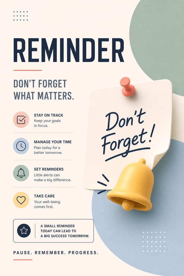
Reminder poster designed for dark mode display, OLED-optimized black background, vibrant accent colors, high contrast text
High-contrast reminder poster, dark background with light text, accent color used for single key element, modern composition
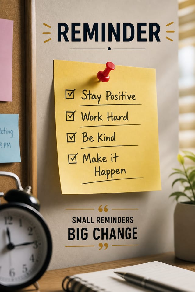
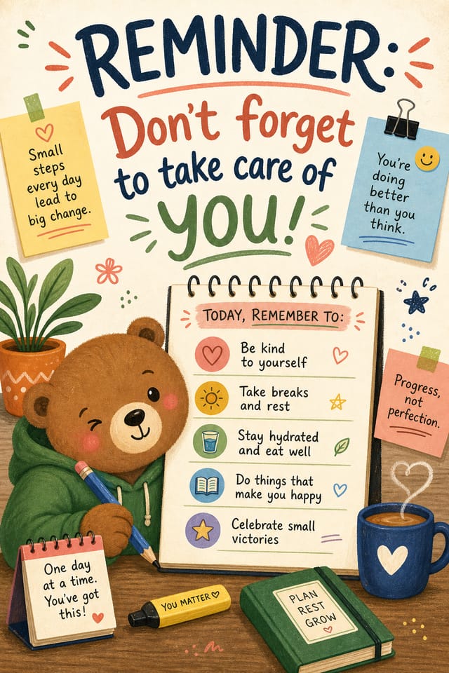
Playful reminder poster for a family audience, rounded typography, bright saturated colors, approachable and energetic toneComparing Reminder Poster Tools: Tools Compared
| Tool | Description |
|---|---|
| PicMonkey | Photo editor and design tool with brand kit management |
| Fotor | Photo editing platform with design templates and batch processing |
| Pixazo | AI-powered reminder poster generator with prompt-based design and professional output quality |
| Piktochart | Infographic and presentation maker for data-driven visuals |
| Crello | Template-based design tool with animation and video support |
Reminder Poster Constraints: Honest Expectations
Known limitations and trade-offs of AI-generated reminder design. Being specific about what AI poster generation can and cannot do helps you plan your workflow and set accurate expectations.
Before You Start: A Quick FAQ
Generated designs that miss the mark usually need more specific prompts. Add details about the visual hierarchy you want, the feeling the reminder poster should create, or specific elements to include or avoid. More context in the prompt produces more targeted output.
Specific prompts produce better results than vague ones. Include the visual style you want, any color preferences, the most important text to display, and the intended use. For reminder design specifically, noting whether you want a contemporary or classic interpretation of reminder style helps the AI make the right design decisions.
Generate your initial reminder poster, review the output, then modify your prompt to adjust specific elements. Each regeneration produces a fresh design incorporating your changes. Most users reach their final reminder poster design within two to four iterations.
You control every major design parameter through your prompt: color palette, typography style, layout structure, visual weight distribution, background treatment, and content hierarchy. The more specific your reminder poster prompt, the more precisely the AI follows your creative direction.
Reminder Poster Starter Prompt Formulas
Copy any prompt below and paste it into Pixazo to generate your design instantly.
Large-format reminder poster design, elements sized for visibility at print scale, no fine detail that would be lost in productionProfessional reminder poster, minimalist reminder approach, negative space used intentionally, readable at multiple viewing distances, print-ready compositionFull-bleed reminder poster, background treatment extends to edges, foreground elements positioned for compositional balance, strong central hierarchyMonochromatic reminder poster, single-hue palette with value variation for contrast, typographic hierarchy creates visual interest without color complexitySeries-compatible reminder poster design, visual language that extends to multiple formats, consistent design system across variants
