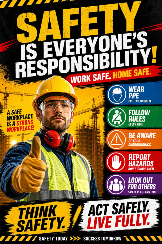
Safety Poster : Create Free Safety Posters in Minutes with AI
Create Custom Safety Posters Quickly with Pixazo Best AI Safety Poster Maker. Try for Free!
Get Started
AI Safety Poster Platform: Start Creating Now
Generate safety poster designs that look considered and intentional. Pixazo handles the design decisions so you only need the idea.
Create Your Safety Poster FreeSafety Visual Language: The Underlying Framework
The Safety Design Approach: How Pixazo Handles It
Safety poster design has its own visual conventions that differ significantly from other styles.
The AI recognizes these patterns and applies them when generating your design, rather than defaulting to a generic layout.
When you describe a safety poster, Pixazo selects typography, color relationships, and compositional approaches appropriate to safety aesthetics.
The result is a design that looks like it belongs in its context, not a repurposed template with the wrong visual DNA.
Design Criteria for Safety Poster: Standards That Matter
Information Density Control
Match the information density of your safety poster to the viewing context. A display viewed from 10 feet needs fewer words and larger elements than one held in hand.
Edge Treatment
How elements meet the edge of a safety poster matters. Full-bleed images feel immersive. Generous margins feel premium. The edge is a design decision, not an afterthought.
Alignment and Grid
Strong safety poster layouts align elements to an invisible grid. Consistent alignment builds trust and professionalism, while deliberate breaks from the grid create emphasis.
The Safety Poster Feature Set: A Closer Look
Export Flexibility
Download your safety poster in formats suited for your use case. Web-optimized versions for digital display, high-DPI files for print.
Typography Matching
Typefaces are selected to match safety aesthetic expectations. The AI pairs fonts that reinforce your safety poster's visual identity.
Layered Style Application
Combine safety style with other design parameters in a single prompt. The AI interprets complex requests and applies multiple style constraints simultaneously.
Context-Aware Design
Describe your safety poster's purpose and audience. The AI adjusts visual weight, complexity, and clarity based on the intended use context.
Color Temperature Control
Specify warm, cool, or neutral color direction for your safety poster. The AI builds the full palette around your temperature preference.
Try These Safety Poster Prompt Starters
Copy any prompt below and paste it into Pixazo to generate your design instantly.
Portrait-orientation safety poster, vertical composition, headline at natural reading entry point, supporting information flows downward logicallyContemporary safety poster design, grid-based layout, typographic precision, restrained color palette, no decorative excessGeometric safety poster, structured grid system, angular composition, colors in blocks rather than gradients, modern clean finishSafety poster with strong visual hierarchy, largest element reads clearly, supporting elements organized by importance, clean background treatmentRefined safety poster, sophisticated color relationships, intentional whitespace, typefaces appropriate to safety style, balanced compositionWhere Safety Poster Design Is Heading: What Is Popular Now
Brutalist Design
Raw, intentionally unpolished safety poster aesthetics with stark contrasts and unconventional layouts are carving a niche in creative industries.
Data-Driven Visuals
Incorporating charts, statistics, and structured data directly into safety poster layouts helps communicate complex messages at a glance.
Organic Shapes
Flowing, irregular forms are replacing sharp geometric shapes in safety poster backgrounds and decorative elements for a softer visual feel.
Dark Mode Aesthetics
Dark backgrounds with high-contrast accents are increasingly common in safety poster design, reducing visual fatigue and adding sophistication.
The Path to Your Safety Poster: The Workflow Explained
Paint the Picture in Words
Describe what you want your safety poster to look like. Include the mood, color palette, typography preference, and content hierarchy. Pixazo reads all of this and uses it to generate an appropriate design.
Weigh Your Options
Your safety poster generates immediately after submission. Evaluate the design against your requirements and refine the prompt to correct any elements that don't match your intent.
Walk Away with the Design
Get your final safety poster file in one click. Choose your format, download at full resolution, and use the design immediately. No watermarks, no additional fees, no waiting.
Watch: Creating Safety Poster designs step by step
Pro Tips for Safety Poster Design: What Professionals Know
Match Tone to Audience
A safety poster for a corporate event needs a different visual tone than one for a music festival. Let the audience guide your style choices.
Prioritize Hierarchy
Every safety poster needs a clear reading order. Make sure the most important information is the largest and most prominent element in the layout.
Start with a Clear Brief
Before generating any safety poster, write down the core message, target audience, and intended use. A focused brief produces better results than iterating from a vague idea.
Test at Actual Size
Always preview your safety poster at the dimensions it will be displayed. Design details that look fine at 100% can disappear or crowd at real-world scale.
Limit Your Color Palette
Stick to 2-3 primary colors in your safety poster design. Too many colors compete for attention and weaken the visual hierarchy.
Putting Safety Posters to Work: Everyday and Professional
Social Media Content
Design safety posters sized for social platforms. Get content that looks intentional and well-crafted, not thrown together.
Educational Materials
Design safety posters for educational contexts. Courses, workshops, and learning materials benefit from the visual clarity of good safety design.
Personal Creative Work
Generate safety posters for personal projects, home display, and creative experiments without spending production time on design execution.
Real Estate Marketing
Create safety posters for property listings, open houses, and agent branding. Professional visuals that elevate property presentation.
Podcast and Media Branding
Generate safety posters for podcast covers, episode artwork, and media channel identity. Consistent visual branding across audio and video platforms.
Safety Style Options: Aesthetic Choices
Classic Safety
Traditional safety design principles applied to modern poster format. Clean composition, conventional hierarchy, time-tested visual decisions.
Textured Safety
Safety design with added surface depth. Background treatments add visual interest without disrupting legibility.
Contemporary Safety
Current safety design sensibility with updated proportions, modern typefaces, and contemporary color relationships.
Geometric Safety
Structured safety composition using grid systems and angular forms. Order and precision define the visual approach.
Editorial Safety
Text-dominant safety poster layout inspired by print publication design. Typographic variety creates visual rhythm.
Safety Poster Design: Straight Answers
Pixazo generates high-resolution files suitable for both print and digital use. Specify your intended output format in your prompt. Print safety posters benefit from high-DPI settings, while web and social media use works well with standard resolution output.
The AI recognizes safety design as a distinct visual category with its own conventions. Specifying safety style in your prompt triggers appropriate design decisions around color, typography, and composition rather than defaulting to generic poster layout.
You can specify any aspect ratio in your prompt. Common options include 1:1 for social posts, 4:5 for Instagram, 9:16 for stories, 16:9 for presentations, and standard print sizes like A4 or letter. The AI adapts safety composition to fit your chosen ratio.
Pixazo generates safety posters in RGB color space. For professional offset printing that requires CMYK, convert the downloaded file using Adobe Photoshop, Illustrator, or a free tool like GIMP. The AI selects colors that translate well to print when you mention print use in your prompt.
Safety Creator Real Creator Work
Real creators sharing their safety designs made with Pixazo AI.


Safety Poster Workflow Stages: From Start to Delivery
Research Gather references
Collect examples of effective safety poster designs, note what works, and identify patterns relevant to your project goals.
Export Deliver final files
Export your safety poster in the required formats and resolutions. Organize deliverables for handoff to the production or publishing team.
Generate Create initial designs
Use AI to produce multiple safety poster variations based on your brief. Start broad and narrow down from the strongest options.
Approve Final sign-off
Get stakeholder approval on the finished safety poster. Verify all text is accurate and the design meets brand and technical requirements.
AI Safety Poster Design: What It Cannot Do
Known limitations and trade-offs of AI-generated safety design. Being specific about what AI poster generation can and cannot do helps you plan your workflow and set accurate expectations.

