TikTok Poster : Create Free TikTok Posters in Minutes with AI
Create Custom TikTok Posters Quickly with Pixazo Best AI TikTok Poster Maker. Try for Free!
Get Started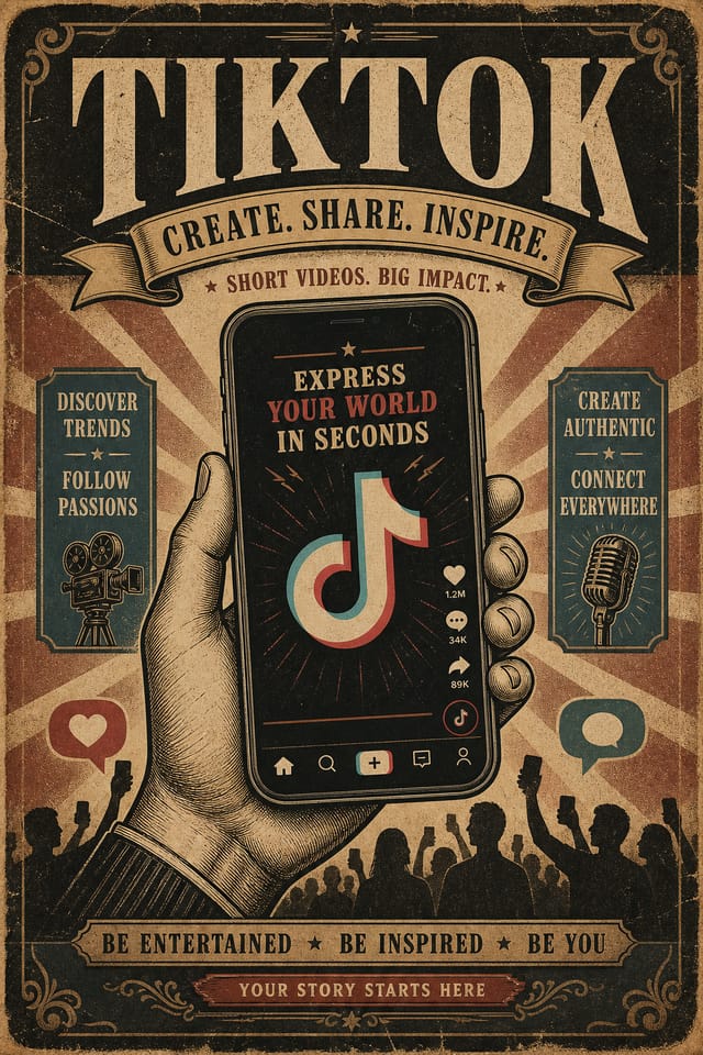
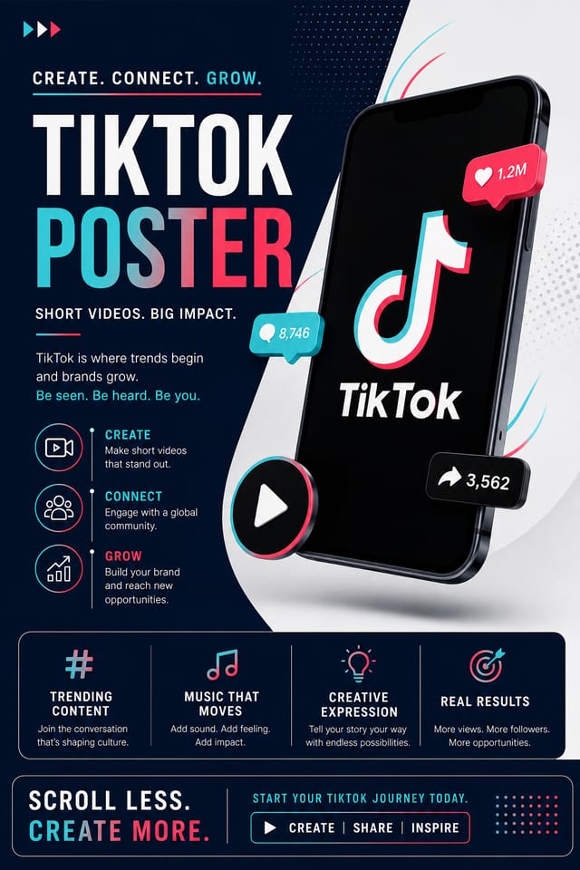
AI Tiktok Poster Tool: From Idea to Reality
From idea to finished tiktok poster in under a minute. Pixazo understands tiktok design conventions and applies them automatically.
Create Your Tiktok Poster FreeTiktok Poster Design Guidance: Rules Worth Following
Use a consistent visual hierarchy
Structure your tiktok poster so the viewer's eye follows a clear path from headline to supporting details to call-to-action.
Use grids and alignment
Structured layouts in your tiktok poster create a sense of order and professionalism that unstructured designs cannot match.
Optimize for the display medium
Tailor your tiktok poster resolution, color space, and text size to the specific platform or physical context where it will appear.
Overcrowd the layout
Filling every pixel of your tiktok poster with content makes it harder to read and reduces the impact of every individual element.
Rely solely on AI output
AI-generated tiktok poster designs are a starting point. Human review catches issues with context, tone, and accuracy that AI can miss.
Skip proofreading
Typos and grammatical errors on a tiktok poster undermine credibility instantly. Always have someone else review the final text.
Your Tiktok Poster Workflow: Made Simple
Register Your Concept
Start with a text description of your tiktok poster concept. Specify the visual style, colors, layout direction, and key text. Detailed prompts produce more accurate tiktok poster designs than general ones.
Watch: Creating Tiktok Poster designs step by step
Design Intelligence for Tiktok Posters: How Pixazo Handles It
Tiktok Visual Language: AI Interpretation
Creating a convincing tiktok poster requires understanding tiktok as a design vocabulary, not just as a label.
The color relationships, the type choices, the spatial organization.
These elements work together to create the impression of intentional tiktok design.
Pixazo's generation model recognizes tiktok design patterns and applies them systematically.
Tiktok Poster Creation Tools: What It Can Do
Compositional Structure
Layout and hierarchy decisions reflect tiktok design patterns. The proportions and arrangement match how tiktok designs are conventionally structured.
Consistency Across Variants
Generate multiple tiktok posters for a project and maintain visual consistency across the set. Specify your core design parameters and vary secondary elements.
Resolution Control
Specify output dimensions for your tiktok poster. Get files sized for web display, social media, or large-format printing.
Text Placement Options
Describe where you want text elements positioned in your tiktok poster. The AI follows compositional direction about headline placement and body copy layout.
Commercial Use Rights
Designs generated with Pixazo are yours to use commercially. No additional licensing required for tiktok poster projects.
Prompt Refinement
Adjust your description to refine any aspect of the tiktok poster design. The AI responds to specific direction about colors, layout, or content.
Putting Tiktok Posters to Work: In the Real World
Sports and Recreation
Produce tiktok posters for leagues, tournaments, and recreational programs. Energetic designs that build excitement and communicate schedules.
Social Media Content
Design tiktok posters sized for social platforms. Get content that looks intentional and well-crafted, not thrown together.
Event Promotion
Create tiktok event posters that establish the right visual mood before the event. Tiktok design signals quality and sets expectations.
Real Estate Marketing
Create tiktok posters for property listings, open houses, and agent branding. Professional visuals that elevate property presentation.
Tiktok Poster Software Options: A Neutral Comparison
PicMonkey
Photo editor and design tool with brand kit management
Desygner
Multi-format design tool with PDF editing and brand management
Pixazo
AI-powered tiktok poster generator with prompt-based design and professional output quality
Snappa
Quick graphic creator focused on social media and marketing visuals
VistaCreate
Visual content platform with templates and a built-in asset library
Exploring Tiktok Poster Directions: A Visual Guide
Minimalist Tiktok
Stripped-back tiktok approach. Fewer elements, more negative space, typography carries more visual weight.
Textured Tiktok
Tiktok design with added surface depth. Background treatments add visual interest without disrupting legibility.
Editorial Tiktok
Text-dominant tiktok poster layout inspired by print publication design. Typographic variety creates visual rhythm.
High-Contrast Tiktok
Bold tiktok visual treatment with strong tonal contrast. Elements read clearly at any viewing distance.
Classic Tiktok
Traditional tiktok design principles applied to modern poster format. Clean composition, conventional hierarchy, time-tested visual decisions.
Tiktok Poster Production Steps: The Full Process
Research
Collect examples of effective tiktok poster designs, note what works, and identify patterns relevant to your project goals.
Approve
Get stakeholder approval on the finished tiktok poster. Verify all text is accurate and the design meets brand and technical requirements.
Review
Compare generated tiktok poster options against your brief. Mark what works and note specific changes needed for the next iteration.
Refine
Apply targeted edits to your selected tiktok poster. Adjust typography, spacing, and color until every element meets your quality standard.
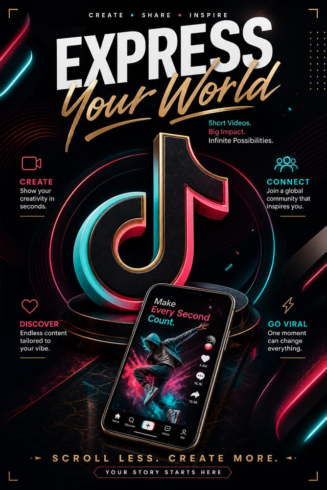
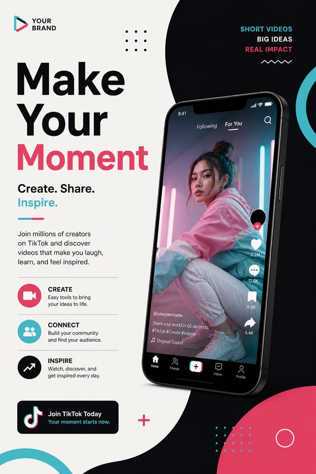
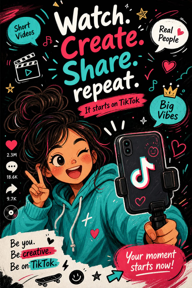
Tiktok Poster Creators: A Design Gallery
Real creators sharing their tiktok designs made with Pixazo AI.
Tiktok poster with retro 1970s color palette, warm oranges and browns, groovy display type, textured paper background feel
Monochromatic tiktok poster, single hue in multiple values, typographic hierarchy creates depth without color complexity
Tiktok poster at 1080x1920 pixels for Instagram stories, bold sans-serif headline centered, gradient background in tiktok tones, call-to-action at bottomProven Tiktok Poster Prompt Templates
Copy any prompt below and paste it into Pixazo to generate your design instantly.
Geometric tiktok poster, structured grid system, angular composition, colors in blocks rather than gradients, modern clean finishTiktok poster with strong visual hierarchy, largest element reads clearly, supporting elements organized by importance, clean background treatmentTwo-color tiktok poster design, high contrast between primary and secondary color, clean separation between graphic and text zonesTextured tiktok poster, surface treatment adds depth without obscuring legibility, texture consistent with tiktok aestheticEditorial-style tiktok poster, text-dominant design, typographic treatment carries visual weight, layout proportions inspired by print publication designUnderstanding Tiktok Posters: FAQ
Specify the dimensions in your prompt. Common formats like A3, 18x24 inches, or 1080x1920 pixels for social media stories all work. The AI generates a tiktok poster composition appropriate for the specified aspect ratio and use case.
You can specify any aspect ratio in your prompt. Common options include 1:1 for social posts, 4:5 for Instagram, 9:16 for stories, 16:9 for presentations, and standard print sizes like A4 or letter. The AI adapts tiktok composition to fit your chosen ratio.
Pixazo generates original designs rather than copying existing work. The AI creates tiktok posters from learned design principles, not by stitching together fragments of existing designs. Generated output does not reproduce copyrighted material or identifiable artistic styles of living creators.
Brand kits let you save your logo, fonts, and color palette so every tiktok poster you generate stays on brand. Once configured, the AI applies your brand parameters automatically alongside tiktok style conventions.
What Tiktok Poster AI: Known Limitations
Known limitations and trade-offs of AI-generated tiktok design. Being specific about what AI poster generation can and cannot do helps you plan your workflow and set accurate expectations.

