How to Create a Minimalistic Poster Design [9 Tips & Tricks]



Minimalist designs have been quite popular in the 21st century. With time, minimalism has become its own field with artists pushing new boundaries in minimalism. Minimalism in graphic design is, however, still a new concept.
The use of minimalism is most prevalent in design posters. Minimalist poster designs are quite eye-grabbing and are an excellent way to attract consumer attention to your business. Unlike normal posters, minimalist posters have a completely unique approach to grabbing people’s attention.
The illusion of ‘less is more’ is actually very effective as it makes people look in-depth at the design you have created. The success of a minimalist poster can be attributed to how well it can convey the message it is supposed to convey. By using Poster Maker, you can easily create effective minimalist posters that stand out and capture the essence of your brand. Here are a few statistics on how successful minimalist design posters are.
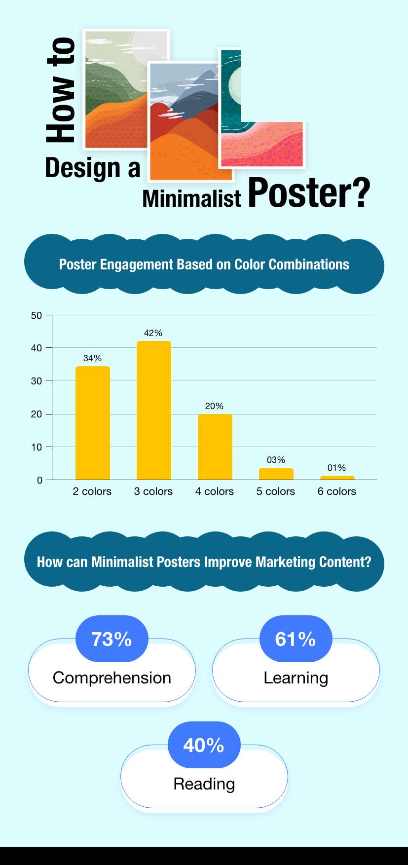
In this guide, we shall discuss a few principles to keep in mind when designing minimalistic posters for your business. Without much ado, let’s jump right into it.
Tips to Create a Minimalist Design Poster
- Think Outside the Box
- The Case for Letterform
- A Good Use of WhiteSpace
- Mix it Up
A minimalist design poster doesn’t mean that you take a generic background and a generic text and drab them in a monochrome gray. Minimalism poster design is as free as any other kind of design. The only ‘minimal’ thing about it is that the end product should look ‘simple’ at first glance.
Use your design elements to send your message and play around with it. Experiment with your design. To know what design elements to use, a good look at the current trends in graphic design is a great way to go about it. Research online and find minimalistic posters to get an idea of what you can create. You can even check out pre-made poster templates.
Suggested Read: 21+ Classroom Poster Design Ideas: Inspire Minds With Visual Impact
Pun intended, letterform is an excellent way to give your minimalistic designs a new breadth of creativity. Letterform is the practice of using alphabets as design elements in designs. For example, the yellow ‘M’ in McDonalds acts as both an alphabet and a design element.
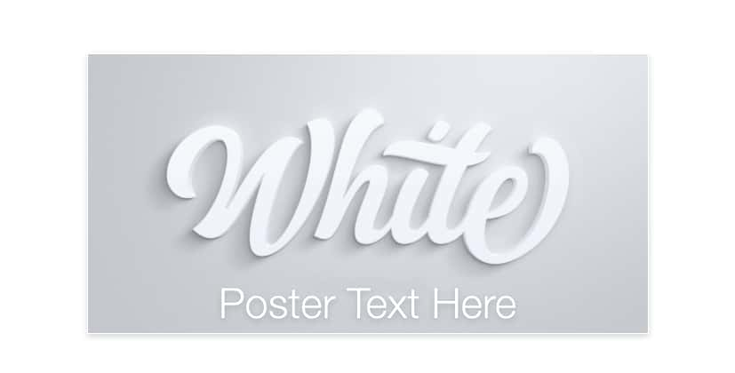
Letterform can often add an additional cool vibe to your designs. Letterforms often create a lasting impression on your viewers when they look at your design and catch the alphabet that shapes up like a design element. For this reason, letterform is popular across the industry.
Suggested Read: Top 10 AI Clipart Tools in 2026: Simplifying Your Graphic Design Journey
Sometimes to attract attention, you don’t need to do anything. Even a good amount of whitespace can work miracles for your designs.
Suggested Read: Top Business Card Design Trends for 2026
Building on the first point in the blog, one of the best ways to think out of the box is to mix different ideas together. Mix and match your designs and how you use various design elements and create a completely unique new design for your designs.
Suggested Read: How to Design a Meme in 4 Simple Steps?
Conclusion
Minimalism poster design is here to stay. With time, more and more designers will realize the true potential of minimalist poster design. In a market where cluttered, bright, and loud designs, uncluttered, and simplistic design attracts a lot of attention.
With good poster maker software such as Pixazo poster maker, designers can also use pre-made templates to take their designs to the next level. Use the principles given in this blog experiment with your next big poster!
Suggested Read: 70+ International Yoga Day Poster Ideas in 2026
Frequently Asked Questions
What is a minimalist poster design?
A minimalist poster uses only the essential elements, such as a single strong image or headline, plenty of empty space, and a limited color palette. The goal is to communicate one clear message without clutter or decoration.
Suggested Read: 35 Graduation Poster Ideas for 2026
How do I keep a poster minimal without making it look empty?
Focus on one strong focal point, use white space intentionally, and let typography carry the design. Balanced spacing and alignment make a sparse layout feel deliberate and elegant rather than unfinished.
How many colors should a minimalist poster use?
Most minimalist posters stick to one to three colors, often a neutral background with a single accent. A tight palette keeps the design calm and helps the main message stand out.
What fonts work best for minimalist posters?
Clean, simple typefaces such as well-spaced sans-serifs usually work best, though a single elegant serif can add character. The key is choosing one or two fonts and giving the text room to breathe.
Do I need design experience to make a minimalist poster?
No, minimalism is actually beginner-friendly because it relies on restraint rather than complex effects. Starting with a simple template and removing anything that is not essential is a reliable way to get a clean result.
Suggested Read: How to Make a Poster: Sizes, Layout and Free Templates
Deepak Joshi
Author · Pixazo
Deepak writes about generative AI models, APIs, and the workflows teams use to ship them. Reviewed by Abhinav Girdhar.