Typography Book Cover : Create Free Typography Book Covers in Minutes with AI
Create Custom Typography Book Covers Quickly with Pixazo Best AI Typography Book Cover Maker. Try for Free!
Get Started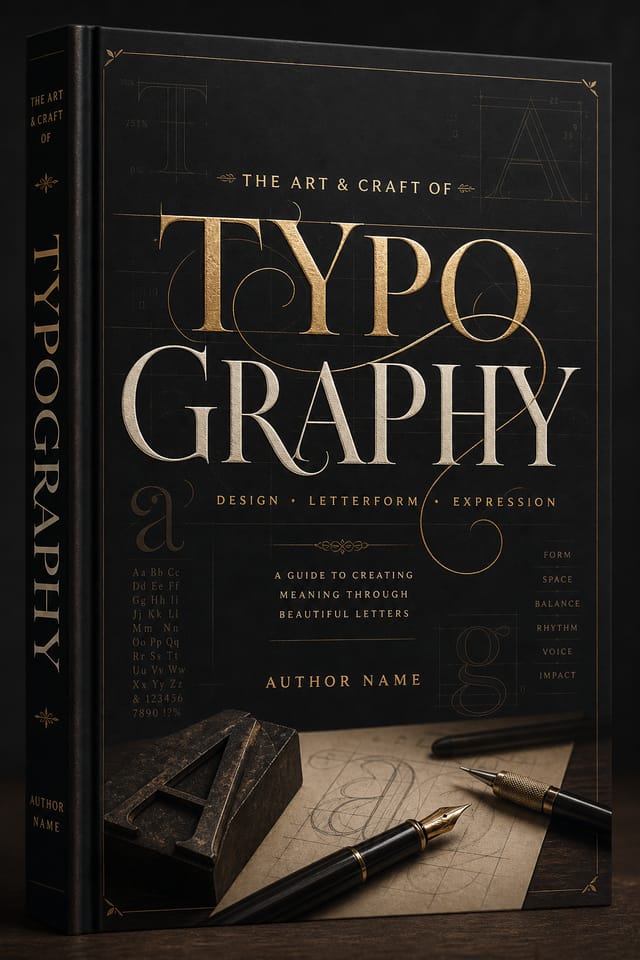
AI Typography Book-Cover Creator: Effortless Design
Create typography book-covers with accurate style interpretation. Pixazo understands typography visual language and applies it to your specific request.
Create Your Typography Book Cover FreeCore of Typography Book-Cover AI: Design Powers
Background Variation
Generate typography book-covers with different background treatments. Solid, gradient, textured, or pattern backgrounds all available for typography style.
Context-Aware Design
Describe your typography book-cover's purpose and audience. The AI adjusts visual weight, complexity, and clarity based on the intended use context.
Color Temperature Control
Specify warm, cool, or neutral color direction for your typography book-cover. The AI builds the full palette around your temperature preference.
Prompt Refinement
Adjust your description to refine any aspect of the typography book-cover design. The AI responds to specific direction about colors, layout, or content.
No Design Software Required
Create professional typography book-covers without Photoshop, Illustrator, or other design applications. The AI handles all technical production.
Typography Matching
Typefaces are selected to match typography aesthetic expectations. The AI pairs fonts that reinforce your typography book-cover's visual identity.
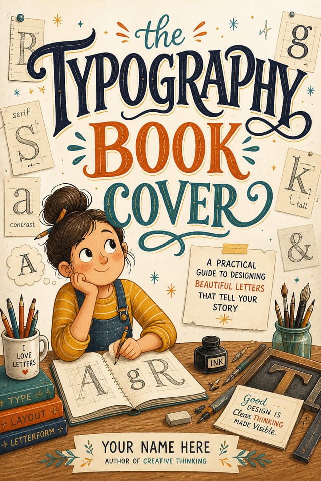
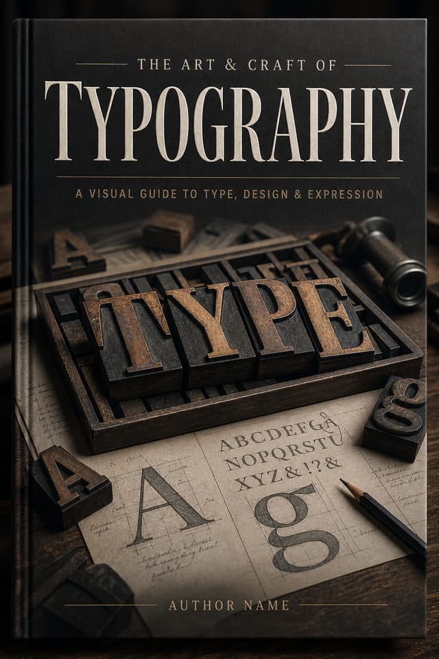
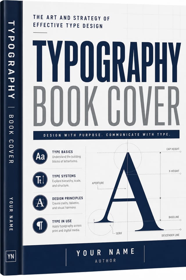
The Typography Book-Cover Gallery: Work in the Wild
Real creators sharing their typography designs made with Pixazo AI.
Full-bleed background typography book-cover, image or texture extends to edges, foreground elements float above, headline anchored to center
Eco-friendly themed typography book-cover, natural green and kraft tones, organic shapes, sustainability messaging, handcrafted aesthetic
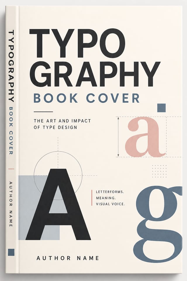
Editorial-inspired typography book-cover, text-dominant layout, typographic variety creates visual interest, clean structured alignmentThe Typography Book-Cover Pipeline: Workflow Breakdown
Refine Polish the design
Apply targeted edits to your selected typography book-cover. Adjust typography, spacing, and color until every element meets your quality standard.
Brief Define requirements
Establish the key message, dimensions, color preferences, and target audience for your typography book-cover before any design work begins.
Review Evaluate and refine
Compare generated typography book-cover options against your brief. Mark what works and note specific changes needed for the next iteration.
Approve Final sign-off
Get stakeholder approval on the finished typography book-cover. Verify all text is accurate and the design meets brand and technical requirements.
Research Gather references
Collect examples of effective typography book-cover designs, note what works, and identify patterns relevant to your project goals.
How People Use Typography Book-Covers: From Hobby to Pro
Religious and Spiritual Organizations
Create typography book-covers for worship services, community outreach, and faith-based events. Respectful designs that reflect the organization's character.
Podcast and Media Branding
Generate typography book-covers for podcast covers, episode artwork, and media channel identity. Consistent visual branding across audio and video platforms.
Restaurant and Food Service
Generate typography book-covers for menus, seasonal promotions, and restaurant branding. Designs that reflect cuisine style and dining atmosphere.
Event Promotion
Create typography event book-covers that establish the right visual mood before the event. Typography design signals quality and sets expectations.
Social Media Content
Design typography book-covers sized for social platforms. Get content that looks intentional and well-crafted, not thrown together.
Typography Book-Cover Design Steps: Three Easy Steps
Put Your Idea in Writing
Write a prompt describing your typography book-cover. Include style preferences, color direction, the most important text to display, and any specific visual elements you want. The more specific your description, the more targeted the output.
Score the First Draft
The AI produces a typography book-cover based on your description. If the first result isn't exactly right, adjust the prompt to address what needs changing. Most designs reach the target within a few iterations.
Optimize the Layout
Refine the typography book-cover by updating your description with precise changes. Add constraints you didn't include initially or remove elements that aren't working. The AI responds to specific direction.
Pull the Final Output
Get your final typography book-cover file in one click. Choose your format, download at full resolution, and use the design immediately. No watermarks, no additional fees, no waiting.
Watch: Creating Typography Book Cover designs step by step
Quantifying Typography Book-Cover Design: By the Numbers
Generate typography book-cover designs at no cost with the f
Generate typography book-cover designs at no cost with the free plan
Maximum output resolution for print-quality typography book-
Maximum output resolution for print-quality typography book-cover designs
Full commercial usage rights for all generated typography bo
Full commercial usage rights for all generated typography book-covers
Visual Directions for Typography Book-Covers: Aesthetic Choices
Minimalist Typography
Stripped-back typography approach. Fewer elements, more negative space, typography carries more visual weight.
Editorial Typography
Text-dominant typography book-cover layout inspired by print publication design. Typographic variety creates visual rhythm.
Atmospheric Typography
Typography book-cover design where mood takes priority. Color and composition work together to create a specific feeling.
Classic Typography
Traditional typography design principles applied to modern book-cover format. Clean composition, conventional hierarchy, time-tested visual decisions.
Geometric Typography
Structured typography composition using grid systems and angular forms. Order and precision define the visual approach.
The Evolution of Typography Book-Cover Design: Design Movements
Retro Revival
Vintage aesthetics from the 1970s and 1990s are influencing typography book-cover design with textured backgrounds, serif fonts, and warm gradients.
Minimalist Layouts
Stripped-back typography book-cover designs with generous white space and limited elements are gaining favor for their clarity and elegance.
Brutalist Design
Raw, intentionally unpolished typography book-cover aesthetics with stark contrasts and unconventional layouts are carving a niche in creative industries.
Dark Mode Aesthetics
Dark backgrounds with high-contrast accents are increasingly common in typography book-cover design, reducing visual fatigue and adding sophistication.
Hand-Drawn Elements
Illustrations, doodles, and hand-lettering bring a personal, approachable quality to typography book-cover designs in an era of polished digital output.
Asymmetric Composition
Breaking grid symmetry in typography book-cover layouts creates visual tension and a modern, editorial feel that stands out.
Tested Typography Book-Cover Prompts Worth Trying
Copy any prompt below and paste it into Pixazo to generate your design instantly.
Large-format typography book-cover design, elements sized for visibility at print scale, no fine detail that would be lost in productionTwo-color typography book-cover design, high contrast between primary and secondary color, clean separation between graphic and text zonesSeries-compatible typography book-cover design, visual language that extends to multiple formats, consistent design system across variantsHigh-impact typography book-cover, immediate visual read at thumbnail size, clear headline dominance, supporting information structured logicallyFull-bleed typography book-cover, background treatment extends to edges, foreground elements positioned for compositional balance, strong central hierarchyAI Typography Book-Cover Design: Known Limitations
Known limitations and trade-offs of AI-generated typography design. AI typography book-cover generation produces strong results within its design domain. These notes describe where human judgment and manual work remain necessary.
Your Typography Book-Cover Questions: A Quick FAQ
Team accounts allow multiple users to share prompts, saved typography book-cover designs, and brand kits within a shared workspace. Team members can iterate on each other's typography book-cover designs and maintain consistent output across projects.
Pixazo generates complete typography book-cover designs from text prompts. Custom image uploads for compositing are on the product roadmap. Currently, the AI creates all visual elements based on your description rather than incorporating external assets.
Pixazo works in any modern mobile browser. The interface adapts to phone and tablet screens so you can generate typography book-covers from anywhere. A dedicated mobile app is in development for an even smoother on-device experience.
Common sizes include 1080x1080 for Instagram feed, 1080x1920 for stories and reels, 1200x628 for Facebook links, 1500x500 for Twitter headers, and 1080x1350 for Pinterest. Specify the platform in your prompt and Pixazo optimizes typography layout for that format.
Brand kits let you save your logo, fonts, and color palette so every typography book-cover you generate stays on brand. Once configured, the AI applies your brand parameters automatically alongside typography style conventions.

