Festival Card : Create Free Festival Cards in Minutes with AI
Create Custom Festival Cards Quickly with Pixazo Best AI Festival Card Maker. Try for Free!
Get Started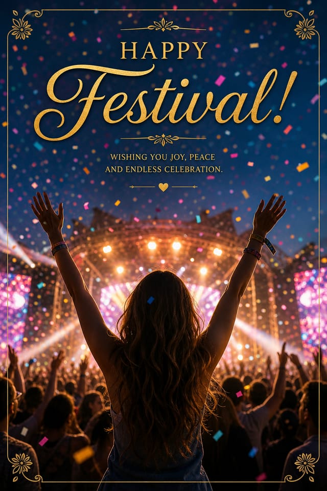
What Powers Festival Card Design: Under the Hood
Print-Ready Output
Generated festival cards are sized and structured for professional printing. Download high-resolution files ready for production.
Subcategory Awareness
The AI distinguishes between design subcategories. A festival card request produces festival-appropriate output, not a generic design with festival text added.
Fast Generation
Complete festival card designs generate in seconds. No rendering queues, no waiting for batch processing.
Color Temperature Control
Specify warm, cool, or neutral color direction for your festival card. The AI builds the full palette around your temperature preference.
Typography Matching
Typefaces are selected to match festival aesthetic expectations. The AI pairs fonts that reinforce your festival card's visual identity.
Color Palette Intelligence
Colors are chosen with festival style awareness. The AI builds palettes that fit festival design conventions rather than selecting arbitrarily.
Making Festival Cards: What Actually Happens
Submit Your Description
Describe what you want your festival card to look like. Include the mood, color palette, typography preference, and content hierarchy. Pixazo reads all of this and uses it to generate an appropriate design.
See the Initial Render
Your festival card generates immediately after submission. Evaluate the design against your requirements and refine the prompt to correct any elements that don't match your intent.
Tighten the Composition
Iterate on your festival card by modifying the aspects that need work. Regenerate with a more targeted prompt until the design matches your vision. Most refinements take one or two iterations.
Pull the Final Output
Download your completed festival card in the format that fits your use case. High-resolution files for print, web-optimized versions for digital, or PDF for production-ready delivery.
Festival Card Specifications
Watch: Creating Festival Card designs step by step
Festival Card Maker: Questions and Answers
Pixazo offers a free tier that lets you generate festival cards with standard resolution output. Paid plans unlock higher resolution, priority generation, and additional export formats. You can try festival card generation without entering payment details.
Designs generated through Pixazo are yours to use as you see fit. You retain full usage rights for commercial and personal applications. The platform does not claim ownership over your generated festival card output.
Common sizes include 1080x1080 for Instagram feed, 1080x1920 for stories and reels, 1200x628 for Facebook links, 1500x500 for Twitter headers, and 1080x1350 for Pinterest. Specify the platform in your prompt and Pixazo optimizes festival layout for that format.
Pixazo provides an API for programmatic festival card generation. Integrate it into your content pipeline to automate design production at scale. API documentation covers authentication, prompt formatting, and output retrieval.
Brand kits let you save your logo, fonts, and color palette so every festival card you generate stays on brand. Once configured, the AI applies your brand parameters automatically alongside festival style conventions.
You control every major design parameter through your prompt: color palette, typography style, layout structure, visual weight distribution, background treatment, and content hierarchy. The more specific your festival card prompt, the more precisely the AI follows your creative direction.
Detailed Festival Card Features: Features Unpacked
Resolution Control
Export festival cards at resolutions from web-optimized to print-quality 4K
Format Flexibility
Download your festival card as PNG, JPG, or PDF depending on your use case
Batch Generation
Create multiple festival card variations from a single prompt efficiently
The Reach of Festival Cards: Everyday and Professional
Gig and Show Promotion
Create festival cards announcing upcoming performances, screenings, and shows. Eye-catching designs that drive ticket sales and attendance.
Fan Community Materials
Create festival cards for fan clubs, viewing groups, and appreciation events. Designs that celebrate fandom and community.
Social Media Event Promotion
Design festival cards sized for Instagram, Twitter, and Facebook event pages. Platform-optimized materials that maximize reach.
Merchandise and Collectibles
Generate festival cards intended for print on merchandise, limited editions, and collectible items. Designs with commercial print production in mind.
Emerging Festival Card Patterns: Where Design Is Going
Motion-Ready Design
Static festival card designs are being created with animation in mind, using layered elements that translate smoothly to motion graphics.
Data-Driven Visuals
Incorporating charts, statistics, and structured data directly into festival card layouts helps communicate complex messages at a glance.
Minimalist Layouts
Stripped-back festival card designs with generous white space and limited elements are gaining favor for their clarity and elegance.
Dark Mode Aesthetics
Dark backgrounds with high-contrast accents are increasingly common in festival card design, reducing visual fatigue and adding sophistication.
Brutalist Design
Raw, intentionally unpolished festival card aesthetics with stark contrasts and unconventional layouts are carving a niche in creative industries.
Festival Card AI Specs: What You Get
Sample Festival Card Prompt Inspiration
Copy any prompt below and paste it into Pixazo to generate your design instantly.
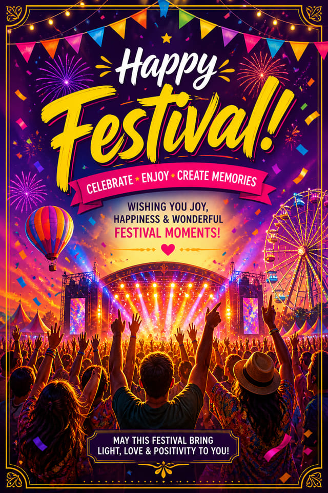
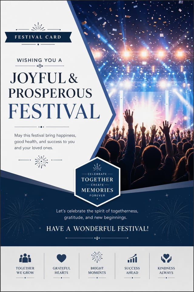
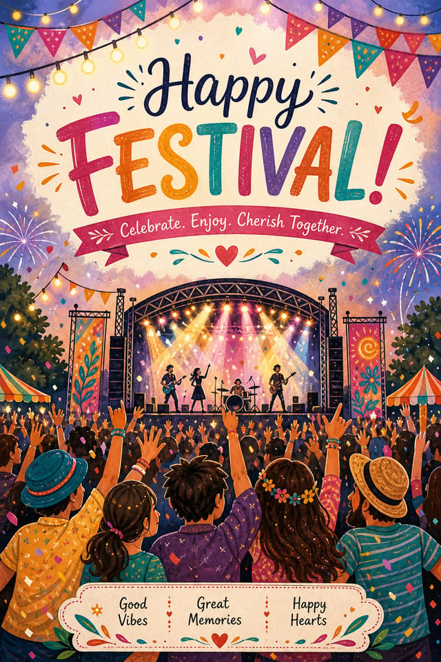
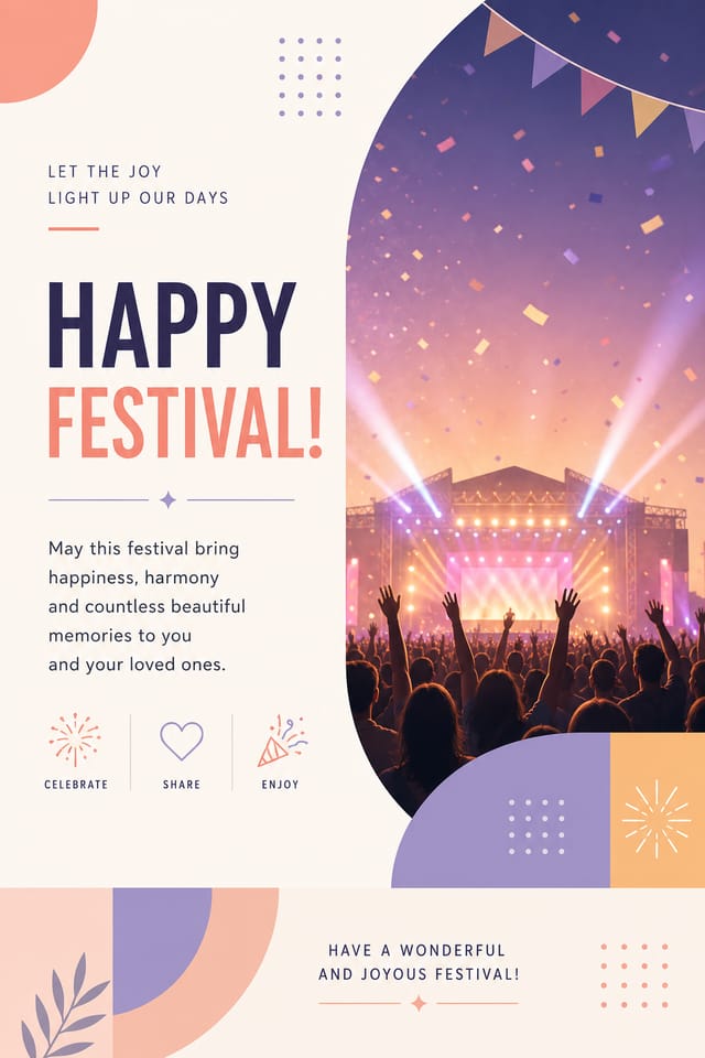
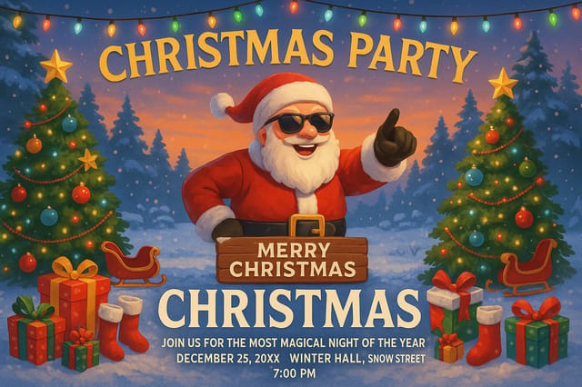
Large-format festival card design, elements sized for visibility at print scale, no fine detail that would be lost in productionSeries-compatible festival card design, visual language that extends to multiple formats, consistent design system across variantsRefined festival card, sophisticated color relationships, intentional whitespace, typefaces appropriate to festival style, balanced compositionHigh-impact festival card, immediate visual read at thumbnail size, clear headline dominance, supporting information structured logicallyPortrait-orientation festival card, vertical composition, headline at natural reading entry point, supporting information flows downward logicallyFestival Card Creators: Designs Worth Seeing
Real creators sharing their festival designs made with Pixazo AI.
Two-color festival card, maximum contrast between primary and secondary color, typography set in one color per level
Full-bleed background festival card, image or texture extends to edges, foreground elements float above, headline anchored to center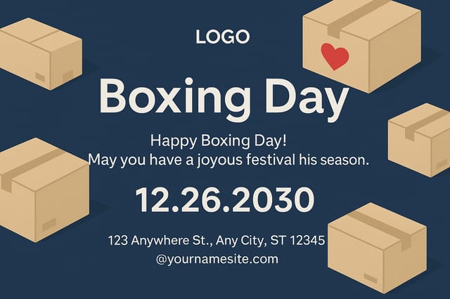
Luxurious festival card with gold foil accents on black, thin serif typography, symmetrical centered layout, premium feelComparing Festival Card Tools: How They Differ
| Tool | Description |
|---|---|
| Piktochart | Infographic and presentation maker for data-driven visuals |
| Pixazo | AI-powered festival card generator with prompt-based design and professional output quality |
| Fotor | Photo editing platform with design templates and batch processing |
| VistaCreate | Visual content platform with templates and a built-in asset library |
| Crello | Template-based design tool with animation and video support |
The Fine Print on Festival Cards: Room to Grow
Known limitations and trade-offs of AI-generated festival design. Transparency matters when using AI for festival card design. The points below describe where you may need to supplement AI output with manual work.

