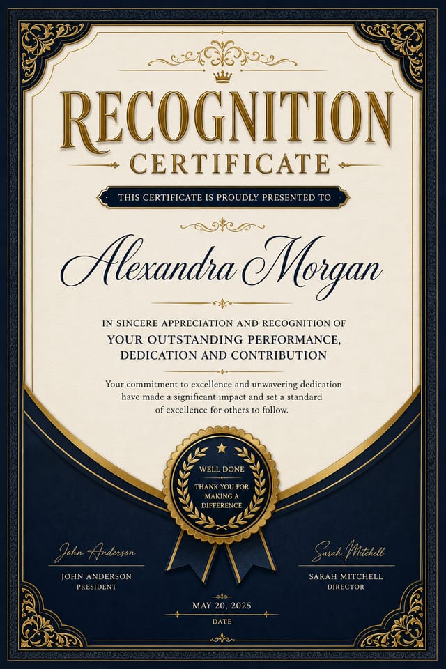
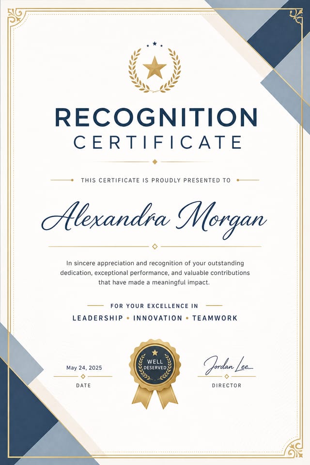
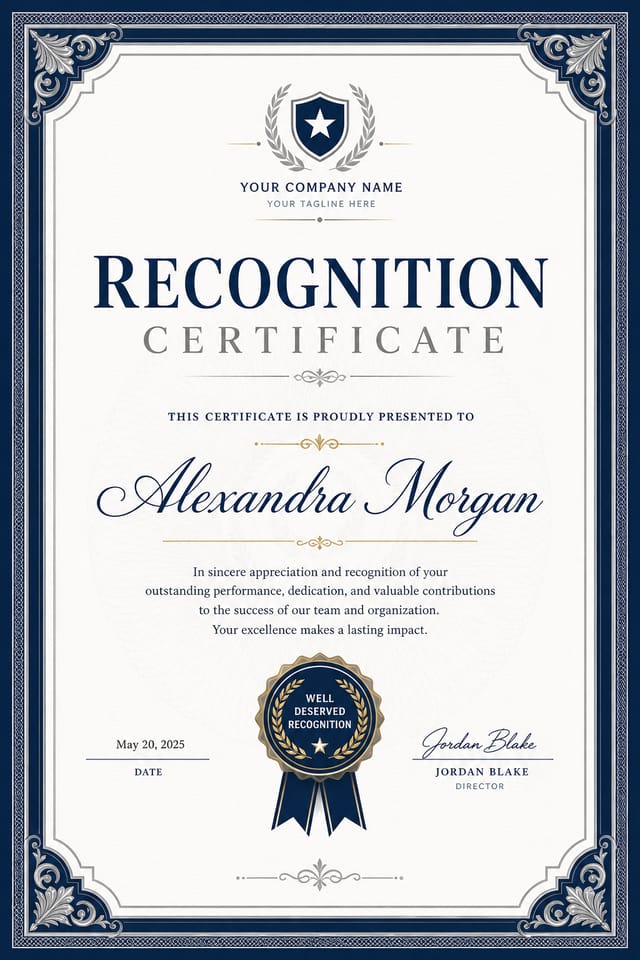
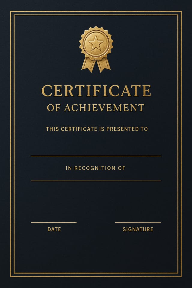
Recognition Certificate : Create Free Recognition Certificates in Minutes with AI
Create Custom Recognition Certificates Quickly with Pixazo Best AI Recognition Certificate Maker. Try for Free!
Get Started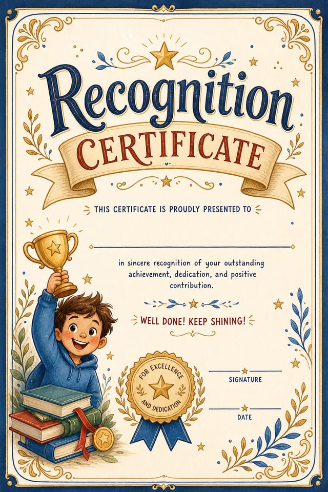

Recognition Certificate Style Movements: Design Movements
Data-Driven Visuals
Incorporating charts, statistics, and structured data directly into recognition certificate layouts helps communicate complex messages at a glance.
Retro Revival
Vintage aesthetics from the 1970s and 1990s are influencing recognition certificate design with textured backgrounds, serif fonts, and warm gradients.
Muted Earth Tones
Natural color palettes with warm neutrals and desaturated greens are replacing the bright neon trends of previous years in recognition certificate work.
Gradient Overlays
Smooth color transitions are being used as primary design elements in recognition certificate work, adding depth without the complexity of photographic backgrounds.
Brutalist Design
Raw, intentionally unpolished recognition certificate aesthetics with stark contrasts and unconventional layouts are carving a niche in creative industries.
Organic Shapes
Flowing, irregular forms are replacing sharp geometric shapes in recognition certificate backgrounds and decorative elements for a softer visual feel.
Get Your Recognition Certificate: The Creation Flow
Draft the Concept
Describe what you want your recognition certificate to look like. Include the mood, color palette, typography preference, and content hierarchy. Pixazo reads all of this and uses it to generate an appropriate design.
Review the Output
The AI produces a recognition certificate based on your description. If the first result isn't exactly right, adjust the prompt to address what needs changing. Most designs reach the target within a few iterations.
Download the Result
Download your completed recognition certificate in the format that fits your use case. High-resolution files for print, web-optimized versions for digital, or PDF for production-ready delivery.
Watch: Creating Recognition Certificate designs step by step
The Recognition Certificate Framework: Why It Matters
The Recognition Design Approach: How Pixazo Handles It
Recognition certificate design has its own visual conventions that differ significantly from other styles.
The AI recognizes these patterns and applies them when generating your design, rather than defaulting to a generic layout.
When you describe a recognition certificate, Pixazo selects typography, color relationships, and compositional approaches appropriate to recognition aesthetics.
The result is a design that looks like it belongs in its context, not a repurposed template with the wrong visual DNA.
The Recognition Certificate Feature Set: A Closer Look
Fast Generation
Complete recognition certificate designs generate in seconds. No rendering queues, no waiting for batch processing.
Prompt Refinement
Adjust your description to refine any aspect of the recognition certificate design. The AI responds to specific direction about colors, layout, or content.
Color Palette Intelligence
Colors are chosen with recognition style awareness. The AI builds palettes that fit recognition design conventions rather than selecting arbitrarily.
Commercial Use Rights
Designs generated with Pixazo are yours to use commercially. No additional licensing required for recognition certificate projects.
Instant Iterations
Generate multiple recognition certificate variations from a single prompt. Compare options and refine until the design matches your vision.
Text Placement Options
Describe where you want text elements positioned in your recognition certificate. The AI follows compositional direction about headline placement and body copy layout.
Recognition Certificate Design For: Everyday and Professional
Personal Creative Work
Generate recognition certificates for personal projects, home display, and creative experiments without spending production time on design execution.
Freelance Design Work
Use Pixazo to generate recognition certificate concepts for client review. Present multiple directions quickly before committing to detailed execution.
Professional Projects
Create recognition certificates for client work, commercial campaigns, and professional applications where quality and style accuracy matter.
Community Organizations
Create recognition announcement certificates for community groups, non-profits, and local organizations without requiring design expertise.
Recognition Style Options: Compared
Textured Recognition
Recognition design with added surface depth. Background treatments add visual interest without disrupting legibility.
Contemporary Recognition
Current recognition design sensibility with updated proportions, modern typefaces, and contemporary color relationships.
High-Contrast Recognition
Bold recognition visual treatment with strong tonal contrast. Elements read clearly at any viewing distance.
Minimalist Recognition
Stripped-back recognition approach. Fewer elements, more negative space, typography carries more visual weight.
Your Recognition Certificate Process: How It All Connects
Review
Compare generated recognition certificate options against your brief. Mark what works and note specific changes needed for the next iteration.
Approve
Get stakeholder approval on the finished recognition certificate. Verify all text is accurate and the design meets brand and technical requirements.
Research
Collect examples of effective recognition certificate designs, note what works, and identify patterns relevant to your project goals.
Generate
Use AI to produce multiple recognition certificate variations based on your brief. Start broad and narrow down from the strongest options.
Effective Recognition Certificate Strategies: Dos and Don'ts
Keep the message focused
A strong recognition certificate communicates one primary idea clearly. Supporting details should reinforce, not compete with, the main message.
Use grids and alignment
Structured layouts in your recognition certificate create a sense of order and professionalism that unstructured designs cannot match.
Optimize for the display medium
Tailor your recognition certificate resolution, color space, and text size to the specific platform or physical context where it will appear.
Rely solely on AI output
AI-generated recognition certificate designs are a starting point. Human review catches issues with context, tone, and accuracy that AI can miss.
Use too many fonts
More than two or three typefaces in a single recognition certificate creates visual noise and makes the design feel disjointed.
Overcrowd the layout
Filling every pixel of your recognition certificate with content makes it harder to read and reduces the impact of every individual element.
Skip proofreading
Typos and grammatical errors on a recognition certificate undermine credibility instantly. Always have someone else review the final text.
Recognition Certificate Creators: Spotlights and Showcases
Real creators sharing their recognition designs made with Pixazo AI.
Refined recognition aesthetic certificate, sophisticated color relationships, intentional negative space, type selection matching recognition conventions
Vibrant recognition certificate targeting Gen Z audience, neon accent colors, asymmetric layout, bold experimental typography, maximum visual energy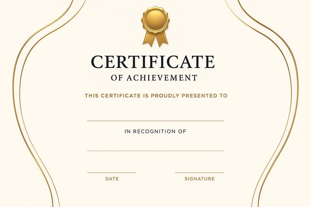
Recognition certificate for outdoor billboard at 14x48 feet, extreme readability at distance, three-word headline max, high contrast backgroundGood Recognition Certificate Prompt Collection
Copy any prompt below and paste it into Pixazo to generate your design instantly.
Recognition style certificate, bold headline placement, supporting text at appropriate scale, color palette consistent with recognition design conventionsAtmospheric recognition certificate, background treatment supports the headline without competing with it, visual weight distributed intentionallyLarge-format recognition certificate design, elements sized for visibility at print scale, no fine detail that would be lost in productionClean recognition certificate design, geometric structure, disciplined typography, color accent used selectively for emphasis, printer-optimized resolutionRecognition aesthetic certificate, palette drawn from recognition design tradition, layout proportions consistent with recognition conventions, purposeful use of each elementTextured recognition certificate, surface treatment adds depth without obscuring legibility, texture consistent with recognition aestheticRecognition Certificate Essentials: What People Ask
Brand kits let you save your logo, fonts, and color palette so every recognition certificate you generate stays on brand. Once configured, the AI applies your brand parameters automatically alongside recognition style conventions.
Specify the dimensions in your prompt. Common formats like A3, 18x24 inches, or 1080x1920 pixels for social media stories all work. The AI generates a recognition certificate composition appropriate for the specified aspect ratio and use case.
Include the target language in your prompt when generating recognition certificates with non-English text. The AI selects typographic approaches appropriate for the language and applies recognition design conventions to the overall layout regardless of language.
Pixazo provides an API for programmatic recognition certificate generation. Integrate it into your content pipeline to automate design production at scale. API documentation covers authentication, prompt formatting, and output retrieval.
Working with Recognition Certificate AI: Realistic Expectations
Known limitations and trade-offs of AI-generated recognition design. Being specific about what AI certificate generation can and cannot do helps you plan your workflow and set accurate expectations.

