Business letterhead
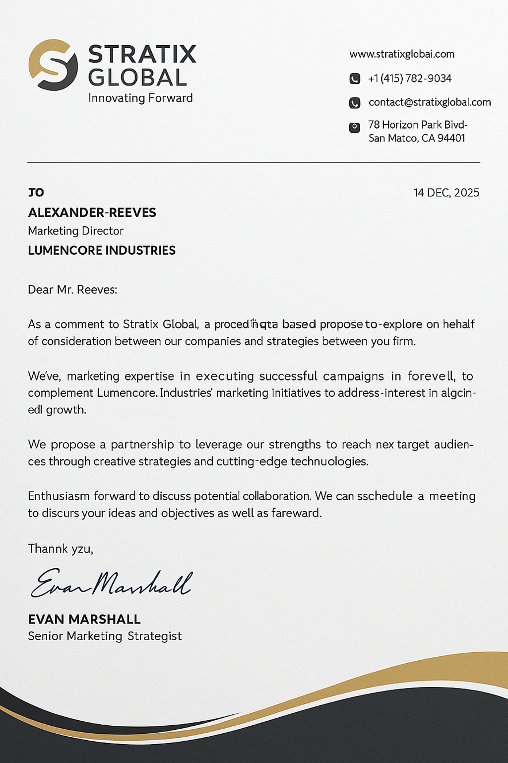
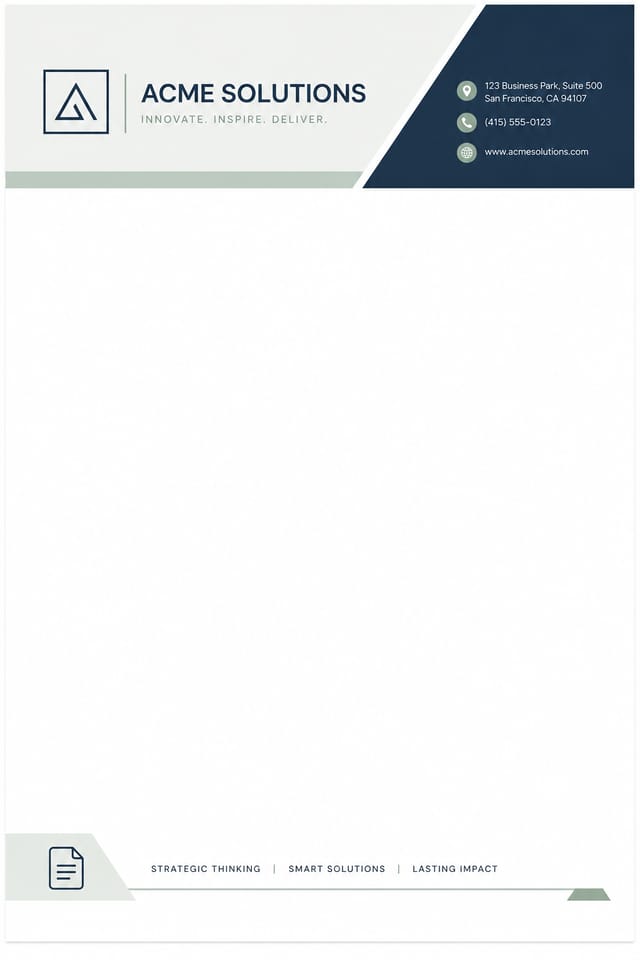
Day-to-day corporate stationery — quotes, contracts, statements of work. Conservative typography, full address block, room for ISO/SEC compliance lines in the footer.
The Pixazo AI Letterhead Maker generates a free, print-ready letterhead design from a one-sentence brief in under two minutes. Built for law firms, healthcare practices, foundations, and creative studios that need a custom letterhead template the print shop can run without revisions — A4 or US Letter, 300 DPI CMYK PDF with 3 mm bleed and a 5 mm safe area handled by default. Unlike a stock letterhead generator that picks from preset templates, every layout is composed by AI from your prompt, logo, and tone — part of Pixazo's AI Image Generator suite.
300 DPI CMYK PDF with 3 mm bleed and a 5 mm safe area handled automatically. Hand the file to any print shop — no rework, no fixes.
Every design is composed from your prompt, logo, and tone. Three layout drafts to pick from, then edit any text field, color, or font inline.
Pre-tuned variants for law firms, healthcare practices, foundations, and creative studios — signature blocks, registration numbers, and tone defaults all match the use case.
Describe the brand, pick a layout, drop your logo, export. No design background needed. Free to preview every result — pay only when you download.
Styles
Eight letterhead types Pixazo's AI is tuned for. Pick the closest match, then refine — every field, color, and font stays editable.
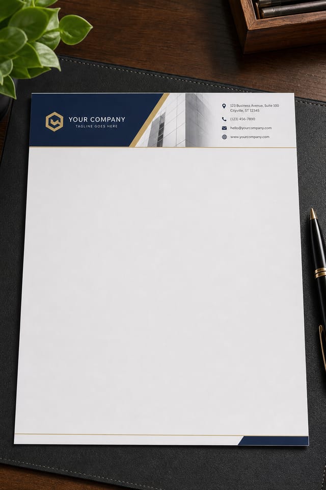
Day-to-day corporate stationery — quotes, contracts, statements of work. Conservative typography, full address block, room for ISO/SEC compliance lines in the footer.
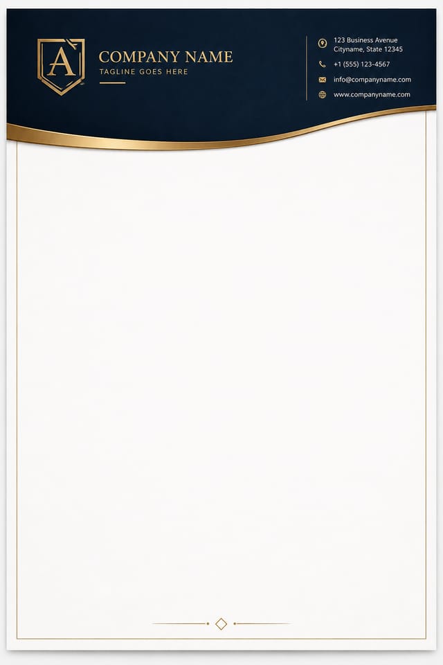
Court-correspondence ready. Serif typography, partner-name signature block, and a masthead generous enough to hold office addresses for multiple jurisdictions.
Referral letters and prescription pads. Soft palettes (cream, sage, slate) and optional NPI / GMC / practice-registration number fields in the footer.
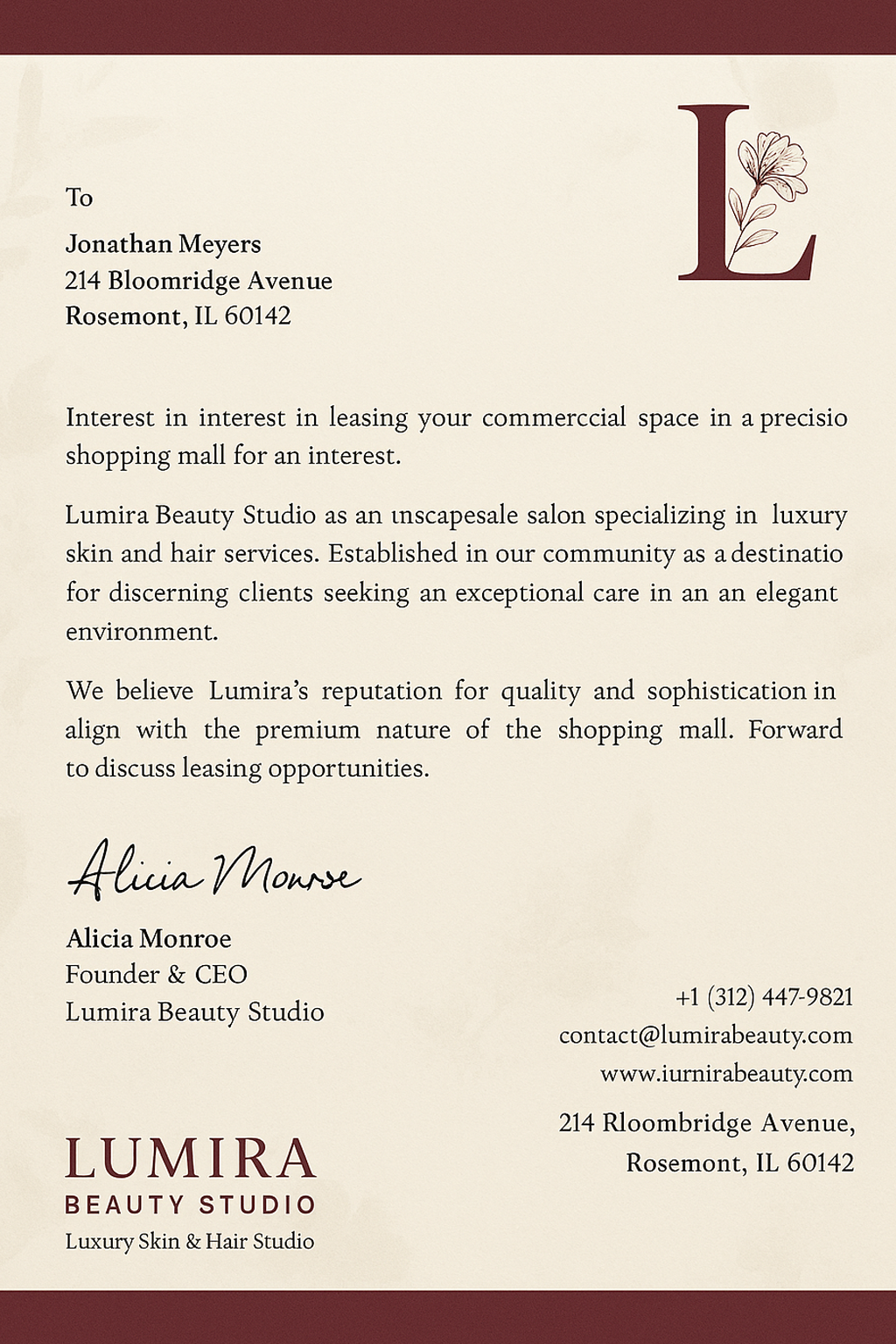
Donor letters, grant acknowledgements, board correspondence. Registered-charity-number footer, patron/trustee sidebar list, warm typography.
For freelancers, consultants, and personal stationery. Lighter weight, monogram or initial mark in the masthead, signature flourish at the foot.
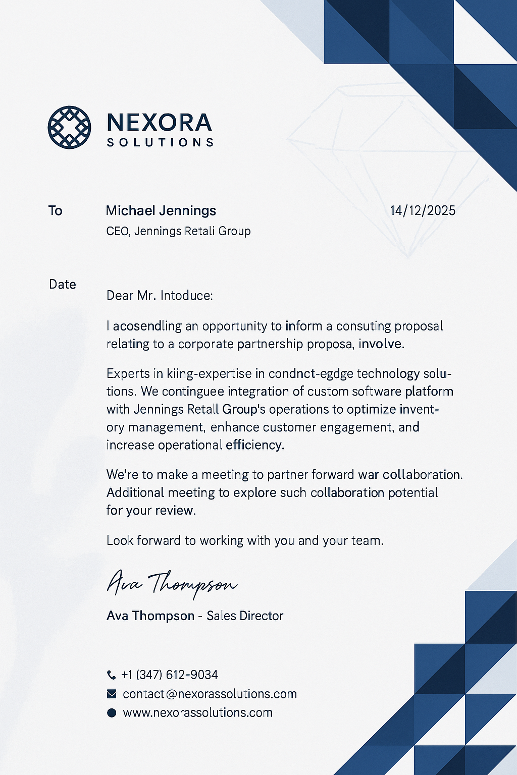
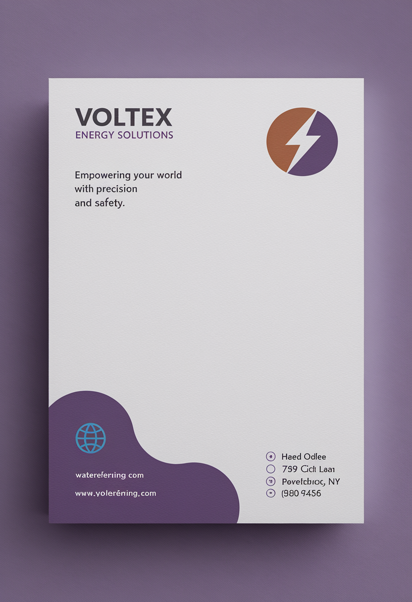
Asymmetric mastheads, sans-serif type, single accent color. Built for tech consultancies and digital-first agencies that want stationery that doesn't feel inherited.
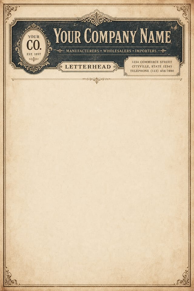
Engraving-style flourishes, laid-paper texture, centred mastheads. Used for foundations, anniversaries, and any letter where the paper itself is part of the message.
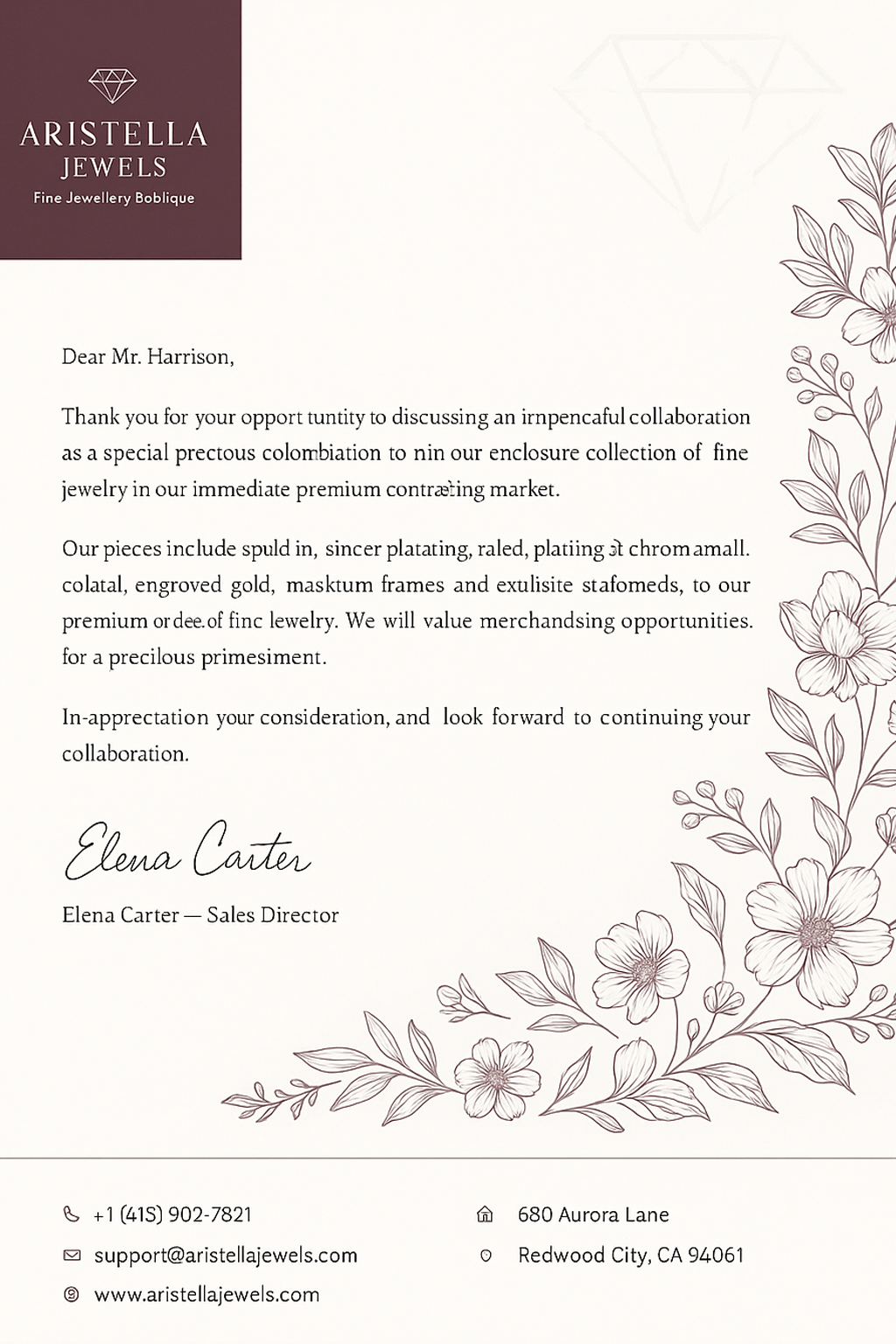
Color-blocked headers, integrated brand patterns, the rules broken on purpose. For studios pitching work where the letterhead is the first portfolio piece.
Paper stocks
Preview your design on the four weights Pixazo users pick most often, with what each is typically used for.
80 gsm · uncoated
Standard internal-memo stock. Folds neatly into a #10 envelope, doesn't add weight to bulk mailings.
For: internal memos, courtesy notes, second-page continuation sheets.
100 gsm · uncoated
The default for most business stationery. Substantial enough to feel deliberate, light enough to send economy mail.
For: client letters, quotes, invoices, statements of work.
120 gsm · uncoated or laid
The stationery of court correspondence and partner-level letters. Substantial in hand; takes signatures cleanly.
For: law firm letterhead, board correspondence, contractual notices.
160 – 200 gsm · cotton or laid
Approaches card stock. Used when the letter itself is the artifact — anniversaries, awards, official notices.
For: personal stationery, foundation letterhead, executive announcements.
How it works
Four steps, two minutes start to finish. No design background needed.
Tell Pixazo what business or person the letterhead is for, the tone you want it to strike, and any colors or motifs to lean into. Two or three sentences is plenty.
The AI proposes three layout drafts — masthead-heavy, sidebar branded, or minimal corner. Pick the one closest to what you had in mind.
Upload your logo (PNG, SVG, or JPG up to 5 MB) and edit address, phone, email, and signature block inline. Pixazo respects your bleed and safe-area limits automatically.
Download as 300 DPI PDF for print or PNG for digital use. CMYK proof and spot-color (Pantone) export are available on the Pro plan.
Use cases
Four industries that order Pixazo letterhead designs most often, with the variant defaults tuned for each.
[ 01 / LEGAL ]
Court correspondence still requires letterhead. Pixazo's law-firm variant defaults to conservative serif typography, partner-name signature blocks, and a generous masthead that holds office addresses for multiple jurisdictions.
Tone reads as: established, restrained, deliberate.
[ 02 / HEALTH ]
Referral letters, prescription pads, patient correspondence. The healthcare variant uses softer color palettes (cream, sage, slate) and includes optional NPI / GMC / practice registration number fields in the footer.
Tone reads as: clean, calming, reassuringly professional.
[ 03 / NGO ]
Donor letters, grant acknowledgements, board correspondence. The NGO variant includes optional registered-charity-number footer and accommodates patron/trustee name lists in the sidebar without crowding the header.
Tone reads as: warm, transparent, mission-led.
[ 04 / CREATIVE ]
Pitch decks, statements of work, client briefs. The creative variant lets Pixazo break the rules a little — asymmetric mastheads, color-blocked headers, and integrated brand patterns.
Tone reads as: confident, current, deliberately unconservative.
Limits
If your project depends on any of these, you'll want a print-design specialist or a different tool.
The maker outputs a flat printable file. Foil-stamping, blind embossing, and letterpress require die-cutting and a specialist print-shop — they're not previewable inside the AI editor.
This is a letterhead generator, not a stationery-suite builder. Business cards, envelopes, and follow-on sheets share the brand but are generated as separate documents.
Pixazo won't flag whether your logo or wording infringes on an existing mark. That's your legal team's call. The AI generates art; it doesn't run trademark searches.
Pixazo exports a print-ready PDF. Sending it to the printer, paying for the run, and proofing the press sheet is still on you. We don't bundle printing.
Trusted by creators
"Three drafts in under five minutes, and the third one was the one we used. Our previous designer took two days for the same brief — and charged a retainer for it. Pixazo gave us bleed, CMYK, and a print-ready PDF without me having to ask."
"We needed a letterhead for our medical referral pads that included our NPI and practice-registration numbers in the footer. Pixazo's healthcare variant had all of that as editable fields out of the box. The print shop opened the PDF and ran the job same-day."
"As a small foundation we used to design letterhead in Word, which always looked it. Pixazo's NGO variant gave us a proper trustee sidebar and registered-charity-number footer — and it costs less per year than a single Canva Pro seat. Our donor letters finally look like the foundation we are."
FAQ
The five questions new users ask most often.
Free to preview every design. No card required. Pay only when you download an export.
Open the maker →
Industry-specific letterhead templates pre-tuned for your sector.