AI Magazine Cover Maker : Create Free Magazine Covers in Minutes
Create Custom Magazine Covers Quickly with Pixazo Best AI Magazine Cover Maker. Try for Free!
Get Started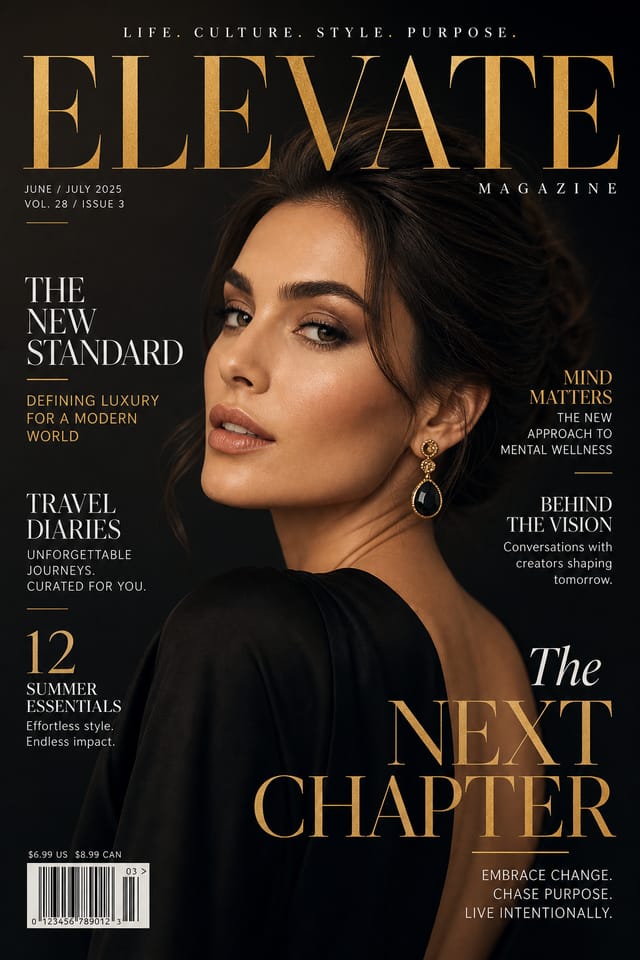

AI Magazine-Cover Workshop: Start Creating Now
Create magazine-covers with accurate style interpretation. Pixazo understands magazine-cover visual language and applies it to your specific request.
Built for designers, marketers, small business owners, and creators who need professional magazine cover designs without design software.
Create Your Magazine Cover FreeMagazine-Cover At a Glance: Performance Metrics
Design Intelligence for Magazine-Covers: The Design System
Understanding Magazine-Cover Design Conventions
The strongest magazine-cover designs succeed because every element reinforces the style rather than contradicting it.
Typography that fits magazine-cover conventions, colors that carry magazine-cover associations, layouts that breathe in ways consistent with magazine-cover design sensibility.
Pixazo's AI understands these relationships.
Describe your magazine-cover and the system generates designs where all the elements agree.
Magazine-Cover Applications: Contexts and Scenarios
Instagram Feed and Story Content
Create magazine-covers optimized for Instagram's feed (1080x1080) and story (1080x1920) formats. Designs that stop the scroll and drive engagement.
Pinterest Pins and Idea Pins
Create magazine-covers in tall vertical formats optimized for Pinterest discovery. Designs that perform well in search and recommendation.
Email Newsletter Headers
Design magazine-covers for email campaign headers and hero images. Lightweight files that render reliably across email clients.
TikTok and Reels Cover Frames
Generate magazine-covers for short-form video cover images. Vertical designs that represent video content and attract clicks.
The Magazine-Cover Feature Set: Tools That Matter
Text Placement Options
Describe where you want text elements positioned in your magazine-cover. The AI follows compositional direction about headline placement and body copy layout.
Layered Style Application
Combine magazine-cover style with other design parameters in a single prompt. The AI interprets complex requests and applies multiple style constraints simultaneously.
Style-Accurate Generation
The AI interprets magazine-cover design conventions and applies them to your magazine-cover, producing output that looks correctly styled rather than generically templated.
Negative Space Handling
The AI manages whitespace in magazine-cover designs according to magazine-cover aesthetic conventions, not generic poster defaults.
Subcategory Awareness
The AI distinguishes between design subcategories. A magazine-cover request produces magazine-cover-appropriate output, not a generic design with magazine-cover text added.
Your Magazine-Cover Process: The Full Process
Refine
Apply targeted edits to your selected magazine-cover. Adjust typography, spacing, and color until every element meets your quality standard.
Approve
Get stakeholder approval on the finished magazine-cover. Verify all text is accurate and the design meets brand and technical requirements.
Generate
Use AI to produce multiple magazine-cover variations based on your brief. Start broad and narrow down from the strongest options.
Export
Export your magazine-cover in the required formats and resolutions. Organize deliverables for handoff to the production or publishing team.
Magazine-Cover Quality Numbers: Numbers to Know
Output formats available for every magazine-cover generation
Output formats available for every magazine-cover generation
Maximum output resolution for print-quality magazine-cover d
Maximum output resolution for print-quality magazine-cover designs
From initial prompt to finished magazine-cover in a simple w
From initial prompt to finished magazine-cover in a simple workflow
Evaluating Magazine-Cover Makers: Side by Side
| Tool | Description |
|---|---|
| Adobe Express | Streamlined creative tool backed by Adobe's design ecosystem |
| Fotor | Photo editing platform with design templates and batch processing |
| Pixazo | AI-powered magazine-cover generator with prompt-based design and professional output quality |
| Piktochart | Infographic and presentation maker for data-driven visuals |
| Crello | Template-based design tool with animation and video support |
Getting More from Magazine-Cover AI: What Professionals Know
Check Alignment Carefully
Misaligned elements are one of the most common signs of amateur magazine-cover design. Use grid lines and snap-to features to keep things precise.
Start with a Clear Brief
Before generating any magazine-cover, write down the core message, target audience, and intended use. A focused brief produces better results than iterating from a vague idea.
Limit Your Color Palette
Stick to 2-3 primary colors in your magazine-cover design. Too many colors compete for attention and weaken the visual hierarchy.
Leave White Space
Resist the urge to fill every area of your magazine-cover. Breathing room around key elements makes the overall design more effective.
The Path to Your Magazine-Cover: The Workflow Explained
Explain the Design Goal
Start with a text description of your magazine-cover concept. Specify the visual style, colors, layout direction, and key text. Detailed prompts produce more accurate magazine-cover designs than general ones.
Watch It Come Together
The AI produces a magazine-cover based on your description. If the first result isn't exactly right, adjust the prompt to address what needs changing. Most designs reach the target within a few iterations.
Save and Share
Download your completed magazine-cover in the format that fits your use case. High-resolution files for print, web-optimized versions for digital, or PDF for production-ready delivery.
Watch: Creating Magazine Cover Magazine Cover designs step by step
The Fundamentals of Magazine-Cover: From Weak to Strong
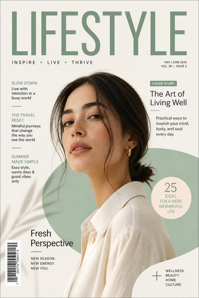
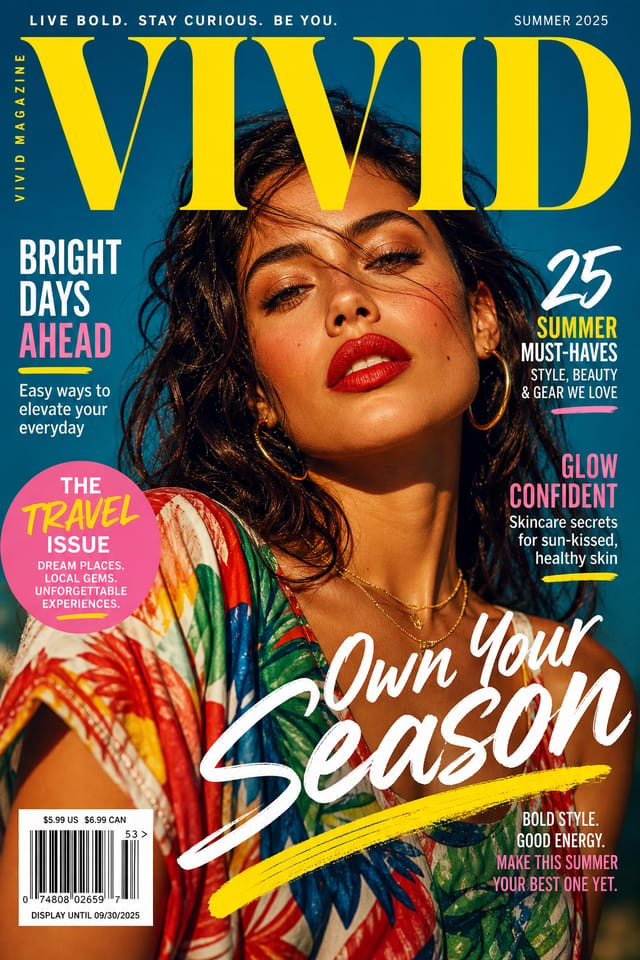
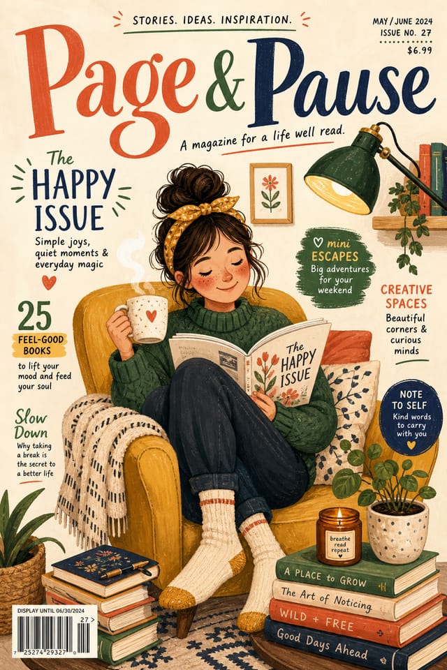
Magazine-Cover Makers: Gallery Highlights
Real creators sharing their magazine cover designs made with Pixazo AI.

Where Magazine-Cover AI: Capabilities and Caveats
Known limitations and trade-offs of AI-generated magazine cover design. Every AI design tool has boundaries. Knowing these limits before you start helps you get the most out of magazine-cover generation.
New to Magazine-Covers? Key Things to Know
Include the target language in your prompt when generating magazine-covers with non-English text. The AI selects typographic approaches appropriate for the language and applies magazine-cover design conventions to the overall layout regardless of language.
Longer, more detailed prompts generally produce more accurate results for magazine-cover design. Include all the relevant information: style direction, color preferences, content to display, intended use, and any specific design elements you want. There is no strict character limit.
Describe your core design parameters in each prompt and vary only the specific elements that should change across the series. Maintaining consistent color palette, typographic approach, and compositional structure across magazine-cover variations creates a coherent series.
Pixazo generates complete magazine-cover designs from text prompts. Custom image uploads for compositing are on the product roadmap. Currently, the AI creates all visual elements based on your description rather than incorporating external assets.
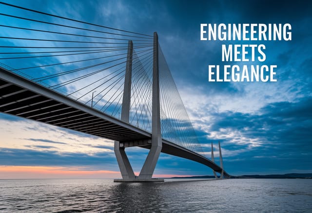
Magazine-Cover Starter Prompt Examples
Copy any prompt below and paste it into Pixazo to generate your design instantly.
Magazine-Cover with strong visual hierarchy, largest element reads clearly, supporting elements organized by importance, clean background treatmentHigh-impact magazine-cover, immediate visual read at thumbnail size, clear headline dominance, supporting information structured logicallyLarge-format magazine-cover design, elements sized for visibility at print scale, no fine detail that would be lost in productionSeries-compatible magazine-cover design, visual language that extends to multiple formats, consistent design system across variantsMagazine-Cover style magazine-cover, bold headline placement, supporting text at appropriate scale, color palette consistent with magazine-cover design conventionsPortrait-orientation magazine-cover, vertical composition, headline at natural reading entry point, supporting information flows downward logically
