Movie Poster : Create Free Movie Posters in Minutes with AI
Create Custom Movie Posters Quickly with Pixazo Best AI Movie Poster Maker. Try for Free!
Get Started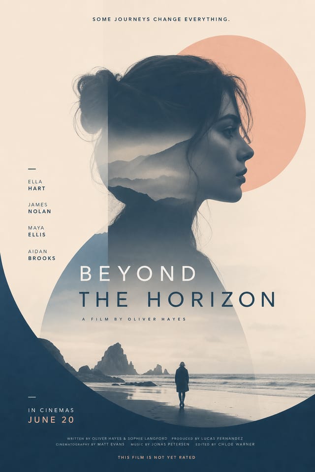
What Makes Movie Poster Design Work: Key Design Conventions
The Movie Design Approach: How Pixazo Handles It
The gap between a professional movie poster and a mediocre one usually comes down to design decisions made early in the process: palette selection, type hierarchy, and compositional structure.
These choices determine whether the final output reads as movie or just looks generic.
Pixazo's AI makes these foundational decisions based on your prompt.
Specify a movie poster and the system selects design parameters that match movie visual expectations, giving you a solid starting point rather than a blank-slate template.
The Art of Movie Poster Design: The Essentials
Compositional Balance
Visual weight in movie poster design should be intentional. Asymmetric balance often creates more interest than centered symmetry, but both can work when executed with purpose.
Texture and Depth
Subtle texture in movie poster design adds visual interest without competing with content. Surface treatments create depth and suggest quality when used sparingly.
Information Density Control
Match the information density of your movie poster to the viewing context. A display viewed from 10 feet needs fewer words and larger elements than one held in hand.
The Evolution of Movie Poster Design: Trend Report
Brutalist Design
Raw, intentionally unpolished movie poster aesthetics with stark contrasts and unconventional layouts are carving a niche in creative industries.
Data-Driven Visuals
Incorporating charts, statistics, and structured data directly into movie poster layouts helps communicate complex messages at a glance.
Motion-Ready Design
Static movie poster designs are being created with animation in mind, using layered elements that translate smoothly to motion graphics.
Hand-Drawn Elements
Illustrations, doodles, and hand-lettering bring a personal, approachable quality to movie poster designs in an era of polished digital output.
Dark Mode Aesthetics
Dark backgrounds with high-contrast accents are increasingly common in movie poster design, reducing visual fatigue and adding sophistication.
Retro Revival
Vintage aesthetics from the 1970s and 1990s are influencing movie poster design with textured backgrounds, serif fonts, and warm gradients.
Movie Poster Applications: Where They Fit
Social Media Event Promotion
Design movie posters sized for Instagram, Twitter, and Facebook event pages. Platform-optimized materials that maximize reach.
Release Day Announcements
Design movie posters for album drops, film releases, and premiere events. Launch-day materials that build buzz across channels.
Gig and Show Promotion
Create movie posters announcing upcoming performances, screenings, and shows. Eye-catching designs that drive ticket sales and attendance.
Venue and Festival Signage
Generate movie posters for venue lobbies, festival grounds, and event spaces. Large-format prints that create atmosphere.
Fan Community Materials
Create movie posters for fan clubs, viewing groups, and appreciation events. Designs that celebrate fandom and community.
Before You Start: Questions and Answers
Brand kits let you save your logo, fonts, and color palette so every movie poster you generate stays on brand. Once configured, the AI applies your brand parameters automatically alongside movie style conventions.
You can generate as many variations as your account tier allows. Refine your prompt with each iteration to move toward your target design. Most users find the right direction within three to five generations.
Pixazo generates original designs rather than copying existing work. The AI creates movie posters from learned design principles, not by stitching together fragments of existing designs. Generated output does not reproduce copyrighted material or identifiable artistic styles of living creators.
Designs generated through Pixazo are yours to use as you see fit. You retain full usage rights for commercial and personal applications. The platform does not claim ownership over your generated movie poster output.
Movie Poster Maker Capabilities: Key Capabilities
Consistency Across Variants
Generate multiple movie posters for a project and maintain visual consistency across the set. Specify your core design parameters and vary secondary elements.
Resolution Control
Specify output dimensions for your movie poster. Get files sized for web display, social media, or large-format printing.
Color Temperature Control
Specify warm, cool, or neutral color direction for your movie poster. The AI builds the full palette around your temperature preference.
No Design Software Required
Create professional movie posters without Photoshop, Illustrator, or other design applications. The AI handles all technical production.
Making Movie Posters: The Workflow Explained
Establish the Parameters
Write a prompt describing your movie poster. Include style preferences, color direction, the most important text to display, and any specific visual elements you want. The more specific your description, the more targeted the output.
Watch: Creating Movie Poster designs step by step
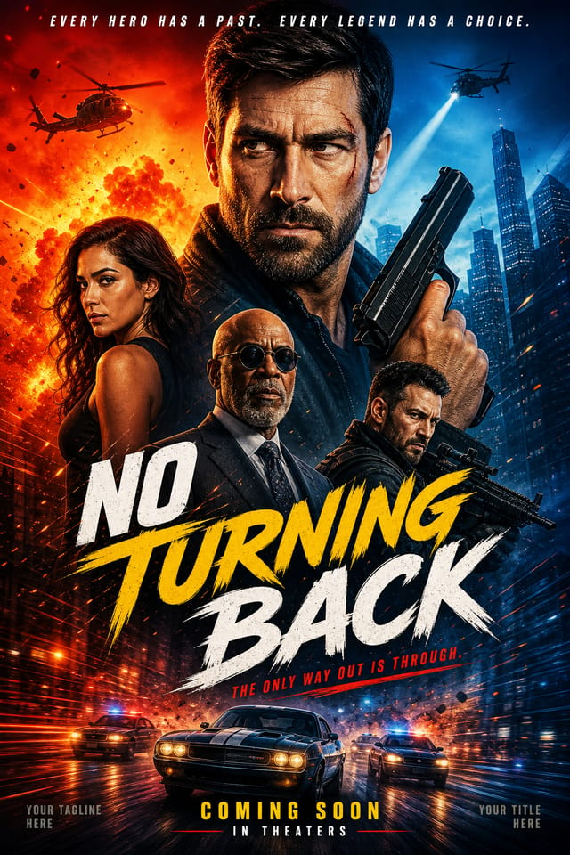
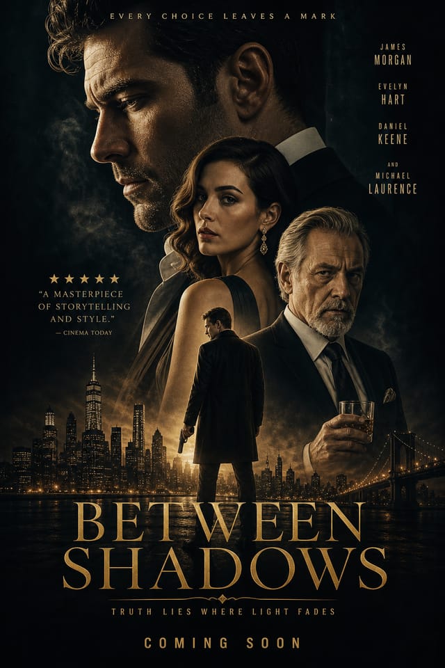
Real Movie Posters: Work in the Wild
Real creators sharing their movie designs made with Pixazo AI.


Movie Poster Design Rules: Rules Worth Following
Keep the message focused
A strong movie poster communicates one primary idea clearly. Supporting details should reinforce, not compete with, the main message.
Use grids and alignment
Structured layouts in your movie poster create a sense of order and professionalism that unstructured designs cannot match.
Test with real content
Never finalize a movie poster with placeholder text. Real copy often has different lengths and line breaks that affect the design.
Use a consistent visual hierarchy
Structure your movie poster so the viewer's eye follows a clear path from headline to supporting details to call-to-action.
Ignore accessibility
Low-contrast text and tiny font sizes in your movie poster exclude a significant portion of your potential audience.
Forget the call to action
A movie poster without a clear next step for the viewer is a missed opportunity. Always include direction on what to do next.
Skip proofreading
Typos and grammatical errors on a movie poster undermine credibility instantly. Always have someone else review the final text.
Tested Movie Poster Prompt Inspiration
Copy any prompt below and paste it into Pixazo to generate your design instantly.
Contemporary movie poster design, grid-based layout, typographic precision, restrained color palette, no decorative excessMovie poster for digital display, optimized proportions for screen viewing, colors calibrated for RGB output, legible at typical viewing distanceTextured movie poster, surface treatment adds depth without obscuring legibility, texture consistent with movie aestheticEditorial-style movie poster, text-dominant design, typographic treatment carries visual weight, layout proportions inspired by print publication designClean movie poster design, geometric structure, disciplined typography, color accent used selectively for emphasis, printer-optimized resolutionMovie Poster AI Boundaries: Areas for Improvement
Known limitations and trade-offs of AI-generated movie design. Being specific about what AI poster generation can and cannot do helps you plan your workflow and set accurate expectations.

