Award Certificate : Create Free Award Certificates in Minutes with AI
Create Custom Award Certificates Quickly with Pixazo Best AI Award Certificate Maker. Try for Free!
Get Started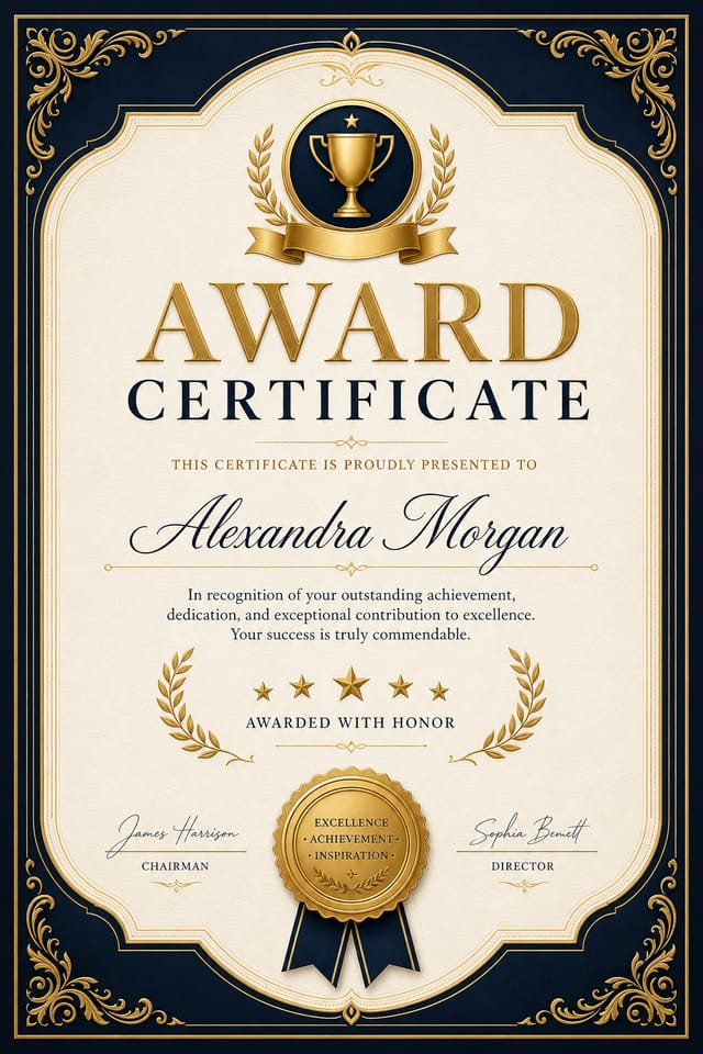
Visual Thinking Behind Award Certificates: Design Intelligence at Work
The Award Certificate Design Framework
Award certificate design has its own visual conventions that differ significantly from other styles.
The AI recognizes these patterns and applies them when generating your design, rather than defaulting to a generic layout.
When you describe a award certificate, Pixazo selects typography, color relationships, and compositional approaches appropriate to award aesthetics.
The result is a design that looks like it belongs in its context, not a repurposed template with the wrong visual DNA.
Award Certificates Across Fields: Contexts and Scenarios
Portfolio Showcase Pages
Design award certificates for creative portfolios, case study covers, and project showcases. Layouts that let work speak while maintaining professional framing.
Business Letterheads and Stationery
Design award certificates for official correspondence, invoices, and branded documents. Consistent visual identity across all business communications.
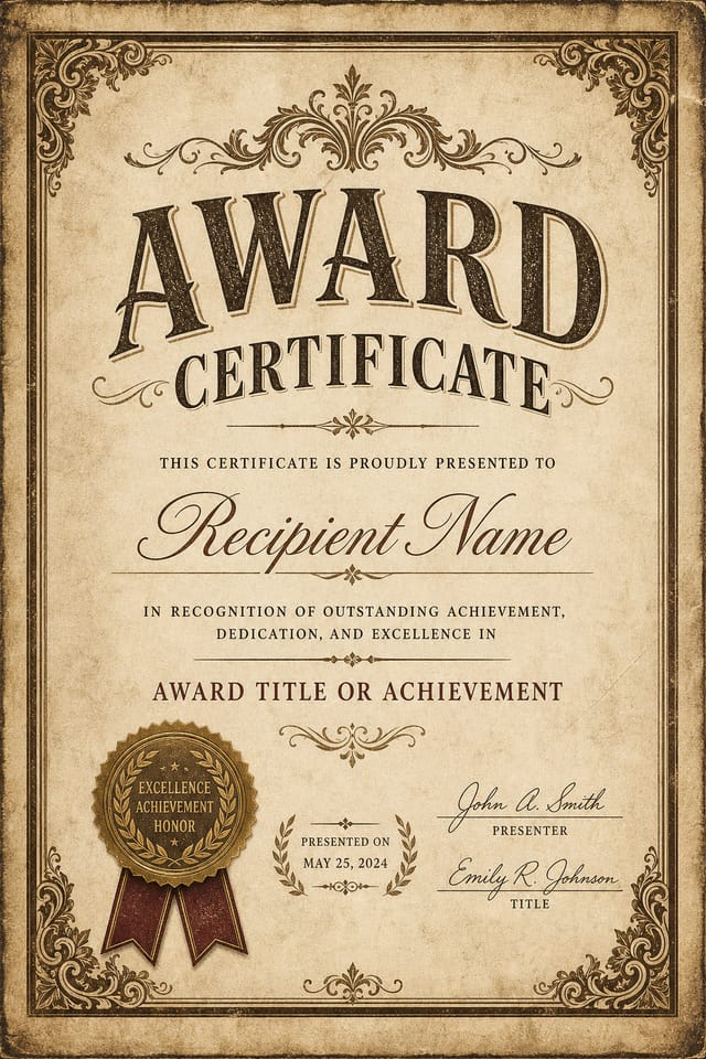
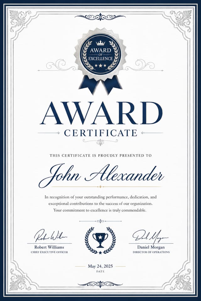
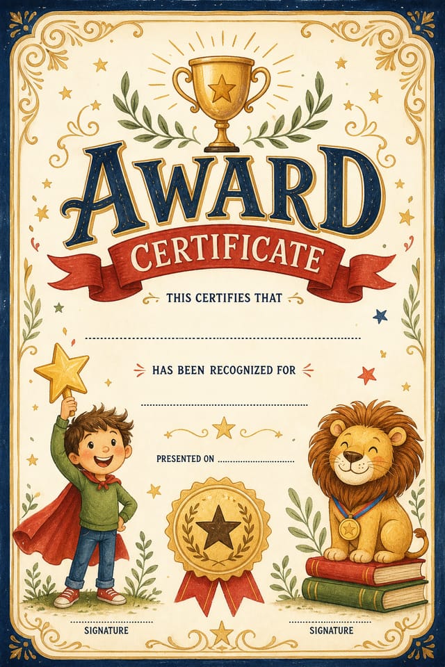
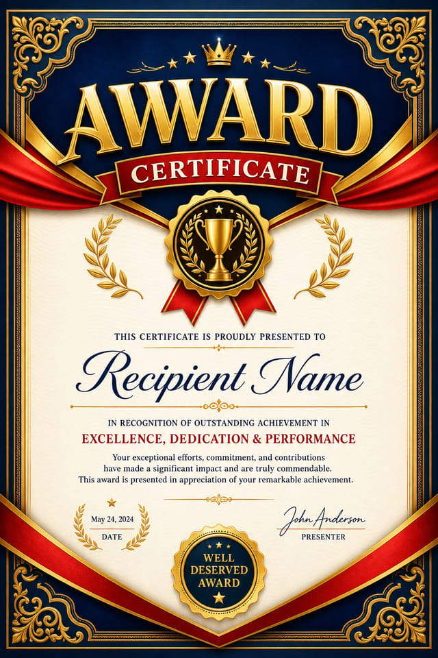
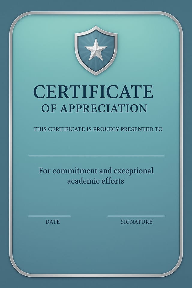
Certificate and Diploma Templates
Generate award certificates for awards, course completions, and professional certifications. Formal designs that convey legitimacy and achievement.
Proposal and Report Covers
Generate award certificates for business proposals, annual reports, and white papers. Cover designs that signal quality before the reader opens the document.
Build a Award Certificate: From Start to Finish
Relay Your Vision
Describe what you want your award certificate to look like. Include the mood, color palette, typography preference, and content hierarchy. Pixazo reads all of this and uses it to generate an appropriate design.
Watch: Creating Award Certificate designs step by step
Core of Award Certificate AI: What It Can Do
Print-Ready Output
Generated award certificates are sized and structured for professional printing. Download high-resolution files ready for production.
Style-Accurate Generation
The AI interprets award design conventions and applies them to your certificate, producing output that looks correctly styled rather than generically templated.
Layered Style Application
Combine award style with other design parameters in a single prompt. The AI interprets complex requests and applies multiple style constraints simultaneously.
Negative Space Handling
The AI manages whitespace in award certificate designs according to award aesthetic conventions, not generic poster defaults.
Prompt Refinement
Adjust your description to refine any aspect of the award certificate design. The AI responds to specific direction about colors, layout, or content.
The Award Certificate AI Edge: Advantages Explained
Iterative Refinement
Start with an initial generation and refine your award certificate through follow-up prompts that adjust specific elements while preserving what already works.
Multi-Format Export
Export your completed award certificate in the format that fits your workflow. PNG for web, PDF for print, and JPG for universal compatibility.
Prompt-to-Design Intelligence
Describe your award certificate in plain language and the AI interprets visual intent, layout preferences, and stylistic cues to generate a design that matches your brief.
Good Award Certificate Design: Key Principles
Award Certificate Prompts: Prompts Worth Trying
Copy any prompt below and paste it into Pixazo to generate your design instantly.
Award style certificate, bold headline placement, supporting text at appropriate scale, color palette consistent with award design conventionsEditorial-style award certificate, text-dominant design, typographic treatment carries visual weight, layout proportions inspired by print publication designLarge-format award certificate design, elements sized for visibility at print scale, no fine detail that would be lost in productionClean award certificate design, geometric structure, disciplined typography, color accent used selectively for emphasis, printer-optimized resolutionContemporary award certificate design, grid-based layout, typographic precision, restrained color palette, no decorative excessPortrait-orientation award certificate, vertical composition, headline at natural reading entry point, supporting information flows downward logicallyAward Creator Spotlights and Showcases
Real creators sharing their award designs made with Pixazo AI.
Award certificate for large format print, elements scaled for visibility at distance, colors optimized for print output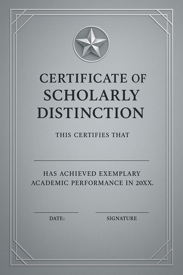
Professional award certificate, minimalist layout, selective use of color for emphasis, clear visual hierarchy from top to bottom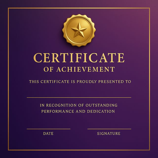
Full-bleed background award certificate, image or texture extends to edges, foreground elements float above, headline anchored to centerPractical Award Certificate Tips: Practical Guidance
Test at Actual Size
Always preview your award certificate at the dimensions it will be displayed. Design details that look fine at 100% can disappear or crowd at real-world scale.
Start with a Clear Brief
Before generating any award certificate, write down the core message, target audience, and intended use. A focused brief produces better results than iterating from a vague idea.
Iterate with Variations
Generate 3-5 versions of your award certificate before committing. Comparing variations side by side often reveals the strongest direction.
Leave White Space
Resist the urge to fill every area of your award certificate. Breathing room around key elements makes the overall design more effective.
The Reality of Award Certificate AI: Needs Human Help
Known limitations and trade-offs of AI-generated award design. Transparency matters when using AI for award certificate design. The points below describe where you may need to supplement AI output with manual work.
Award Certificate Maker Comparison: How They Differ
Fotor
Photo editing platform with design templates and batch processing
Stencil
Lightweight image creator optimized for fast social media graphics
Pixazo
AI-powered award certificate generator with prompt-based design and professional output quality
Adobe Express
Streamlined creative tool backed by Adobe's design ecosystem
Desygner
Multi-format design tool with PDF editing and brand management
Award Certificate Maker: The Essentials
Team accounts allow multiple users to share prompts, saved award certificate designs, and brand kits within a shared workspace. Team members can iterate on each other's award certificate designs and maintain consistent output across projects.
Each generation uses your unique prompt text to produce a distinct award certificate design. Even similar prompts produce noticeably different outputs due to the AI's generative process. No two users receive identical designs.
Include 'transparent background' in your prompt to generate a award certificate with no background fill. Download as PNG to preserve transparency. This is useful for award designs that will be composited over other imagery or placed on colored surfaces.
Professional award certificate design comes down to the right color relationships, appropriate typographic hierarchy, and compositional balance that fits award aesthetic conventions. Generic designs miss these details because they apply neutral defaults rather than style-specific decisions. Pixazo applies award design knowledge when you specify the style.
Specific prompts produce better results than vague ones. Include the visual style you want, any color preferences, the most important text to display, and the intended use. For award design specifically, noting whether you want a contemporary or classic interpretation of award style helps the AI make the right design decisions.

