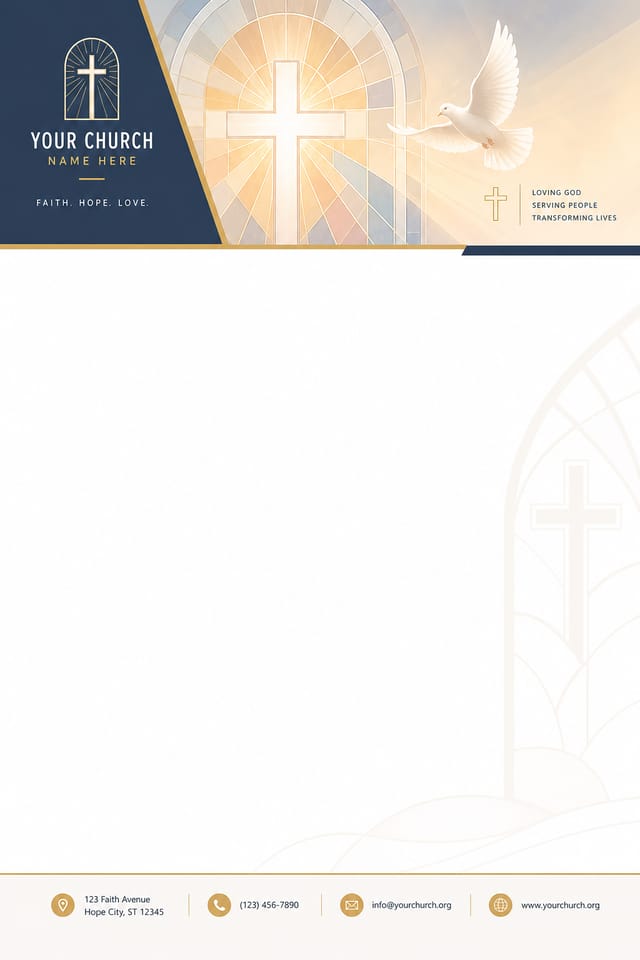
Church Letterhead : Create Free Church Letterheads in Minutes with AI
Create Custom Church Letterheads Quickly with Pixazo Best AI Church Letterhead Maker. Try for Free!
Get Started
Church Visual Language: How Pixazo Handles It
Understanding Church Letterhead Design Conventions
Professional church letterhead design involves more than applying a color filter to a generic layout.
The visual language of church design encompasses distinctive compositional approaches, characteristic color affinities, and typographic choices that signal quality and intentionality.
When you use Pixazo to create a church letterhead, the AI applies this visual knowledge to your specific request.
The result looks deliberate and style-appropriate, not accidental or template-derived.
Inside Church Letterhead Creation: From Start to Finish
Transcribe the Brief
Write a prompt describing your church letterhead. Include style preferences, color direction, the most important text to display, and any specific visual elements you want. The more specific your description, the more targeted the output.
Generate and Review
Pixazo generates your church letterhead in seconds. Review the design and adjust your prompt to refine specific elements: change the color palette, shift the layout weight, or add visual elements you want included.
Hand Off the File
Export your church letterhead in the format you need. PNG for web and social, PDF for print production, JPG for email and lightweight sharing. The file is yours to use commercially without restrictions.
Church Letterhead Specifications
Watch: Creating Church Letterhead designs step by step
Core of Church Letterhead AI: Tools That Matter
Fast Generation
Complete church letterhead designs generate in seconds. No rendering queues, no waiting for batch processing.
Typography Matching
Typefaces are selected to match church aesthetic expectations. The AI pairs fonts that reinforce your church letterhead's visual identity.
Resolution Control
Specify output dimensions for your church letterhead. Get files sized for web display, social media, or large-format printing.
Background Variation
Generate church letterheads with different background treatments. Solid, gradient, textured, or pattern backgrounds all available for church style.
Subcategory Awareness
The AI distinguishes between design subcategories. A church letterhead request produces church-appropriate output, not a generic design with church text added.
Export Flexibility
Download your church letterhead in formats suited for your use case. Web-optimized versions for digital display, high-DPI files for print.
Before You Start: Your Questions Answered
Pixazo generates original designs rather than copying existing work. The AI creates church letterheads from learned design principles, not by stitching together fragments of existing designs. Generated output does not reproduce copyrighted material or identifiable artistic styles of living creators.
Generated designs that miss the mark usually need more specific prompts. Add details about the visual hierarchy you want, the feeling the church letterhead should create, or specific elements to include or avoid. More context in the prompt produces more targeted output.
The AI renders text as specified in your prompt, so double-check spelling and punctuation before generating. If text renders incorrectly in a church letterhead, adjust your prompt and regenerate. The AI follows your exact text input.
Designs generated through Pixazo are yours to use as you see fit. You retain full usage rights for commercial and personal applications. The platform does not claim ownership over your generated church letterhead output.
Generate your initial church letterhead, review the output, then modify your prompt to adjust specific elements. Each regeneration produces a fresh design incorporating your changes. Most users reach their final church letterhead design within two to four iterations.
Putting Church Letterheads to Work: A Practical Guide
Podcast and Media Branding
Generate church letterheads for podcast covers, episode artwork, and media channel identity. Consistent visual branding across audio and video platforms.
Trade Show and Conference Materials
Generate church letterheads for booth displays, attendee handouts, and event signage. Professional materials that represent your brand in competitive environments.
Personal Creative Work
Generate church letterheads for personal projects, home display, and creative experiments without spending production time on design execution.
Professional Projects
Create church letterheads for client work, commercial campaigns, and professional applications where quality and style accuracy matter.
Standout Church Letterhead Features: Key Strengths
Iterative Refinement
Start with an initial generation and refine your church letterhead through follow-up prompts that adjust specific elements while preserving what already works.
Professional Output Quality
Every church letterhead is generated at production quality with proper resolution, color space handling, and typography rendering suitable for both digital and print use.
What Works in Church Letterhead Design: Common Pitfalls
Use grids and alignment
Structured layouts in your church letterhead create a sense of order and professionalism that unstructured designs cannot match.
Test with real content
Never finalize a church letterhead with placeholder text. Real copy often has different lengths and line breaks that affect the design.
Optimize for the display medium
Tailor your church letterhead resolution, color space, and text size to the specific platform or physical context where it will appear.
Rely solely on AI output
AI-generated church letterhead designs are a starting point. Human review catches issues with context, tone, and accuracy that AI can miss.
Use too many fonts
More than two or three typefaces in a single church letterhead creates visual noise and makes the design feel disjointed.
Ignore accessibility
Low-contrast text and tiny font sizes in your church letterhead exclude a significant portion of your potential audience.
Forget the call to action
A church letterhead without a clear next step for the viewer is a missed opportunity. Always include direction on what to do next.
Church Letterhead Aesthetics: Worth Exploring
Contemporary Church
Current church design sensibility with updated proportions, modern typefaces, and contemporary color relationships.
Textured Church
Church design with added surface depth. Background treatments add visual interest without disrupting legibility.
High-Contrast Church
Bold church visual treatment with strong tonal contrast. Elements read clearly at any viewing distance.
Classic Church
Traditional church design principles applied to modern letterhead format. Clean composition, conventional hierarchy, time-tested visual decisions.
Church Letterhead Starter Prompts Worth Trying
Copy any prompt below and paste it into Pixazo to generate your design instantly.
Church letterhead design, clean layout, strong typography hierarchy, appropriate color palette for church aesthetic, high contrast between headline and backgroundChurch letterhead with strong visual hierarchy, largest element reads clearly, supporting elements organized by importance, clean background treatmentMonochromatic church letterhead, single-hue palette with value variation for contrast, typographic hierarchy creates visual interest without color complexityTextured church letterhead, surface treatment adds depth without obscuring legibility, texture consistent with church aestheticSeries-compatible church letterhead design, visual language that extends to multiple formats, consistent design system across variantsTwo-color church letterhead design, high contrast between primary and secondary color, clean separation between graphic and text zonesChurch Letterhead Design Trends: Trend Report
Gradient Overlays
Smooth color transitions are being used as primary design elements in church letterhead work, adding depth without the complexity of photographic backgrounds.
Minimalist Layouts
Stripped-back church letterhead designs with generous white space and limited elements are gaining favor for their clarity and elegance.
Bold Typography
Oversized type and expressive fonts are dominating church letterhead design, turning headlines into visual centerpieces rather than just text.
Retro Revival
Vintage aesthetics from the 1970s and 1990s are influencing church letterhead design with textured backgrounds, serif fonts, and warm gradients.
Church Creator Featured Designs
Real creators sharing their church designs made with Pixazo AI.

AI Church Letterhead Design: Where It Falls Short
Known limitations and trade-offs of AI-generated church design. Understanding what the AI handles well and where it falls short helps you structure your church letterhead design workflow effectively.

