Law Firm Letterhead : Create Free Law Firm Letterheads in Minutes with AI
Create Custom Law Firm Letterheads Quickly with Pixazo Best AI Law Firm Letterhead Maker. Try for Free!
Get Started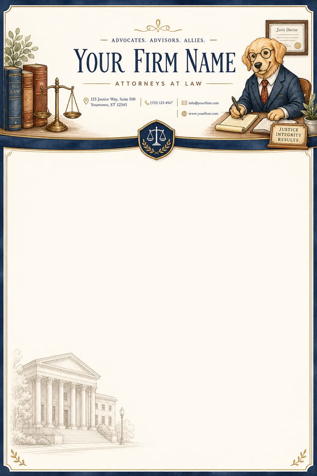
AI Law-Firm Letterhead Maker: Start Creating Now
Generate law-firm letterheads that capture the right visual mood. Pixazo's AI handles composition, color, and typography so you can focus on your message.
Create Your Law Firm Letterhead FreeWhat Powers Law-Firm Letterhead Design: Technical Breakdown
Print-Ready Output
Generated law-firm letterheads are sized and structured for professional printing. Download high-resolution files ready for production.
No Design Software Required
Create professional law-firm letterheads without Photoshop, Illustrator, or other design applications. The AI handles all technical production.
Background Variation
Generate law-firm letterheads with different background treatments. Solid, gradient, textured, or pattern backgrounds all available for law-firm style.
Instant Iterations
Generate multiple law-firm letterhead variations from a single prompt. Compare options and refine until the design matches your vision.
Subcategory Awareness
The AI distinguishes between design subcategories. A law-firm letterhead request produces law-firm-appropriate output, not a generic design with law-firm text added.
Creating Your Law-Firm Letterhead: The Workflow Explained
Establish the Parameters
Write a prompt describing your law-firm letterhead. Include style preferences, color direction, the most important text to display, and any specific visual elements you want. The more specific your description, the more targeted the output.
Watch: Creating Law Firm Letterhead designs step by step
About Law-Firm Letterheads: The Essentials
Longer, more detailed prompts generally produce more accurate results for law-firm letterhead design. Include all the relevant information: style direction, color preferences, content to display, intended use, and any specific design elements you want. There is no strict character limit.
Each generation uses your unique prompt text to produce a distinct law-firm letterhead design. Even similar prompts produce noticeably different outputs due to the AI's generative process. No two users receive identical designs.
The AI renders text as specified in your prompt, so double-check spelling and punctuation before generating. If text renders incorrectly in a law-firm letterhead, adjust your prompt and regenerate. The AI follows your exact text input.
Professional law-firm letterhead design comes down to the right color relationships, appropriate typographic hierarchy, and compositional balance that fits law-firm aesthetic conventions. Generic designs miss these details because they apply neutral defaults rather than style-specific decisions. Pixazo applies law-firm design knowledge when you specify the style.
Pixazo supports PNG, JPEG, and PDF export for law-firm letterheads. PNG preserves transparency if your design uses it. JPEG works well for web and social media. PDF is the preferred format for print production of law-firm letterheads.
Advanced Law-Firm Letterhead Features: Feature by Feature
AI Generation
Convert text prompts into polished law-firm letterhead designs with contextual understanding
Style Transfer
Apply different visual styles to your law-firm letterhead while maintaining layout integrity
Color Palettes
AI-suggested color combinations that work for law-firm letterhead design conventions
Law-Firm Letterhead Style Movements: Styles Gaining Traction
Bold Typography
Oversized type and expressive fonts are dominating law-firm letterhead design, turning headlines into visual centerpieces rather than just text.
Gradient Overlays
Smooth color transitions are being used as primary design elements in law-firm letterhead work, adding depth without the complexity of photographic backgrounds.
Motion-Ready Design
Static law-firm letterhead designs are being created with animation in mind, using layered elements that translate smoothly to motion graphics.
Organic Shapes
Flowing, irregular forms are replacing sharp geometric shapes in law-firm letterhead backgrounds and decorative elements for a softer visual feel.
Law-Firm Letterhead Design For: Who Benefits Most
Sports and Recreation
Produce law-firm letterheads for leagues, tournaments, and recreational programs. Energetic designs that build excitement and communicate schedules.
Small Business Marketing
Produce law-firm marketing letterheads without a design agency budget. Get professional results from a text description.
Personal Creative Work
Generate law-firm letterheads for personal projects, home display, and creative experiments without spending production time on design execution.
Travel and Tourism Promotion
Design law-firm letterheads for destinations, tour packages, and hospitality brands. Aspirational visuals that inspire booking decisions.
Podcast and Media Branding
Generate law-firm letterheads for podcast covers, episode artwork, and media channel identity. Consistent visual branding across audio and video platforms.
Law-Firm Letterhead Production Steps: From Start to Delivery
Review Evaluate and refine
Compare generated law-firm letterhead options against your brief. Mark what works and note specific changes needed for the next iteration.
Research Gather references
Collect examples of effective law-firm letterhead designs, note what works, and identify patterns relevant to your project goals.
Generate Create initial designs
Use AI to produce multiple law-firm letterhead variations based on your brief. Start broad and narrow down from the strongest options.
Approve Final sign-off
Get stakeholder approval on the finished law-firm letterhead. Verify all text is accurate and the design meets brand and technical requirements.
Law-Firm Letterhead Tech Specs: Specs and Limits
Effective Law-Firm Letterhead Prompts to Try
Copy any prompt below and paste it into Pixazo to generate your design instantly.
Series-compatible law-firm letterhead design, visual language that extends to multiple formats, consistent design system across variantsContemporary law-firm letterhead design, grid-based layout, typographic precision, restrained color palette, no decorative excessTextured law-firm letterhead, surface treatment adds depth without obscuring legibility, texture consistent with law-firm aestheticLaw-Firm aesthetic letterhead, palette drawn from law-firm design tradition, layout proportions consistent with law-firm conventions, purposeful use of each elementLarge-format law-firm letterhead design, elements sized for visibility at print scale, no fine detail that would be lost in productionLaw-Firm Design Community: Designs Worth Seeing
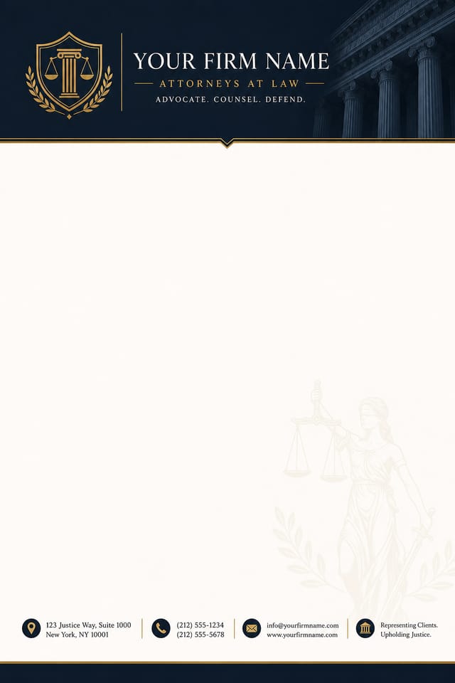
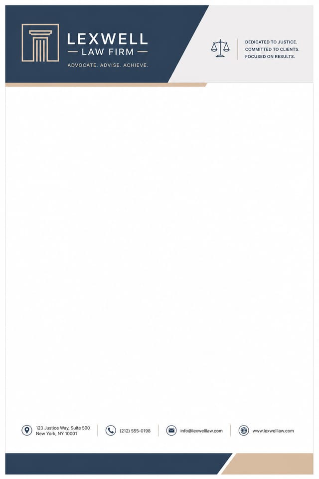
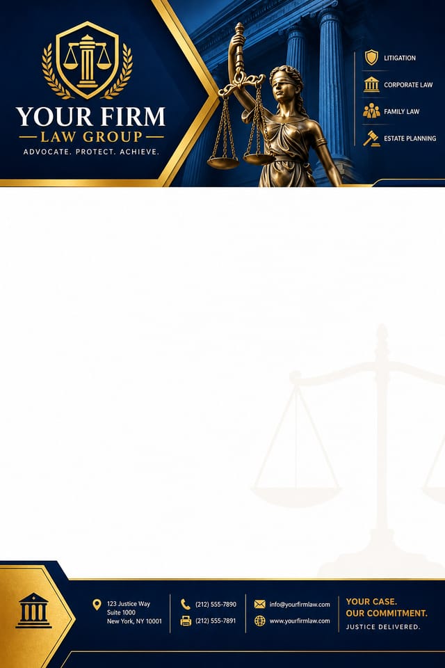
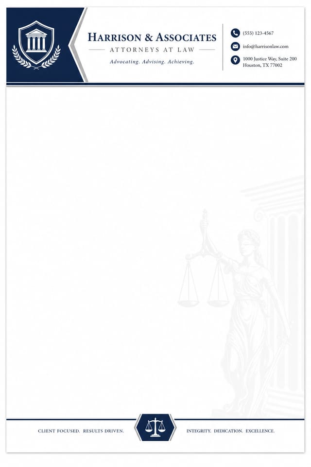
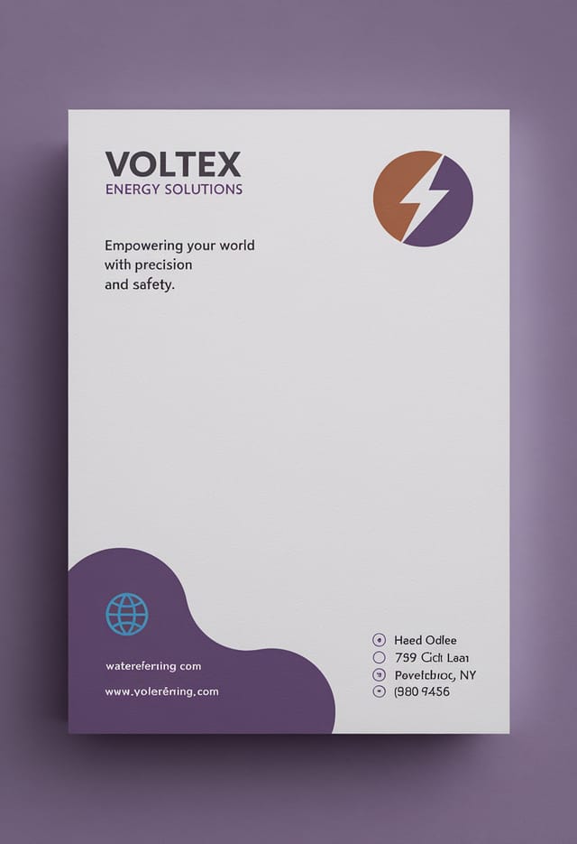
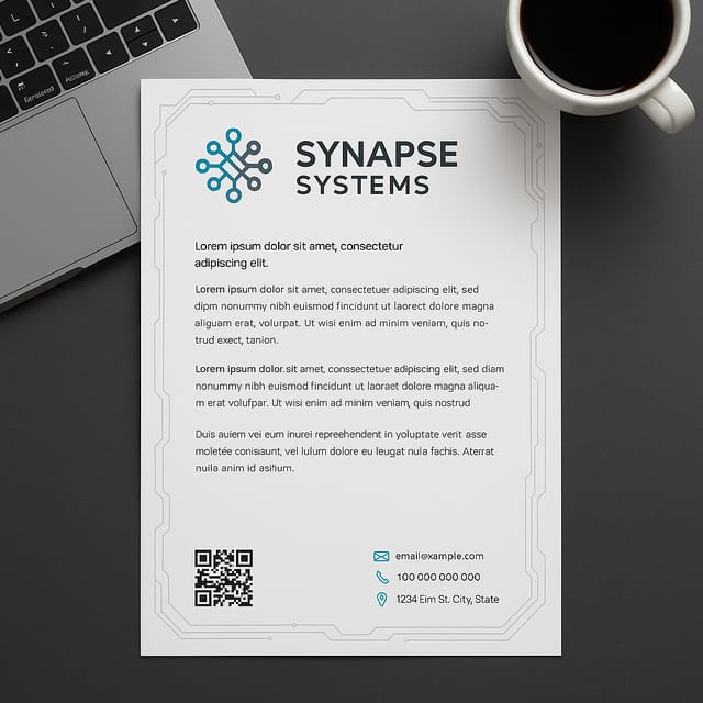
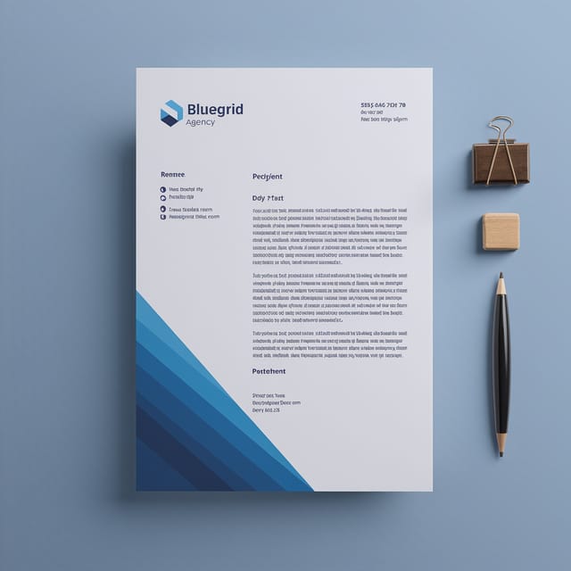
Real creators sharing their law firm designs made with Pixazo AI.
The Fine Print on Law-Firm Letterheads: Trade-Offs to Know
Known limitations and trade-offs of AI-generated law firm design. AI law-firm letterhead generation produces strong results within its design domain. These notes describe where human judgment and manual work remain necessary.

