Personal Letterhead : Create Free Personal Letterheads in Minutes with AI
Create Custom Personal Letterheads Quickly with Pixazo Best AI Personal Letterhead Maker. Try for Free!
Get Started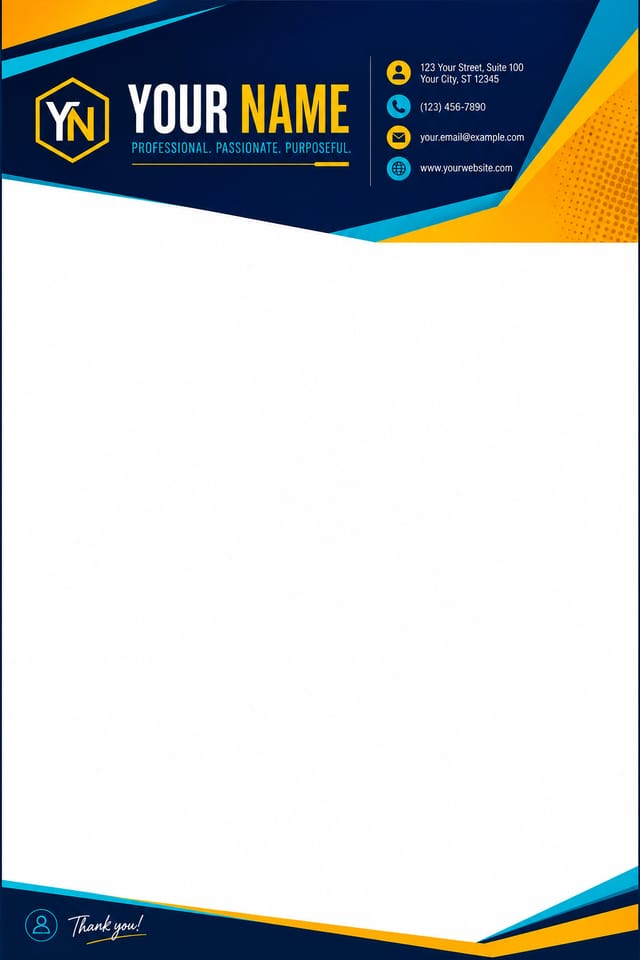
Practical Personal Letterhead Tips: What Professionals Know
Match Tone to Audience
A personal letterhead for a corporate event needs a different visual tone than one for a music festival. Let the audience guide your style choices.
Limit Your Color Palette
Stick to 2-3 primary colors in your personal letterhead design. Too many colors compete for attention and weaken the visual hierarchy.
Leave White Space
Resist the urge to fill every area of your personal letterhead. Breathing room around key elements makes the overall design more effective.
Keep Typography Simple
Use no more than two typefaces per personal letterhead. One for headlines, one for body text. Consistency in typography signals professionalism.
Community Personal Letterhead: Featured Designs
Real creators sharing their personal designs made with Pixazo AI.
Cool palette personal letterhead, slate and steel tones, sans-serif typography, contemporary personal sensibility, precise alignment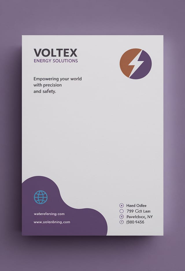
Portrait personal letterhead for social sharing, vertical 4:5 ratio, headline in upper third, supporting content below centerline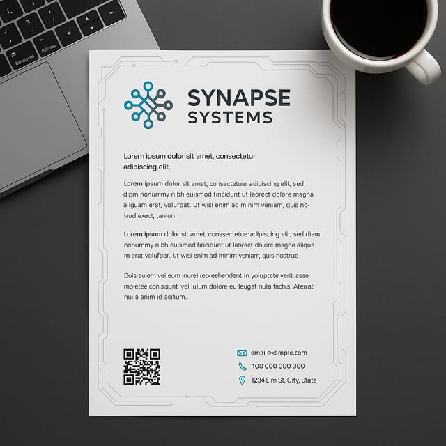
Full-bleed background personal letterhead, image or texture extends to edges, foreground elements float above, headline anchored to centerPersonal Letterhead File Formats: Format Guide
WEBP
Modern web format offering smaller file sizes than PNG or JPG for personal letterhead images without significant quality loss.
Print-ready format for personal letterhead files that preserves fonts, colors, and layout across different devices and print services.
PNG
Lossless image format ideal for personal letterhead designs with transparency, sharp text, and web display at predictable file sizes.
TIFF
High-fidelity format for personal letterhead files destined for professional printing, supporting CMYK color and lossless compression.
Who Creates Personal Letterheads: From Hobby to Pro
Restaurant and Food Service
Generate personal letterheads for menus, seasonal promotions, and restaurant branding. Designs that reflect cuisine style and dining atmosphere.
Non-Profit Campaigns
Create compelling personal campaign letterheads without allocating budget to design production. Focus resources on mission-critical activities.
Political and Advocacy Campaigns
Create personal campaign letterheads for candidates, ballot measures, and social causes. Persuasive designs that mobilize and inform.
Religious and Spiritual Organizations
Create personal letterheads for worship services, community outreach, and faith-based events. Respectful designs that reflect the organization's character.
Smart Personal Letterhead AI: What It Can Do
Style-Accurate Generation
The AI interprets personal design conventions and applies them to your letterhead, producing output that looks correctly styled rather than generically templated.
Layered Style Application
Combine personal style with other design parameters in a single prompt. The AI interprets complex requests and applies multiple style constraints simultaneously.
Color Palette Intelligence
Colors are chosen with personal style awareness. The AI builds palettes that fit personal design conventions rather than selecting arbitrarily.
Instant Iterations
Generate multiple personal letterhead variations from a single prompt. Compare options and refine until the design matches your vision.
Export Flexibility
Download your personal letterhead in formats suited for your use case. Web-optimized versions for digital display, high-DPI files for print.
Negative Space Handling
The AI manages whitespace in personal letterhead designs according to personal aesthetic conventions, not generic poster defaults.
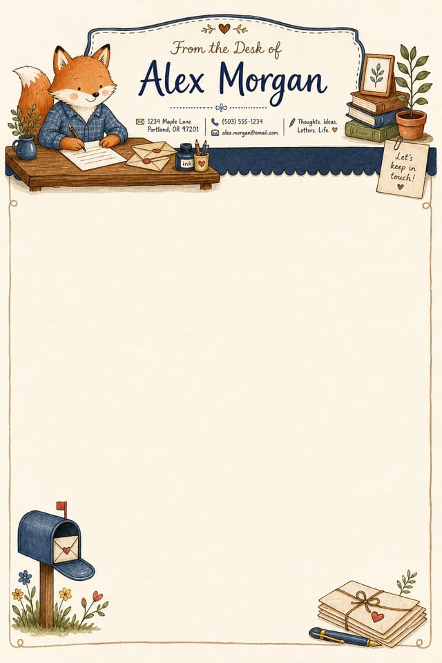
Visual Styles for Personal Letterheads: Finding Your Look
High-Contrast Personal
Bold personal visual treatment with strong tonal contrast. Elements read clearly at any viewing distance.
Geometric Personal
Structured personal composition using grid systems and angular forms. Order and precision define the visual approach.
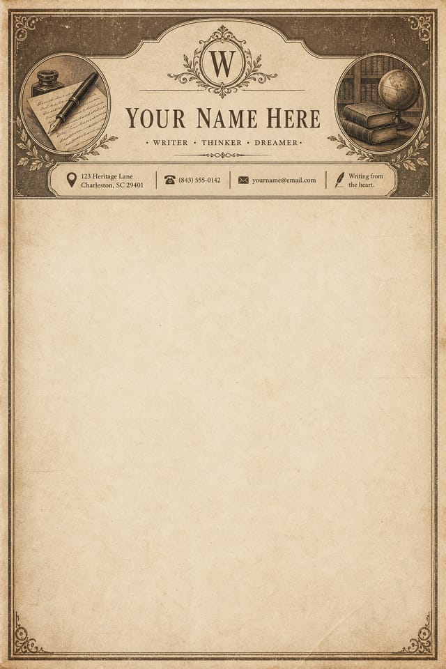
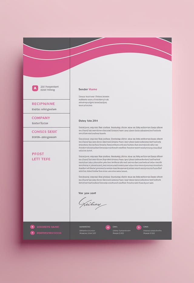
Editorial Personal
Text-dominant personal letterhead layout inspired by print publication design. Typographic variety creates visual rhythm.
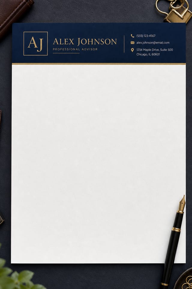
Classic Personal
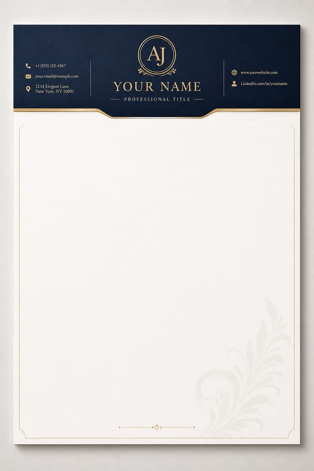
Traditional personal design principles applied to modern letterhead format. Clean composition, conventional hierarchy, time-tested visual decisions.
Contemporary Personal
Current personal design sensibility with updated proportions, modern typefaces, and contemporary color relationships.
The Personal Letterhead Process: Step by Step
Define Your Concept
Start with a text description of your personal letterhead concept. Specify the visual style, colors, layout direction, and key text. Detailed prompts produce more accurate personal letterhead designs than general ones.
Inspect and Compare
The AI produces a personal letterhead based on your description. If the first result isn't exactly right, adjust the prompt to address what needs changing. Most designs reach the target within a few iterations.
Grab the Finished Version
Get your final personal letterhead file in one click. Choose your format, download at full resolution, and use the design immediately. No watermarks, no additional fees, no waiting.
Watch: Creating Personal Letterhead designs step by step
Tested Personal Letterhead Prompts Worth Trying
Copy any prompt below and paste it into Pixazo to generate your design instantly.
Large-format personal letterhead design, elements sized for visibility at print scale, no fine detail that would be lost in productionAtmospheric personal letterhead, background treatment supports the headline without competing with it, visual weight distributed intentionallyEditorial-style personal letterhead, text-dominant design, typographic treatment carries visual weight, layout proportions inspired by print publication designPersonal aesthetic letterhead, palette drawn from personal design tradition, layout proportions consistent with personal conventions, purposeful use of each elementClean personal letterhead design, geometric structure, disciplined typography, color accent used selectively for emphasis, printer-optimized resolutionGeometric personal letterhead, structured grid system, angular composition, colors in blocks rather than gradients, modern clean finishAI Personal Letterhead Design: What to Expect
Known limitations and trade-offs of AI-generated personal design. Every AI design tool has boundaries. Knowing these limits before you start helps you get the most out of personal letterhead generation.
Your Personal Letterhead Questions: Plain Answers
Generate your initial personal letterhead, review the output, then modify your prompt to adjust specific elements. Each regeneration produces a fresh design incorporating your changes. Most users reach their final personal letterhead design within two to four iterations.
Generated designs that miss the mark usually need more specific prompts. Add details about the visual hierarchy you want, the feeling the personal letterhead should create, or specific elements to include or avoid. More context in the prompt produces more targeted output.
Describe your core design parameters in each prompt and vary only the specific elements that should change across the series. Maintaining consistent color palette, typographic approach, and compositional structure across personal letterhead variations creates a coherent series.
Include your specific colors in the prompt, either by hex code or descriptive terms. 'Navy and copper with white text' or '#1a1a2e and #c9a84c palette' both work. The AI builds a personal-appropriate palette around your specified colors.
You control every major design parameter through your prompt: color palette, typography style, layout structure, visual weight distribution, background treatment, and content hierarchy. The more specific your personal letterhead prompt, the more precisely the AI follows your creative direction.

