Professional Letterhead : Create Free Professional Letterheads in Minutes with AI
Create Custom Professional Letterheads Quickly with Pixazo Best AI Professional Letterhead Maker. Try for Free!
Get Started
Inside the Professional Community: What People Are Making
Real creators sharing their professional designs made with Pixazo AI.
Professional letterhead at 1080x1920 pixels for Instagram stories, bold sans-serif headline centered, gradient background in professional tones, call-to-action at bottom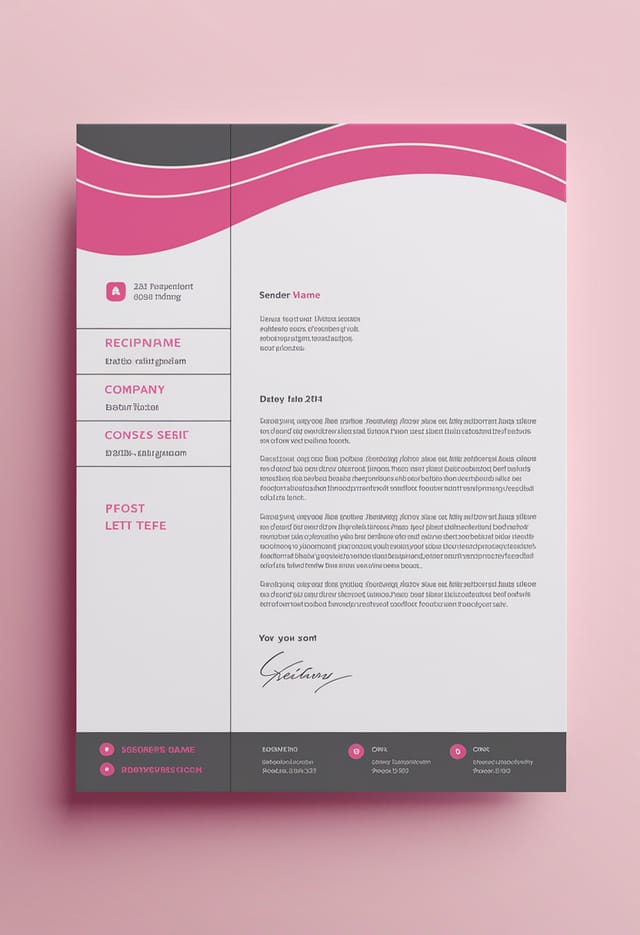
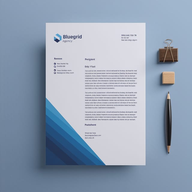
Contemporary professional style letterhead, grid-based structure, disciplined spacing, restrained decoration, readable at viewing distance
Portrait professional letterhead for social sharing, vertical 4:5 ratio, headline in upper third, supporting content below centerlineVisual Thinking Behind Professional Letterheads: Design Intelligence at Work
Visual Thinking Behind Professional Letterhead Creation
Effective professional letterhead design depends on understanding what makes professional work visually.
Color relationships, typographic choices, and spatial arrangement all carry different weight depending on the design style.
Pixazo's AI has been trained to recognize these distinctions.
The practical result is that a professional letterhead prompt produces designs that fit professional conventions rather than generic poster layouts.
Format Options for Professional Letterheads: Format Guide
JPG
Compressed image format suited for professional letterhead designs with photographic elements where smaller file size matters more than pixel-perfect edges.
TIFF
High-fidelity format for professional letterhead files destined for professional printing, supporting CMYK color and lossless compression.
Print-ready format for professional letterhead files that preserves fonts, colors, and layout across different devices and print services.
PNG
Lossless image format ideal for professional letterhead designs with transparency, sharp text, and web display at predictable file sizes.
Professional Letterheads Across Fields: Across Industries
Internal Communications
Create professional letterheads for all-hands meetings, policy announcements, and employee recognition programs. Professional materials for internal audiences.
Client and Investor Presentations
Design professional letterheads that support pitch decks, quarterly reviews, and stakeholder updates. Visual summaries that communicate key metrics.
Trade Show and Expo Booth Graphics
Create professional letterheads for exhibition stands, pull-up banners, and booth backdrops. Large-format designs that attract foot traffic.
Product Launch Campaigns
Design professional letterheads for new product introductions across digital and print channels. Materials that establish positioning from day one.
Storefront and Office Displays
Generate professional letterheads for window displays, reception areas, and retail environments. Designs that reinforce brand presence in physical spaces.
Professional Letterhead Creator Tips: Lessons from the Field
Prioritize Hierarchy
Every professional letterhead needs a clear reading order. Make sure the most important information is the largest and most prominent element in the layout.
Iterate with Variations
Generate 3-5 versions of your professional letterhead before committing. Comparing variations side by side often reveals the strongest direction.
Keep Typography Simple
Use no more than two typefaces per professional letterhead. One for headlines, one for body text. Consistency in typography signals professionalism.
Check Alignment Carefully
Misaligned elements are one of the most common signs of amateur professional letterhead design. Use grid lines and snap-to features to keep things precise.
Match Tone to Audience
A professional letterhead for a corporate event needs a different visual tone than one for a music festival. Let the audience guide your style choices.
Design Principles for Professional Letterheads: A Designer's Perspective
Visual Hierarchy
Strong professional letterhead design establishes a clear reading order. The headline should be immediately visible, supporting information should follow in logical sequence.
Typographic Clarity
Type choices in professional letterhead design should serve legibility first. Font selection should reinforce the professional aesthetic while remaining readable at intended viewing distances.
Repetition and Consistency
Repeating visual elements in professional letterhead design creates cohesion. Consistent use of shapes, colors, and spacing makes the design feel unified rather than assembled from random parts.
Which Professional Letterhead Tool Fits: How They Differ
PicMonkey
Photo editor and design tool with brand kit management
Fotor
Photo editing platform with design templates and batch processing
Pixazo
AI-powered professional letterhead generator with prompt-based design and professional output quality
Desygner
Multi-format design tool with PDF editing and brand management
Crello
Template-based design tool with animation and video support
What Powers Professional Letterhead Design: Feature Overview
Color Temperature Control
Specify warm, cool, or neutral color direction for your professional letterhead. The AI builds the full palette around your temperature preference.
Consistency Across Variants
Generate multiple professional letterheads for a project and maintain visual consistency across the set. Specify your core design parameters and vary secondary elements.
Color Palette Intelligence
Colors are chosen with professional style awareness. The AI builds palettes that fit professional design conventions rather than selecting arbitrarily.
Context-Aware Design
Describe your professional letterhead's purpose and audience. The AI adjusts visual weight, complexity, and clarity based on the intended use context.
No Design Software Required
Create professional professional letterheads without Photoshop, Illustrator, or other design applications. The AI handles all technical production.
Layered Style Application
Combine professional style with other design parameters in a single prompt. The AI interprets complex requests and applies multiple style constraints simultaneously.
Making Professional Letterheads: Behind the Scenes
Watch: Creating Professional Letterhead designs step by step
Professional Letterhead Tech Specs: What You Get
Try These Professional Letterhead Prompts That Work
Copy any prompt below and paste it into Pixazo to generate your design instantly.
Professional letterhead design, clean layout, strong typography hierarchy, appropriate color palette for professional aesthetic, high contrast between headline and backgroundClean professional letterhead design, geometric structure, disciplined typography, color accent used selectively for emphasis, printer-optimized resolutionProfessional letterhead for digital display, optimized proportions for screen viewing, colors calibrated for RGB output, legible at typical viewing distanceProfessional professional letterhead, minimalist professional approach, negative space used intentionally, readable at multiple viewing distances, print-ready compositionLarge-format professional letterhead design, elements sized for visibility at print scale, no fine detail that would be lost in productionProfessional Letterhead Maker: A Quick FAQ
Longer, more detailed prompts generally produce more accurate results for professional letterhead design. Include all the relevant information: style direction, color preferences, content to display, intended use, and any specific design elements you want. There is no strict character limit.
You can generate as many variations as your account tier allows. Refine your prompt with each iteration to move toward your target design. Most users find the right direction within three to five generations.
Designs created with Pixazo are available for commercial use. You can use your professional letterheads for client projects, product sales, advertising, and other commercial applications without additional licensing fees.
Generate your initial professional letterhead, review the output, then modify your prompt to adjust specific elements. Each regeneration produces a fresh design incorporating your changes. Most users reach their final professional letterhead design within two to four iterations.
Describe your core design parameters in each prompt and vary only the specific elements that should change across the series. Maintaining consistent color palette, typographic approach, and compositional structure across professional letterhead variations creates a coherent series.
Generated designs that miss the mark usually need more specific prompts. Add details about the visual hierarchy you want, the feeling the professional letterhead should create, or specific elements to include or avoid. More context in the prompt produces more targeted output.
The Reality of Professional Letterhead AI: Honest Expectations
Known limitations and trade-offs of AI-generated professional design. Being specific about what AI letterhead generation can and cannot do helps you plan your workflow and set accurate expectations.

