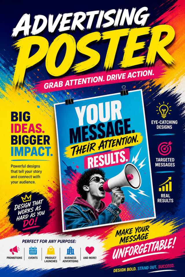
Advertising Poster : Create Free Advertising Posters in Minutes with AI
Create Custom Advertising Posters Quickly with Pixazo Best AI Advertising Poster Maker. Try for Free!
Get Started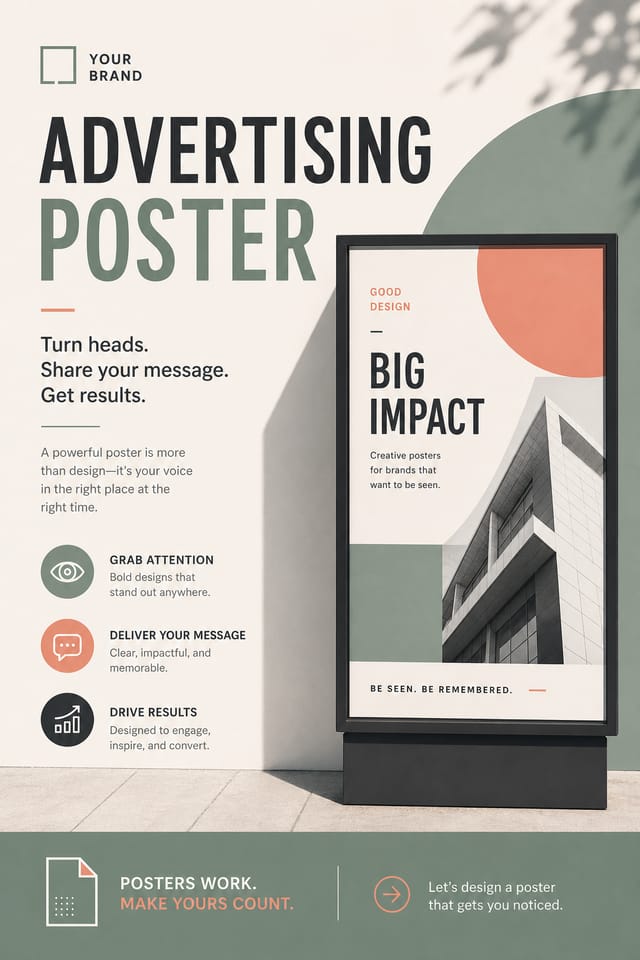

Advertising Poster Design Insights: What Professionals Know
Match Tone to Audience
A advertising poster for a corporate event needs a different visual tone than one for a music festival. Let the audience guide your style choices.
Consider the Context
Think about where your advertising poster will appear. A design optimized for social media needs different proportions and density than one for a physical bulletin board.
Limit Your Color Palette
Stick to 2-3 primary colors in your advertising poster design. Too many colors compete for attention and weaken the visual hierarchy.
Use High Contrast for Readability
Whether your advertising poster is displayed on screen or in print, strong contrast between text and background ensures the message gets through at any size.
From Prompt to Advertising Poster: The Creation Flow
Set the Direction
Start with a text description of your advertising poster concept. Specify the visual style, colors, layout direction, and key text. Detailed prompts produce more accurate advertising poster designs than general ones.
Examine What Appears
The AI produces a advertising poster based on your description. If the first result isn't exactly right, adjust the prompt to address what needs changing. Most designs reach the target within a few iterations.
Tweak and Polish
Iterate on your advertising poster by modifying the aspects that need work. Regenerate with a more targeted prompt until the design matches your vision. Most refinements take one or two iterations.
Commit the Output
Export your advertising poster in the format you need. PNG for web and social, PDF for print production, JPG for email and lightweight sharing. The file is yours to use commercially without restrictions.
Watch: Creating Advertising Poster designs step by step
How Pixazo Reads Advertising Style: Key Design Conventions
Understanding Advertising Poster Design Conventions
The strongest advertising poster designs succeed because every element reinforces the style rather than contradicting it.
Typography that fits advertising conventions, colors that carry advertising associations, layouts that breathe in ways consistent with advertising design sensibility.
Pixazo's AI understands these relationships.
Describe your advertising poster and the system generates designs where all the elements agree.
Core of Advertising Poster AI: Core Strengths
Consistency Across Variants
Generate multiple advertising posters for a project and maintain visual consistency across the set. Specify your core design parameters and vary secondary elements.
Background Variation
Generate advertising posters with different background treatments. Solid, gradient, textured, or pattern backgrounds all available for advertising style.
Context-Aware Design
Describe your advertising poster's purpose and audience. The AI adjusts visual weight, complexity, and clarity based on the intended use context.
Typography Matching
Typefaces are selected to match advertising aesthetic expectations. The AI pairs fonts that reinforce your advertising poster's visual identity.
Advertising Poster Applications: Real Applications
Product Launch Campaigns
Design advertising posters for new product introductions across digital and print channels. Materials that establish positioning from day one.
Storefront and Office Displays
Generate advertising posters for window displays, reception areas, and retail environments. Designs that reinforce brand presence in physical spaces.
Trade Show and Expo Booth Graphics
Create advertising posters for exhibition stands, pull-up banners, and booth backdrops. Large-format designs that attract foot traffic.
Internal Communications
Create advertising posters for all-hands meetings, policy announcements, and employee recognition programs. Professional materials for internal audiences.
Advertising Style Options: What Works Best
Editorial Advertising
Text-dominant advertising poster layout inspired by print publication design. Typographic variety creates visual rhythm.
Contemporary Advertising
Current advertising design sensibility with updated proportions, modern typefaces, and contemporary color relationships.
Textured Advertising
Advertising design with added surface depth. Background treatments add visual interest without disrupting legibility.
High-Contrast Advertising
Bold advertising visual treatment with strong tonal contrast. Elements read clearly at any viewing distance.
Community Advertising Poster: Spotlights and Showcases
Real creators sharing their advertising designs made with Pixazo AI.

Advertising poster in 18x24 inch print format, museum-quality composition, generous margins, elegant serif headline, muted earth tones
Corporate advertising poster for a B2B audience, clean and authoritative, navy and white palette, structured grid, data-friendly layout
Contemporary advertising style poster, grid-based structure, disciplined spacing, restrained decoration, readable at viewing distanceWriting Advertising Poster Prompt Inspiration
Copy any prompt below and paste it into Pixazo to generate your design instantly.
Atmospheric advertising poster, background treatment supports the headline without competing with it, visual weight distributed intentionallyContemporary advertising poster design, grid-based layout, typographic precision, restrained color palette, no decorative excessHigh-impact advertising poster, immediate visual read at thumbnail size, clear headline dominance, supporting information structured logicallyProfessional advertising poster, minimalist advertising approach, negative space used intentionally, readable at multiple viewing distances, print-ready compositionFull-bleed advertising poster, background treatment extends to edges, foreground elements positioned for compositional balance, strong central hierarchyAdvertising Poster Essentials: The Essentials
The AI generates designs at the specified dimensions. For professional print production, add 'with bleed area' to your prompt to extend background elements beyond the trim line. Crop marks and registration marks should be added in your print preparation software.
Pixazo generates single-page advertising poster designs per prompt. For multi-page projects, generate each page individually using consistent prompt language to maintain visual continuity across your advertising document set.
Designs created with Pixazo are available for commercial use. You can use your advertising posters for client projects, product sales, advertising, and other commercial applications without additional licensing fees.
The AI generates visual designs, not data visualizations. For advertising posters that need charts or graphs, generate the advertising layout in Pixazo and overlay your data graphics in post-production. The design framework will be style-consistent even if data elements are added separately.
The AI recognizes advertising design as a distinct visual category with its own conventions. Specifying advertising style in your prompt triggers appropriate design decisions around color, typography, and composition rather than defaulting to generic poster layout.
Pixazo generates high-resolution files suitable for both print and digital use. Specify your intended output format in your prompt. Print advertising posters benefit from high-DPI settings, while web and social media use works well with standard resolution output.
Advertising Poster Maker Comparison: Side by Side
PicMonkey
Photo editor and design tool with brand kit management
Piktochart
Infographic and presentation maker for data-driven visuals
Pixazo
AI-powered advertising poster generator with prompt-based design and professional output quality
Canva
Drag-and-drop editor with a large template library and collaboration features
Snappa
Quick graphic creator focused on social media and marketing visuals
Streamlining Advertising Poster Creation: How It All Connects
Approve
Get stakeholder approval on the finished advertising poster. Verify all text is accurate and the design meets brand and technical requirements.
Brief
Establish the key message, dimensions, color preferences, and target audience for your advertising poster before any design work begins.
Generate
Use AI to produce multiple advertising poster variations based on your brief. Start broad and narrow down from the strongest options.
Review
Compare generated advertising poster options against your brief. Mark what works and note specific changes needed for the next iteration.
Research
Collect examples of effective advertising poster designs, note what works, and identify patterns relevant to your project goals.
The Fine Print on Advertising Posters: Trade-Offs to Know
Known limitations and trade-offs of AI-generated advertising design. Being specific about what AI poster generation can and cannot do helps you plan your workflow and set accurate expectations.

