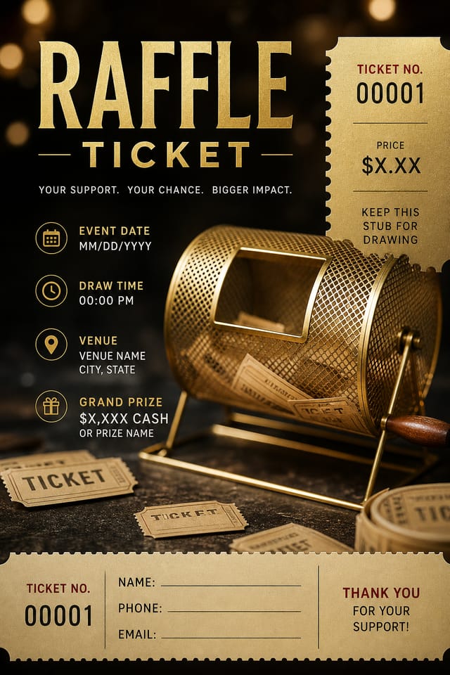
Raffle Ticket : Create Free Raffle Tickets in Minutes with AI
Create Custom Raffle Tickets Quickly with Pixazo Best AI Raffle Ticket Maker. Try for Free!
Get Started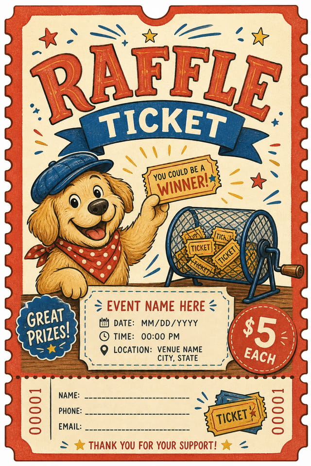
The Raffle Ticket Feature Set: Under the Hood
Export Flexibility
Download your raffle ticket in formats suited for your use case. Web-optimized versions for digital display, high-DPI files for print.
Subcategory Awareness
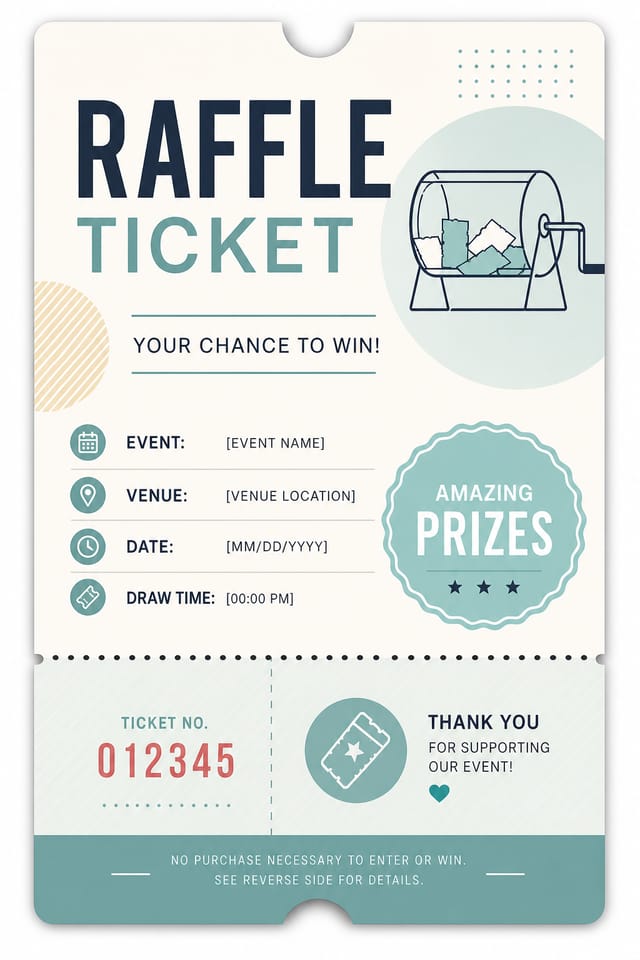
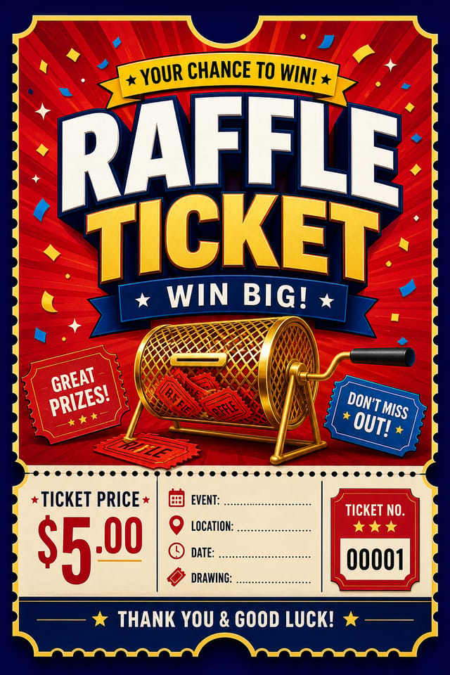
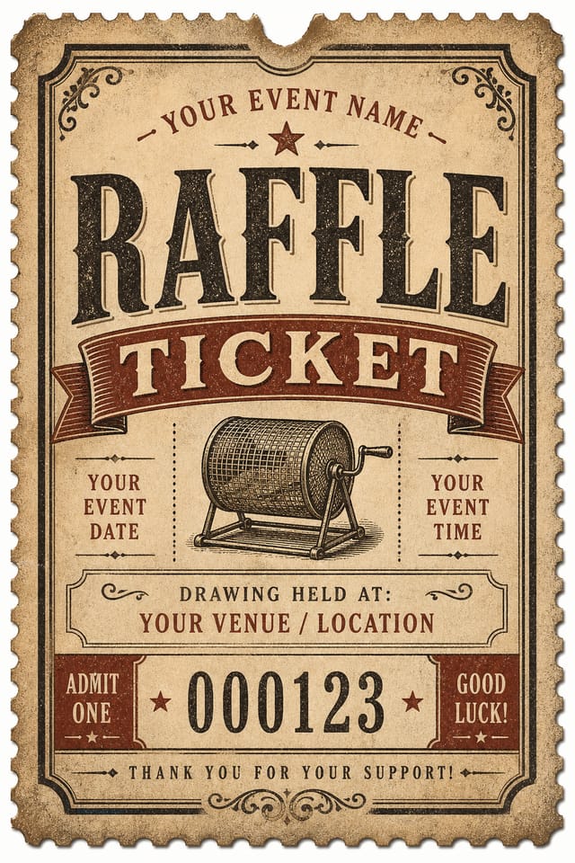
The AI distinguishes between design subcategories. A raffle ticket request produces raffle-appropriate output, not a generic design with raffle text added.
Layered Style Application
Combine raffle style with other design parameters in a single prompt. The AI interprets complex requests and applies multiple style constraints simultaneously.
Consistency Across Variants
Generate multiple raffle tickets for a project and maintain visual consistency across the set. Specify your core design parameters and vary secondary elements.
Get Your Raffle Ticket: Three Easy Steps
Kick Off the Design
Start with a text description of your raffle ticket concept. Specify the visual style, colors, layout direction, and key text. Detailed prompts produce more accurate raffle ticket designs than general ones.
Test the Initial Output
Pixazo generates your raffle ticket in seconds. Review the design and adjust your prompt to refine specific elements: change the color palette, shift the layout weight, or add visual elements you want included.
Fine-Tune Your Design
Refine the raffle ticket by updating your description with precise changes. Add constraints you didn't include initially or remove elements that aren't working. The AI responds to specific direction.
Tie Off the Design
Download your completed raffle ticket in the format that fits your use case. High-resolution files for print, web-optimized versions for digital, or PDF for production-ready delivery.
Raffle Ticket Specifications
Watch: Creating Raffle Ticket designs step by step
Raffle Ticket Essentials: The Essentials
The AI recognizes raffle design as a distinct visual category with its own conventions. Specifying raffle style in your prompt triggers appropriate design decisions around color, typography, and composition rather than defaulting to generic poster layout.
Generate your initial raffle ticket, review the output, then modify your prompt to adjust specific elements. Each regeneration produces a fresh design incorporating your changes. Most users reach their final raffle ticket design within two to four iterations.
Specify the dimensions in your prompt. Common formats like A3, 18x24 inches, or 1080x1920 pixels for social media stories all work. The AI generates a raffle ticket composition appropriate for the specified aspect ratio and use case.
Include the target language in your prompt when generating raffle tickets with non-English text. The AI selects typographic approaches appropriate for the language and applies raffle design conventions to the overall layout regardless of language.
Designs generated through Pixazo are yours to use as you see fit. You retain full usage rights for commercial and personal applications. The platform does not claim ownership over your generated raffle ticket output.
Raffle Ticket Capabilities: A Complete Tour
AI Generation
Convert text prompts into polished raffle ticket designs with contextual understanding
Style Transfer
Apply different visual styles to your raffle ticket while maintaining layout integrity
Color Palettes
AI-suggested color combinations that work for raffle ticket design conventions
Real Raffle Ticket Projects: In the Real World
Professional Projects
Create raffle tickets for client work, commercial campaigns, and professional applications where quality and style accuracy matter.
Trade Show and Conference Materials
Generate raffle tickets for booth displays, attendee handouts, and event signage. Professional materials that represent your brand in competitive environments.
Social Media Content
Design raffle tickets sized for social platforms. Get content that looks intentional and well-crafted, not thrown together.
Wedding and Celebration Planning
Create raffle tickets for invitations, signage, and event branding. Cohesive visual systems that carry a celebration's theme across every touchpoint.
Inside Raffle Ticket AI: Speed and Quality
Raffle Ticket Dos and Don'ts: What to Do and What to Avoid
Maintain brand alignment
Keep your raffle ticket design consistent with existing brand colors, fonts, and visual language for a cohesive identity.
Test with real content
Never finalize a raffle ticket with placeholder text. Real copy often has different lengths and line breaks that affect the design.
Optimize for the display medium
Tailor your raffle ticket resolution, color space, and text size to the specific platform or physical context where it will appear.
Ignore accessibility
Low-contrast text and tiny font sizes in your raffle ticket exclude a significant portion of your potential audience.
Overcrowd the layout
Filling every pixel of your raffle ticket with content makes it harder to read and reduces the impact of every individual element.
Forget the call to action
A raffle ticket without a clear next step for the viewer is a missed opportunity. Always include direction on what to do next.
Current Raffle Ticket Directions: What Is Popular Now
Retro Revival
Vintage aesthetics from the 1970s and 1990s are influencing raffle ticket design with textured backgrounds, serif fonts, and warm gradients.
Muted Earth Tones
Natural color palettes with warm neutrals and desaturated greens are replacing the bright neon trends of previous years in raffle ticket work.
Organic Shapes
Flowing, irregular forms are replacing sharp geometric shapes in raffle ticket backgrounds and decorative elements for a softer visual feel.
Brutalist Design
Raw, intentionally unpolished raffle ticket aesthetics with stark contrasts and unconventional layouts are carving a niche in creative industries.
Copy-Paste Raffle Ticket Prompt Templates
Copy any prompt below and paste it into Pixazo to generate your design instantly.
Raffle ticket design, clean layout, strong typography hierarchy, appropriate color palette for raffle aesthetic, high contrast between headline and backgroundPortrait-orientation raffle ticket, vertical composition, headline at natural reading entry point, supporting information flows downward logicallyClean raffle ticket design, geometric structure, disciplined typography, color accent used selectively for emphasis, printer-optimized resolutionMonochromatic raffle ticket, single-hue palette with value variation for contrast, typographic hierarchy creates visual interest without color complexityLarge-format raffle ticket design, elements sized for visibility at print scale, no fine detail that would be lost in productionTwo-color raffle ticket design, high contrast between primary and secondary color, clean separation between graphic and text zonesRaffle Design Community: Spotlights and Showcases
Real creators sharing their raffle designs made with Pixazo AI.
Square raffle ticket at 1080x1080 for LinkedIn post, professional tone, balanced text-to-visual ratio, brand-safe composition
Refined raffle aesthetic ticket, sophisticated color relationships, intentional negative space, type selection matching raffle conventions
Raffle ticket for outdoor billboard at 14x48 feet, extreme readability at distance, three-word headline max, high contrast backgroundThe Reality of Raffle Ticket AI: What It Cannot Do
Known limitations and trade-offs of AI-generated raffle design. AI raffle ticket generation produces strong results within its design domain. These notes describe where human judgment and manual work remain necessary.

