GPT Image 2.5 Prompt Guide: How to Write Prompts That Get the Image You Want
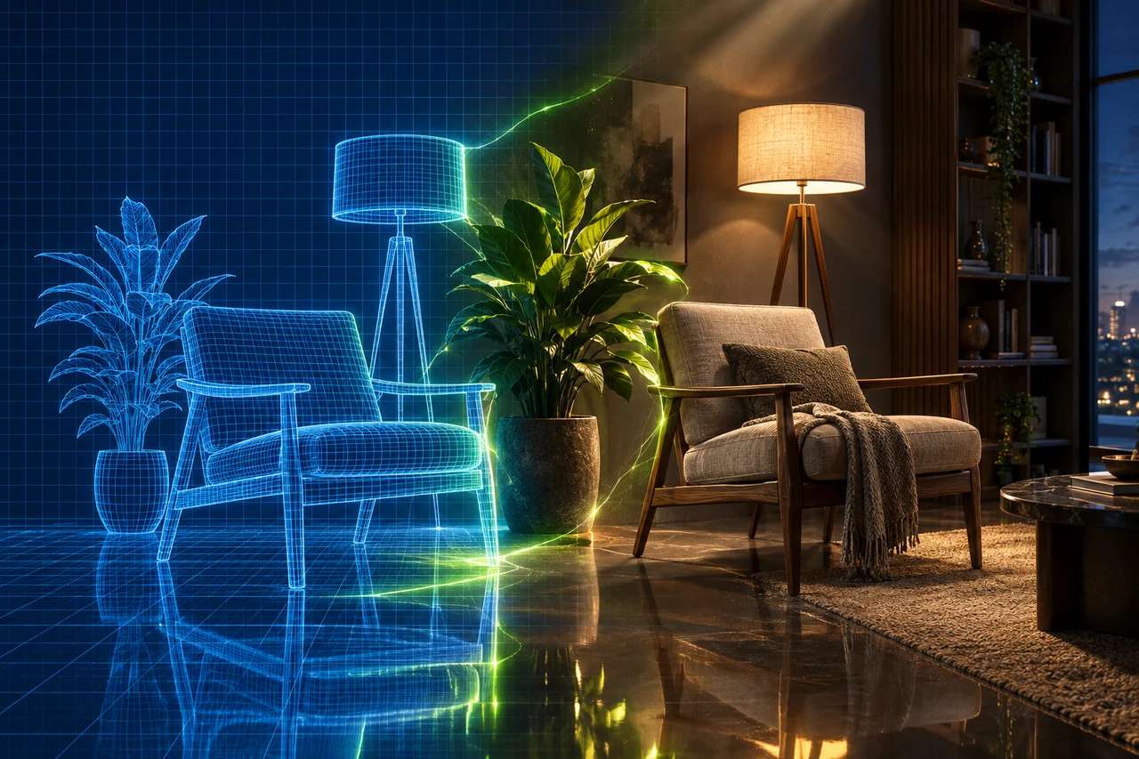
A great image starts with a great prompt. The GPT Image 2.5 API reads a prompt the way GPT reads a sentence — it follows multi-part instructions, renders real on-image text, and edits pictures from plain language — so the more precisely you describe what you want, the closer the result. This GPT Image 2.5 prompt guide turns OpenAI’s official image-prompting advice into a practical, step-by-step playbook, with real GPT Image 2.5 renders at every step. Every image below was generated from the exact prompt shown.
The anatomy of a great prompt
OpenAI’s first rule is define the result before you write. Decide the subject, the intended use (product photo, poster, diagram), the composition and the aspect ratio — then build the prompt from four parts. Think of it as a blueprint with four labelled layers:
SUBJECT
DETAILS
CONSTRAINTS
A sunlit Scandinavian kitchen at breakfast time,
a ceramic pour-over coffee set on the counter,
soft morning window light, matte materials, shallow depth of field, warm neutral tones, 50mm look,
no text, no brand logos, landscape 3:2.
Scene sets the world. Subject is the hero and what it’s doing. Details are the visible specifics — materials, light, colour, medium, camera cues. Constraints are the guardrails: what to exclude, the aspect ratio, and anything that must stay fixed. The order matters less than the coverage: if all four parts are present, the model has enough to work with. For long requests, don’t rely on a run-on sentence — label the sections outright (Scene:, Subject:, Details:, Constraints:) or split them onto lines. A readable, editable structure beats clever syntax or hidden keywords every time.
Suggested Read: Introducing GPT Image 2.5 API on Pixazo API
Vague vs specific: the same idea, upgraded
The single biggest lever is specificity. Here is the exact same subject — a cup of coffee — run through GPT Image 2.5 twice, at the same size and quality. Only the prompt changed.
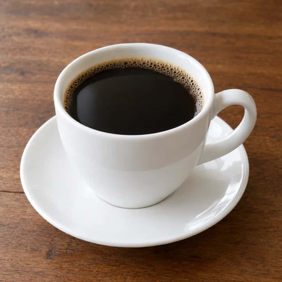
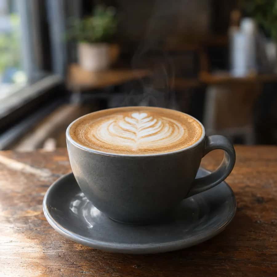
Specificity isn’t padding — every named detail removes a decision the model would otherwise guess. If a detail matters (a colour, a material, where the light comes from), say it. If it doesn’t, leave it out and let the model choose. The goal is a prompt where nothing important is left to chance.
Suggested Read: How to Make an 8-Bit Sprite Sheet GIF From Your Photo
Describe what is actually visible
The model renders what you name, so name the things a camera would see rather than the mood you feel. The portrait below came from one prompt that spelled out framing, light, texture and lens — note the visible skin texture and soft window light it produced:
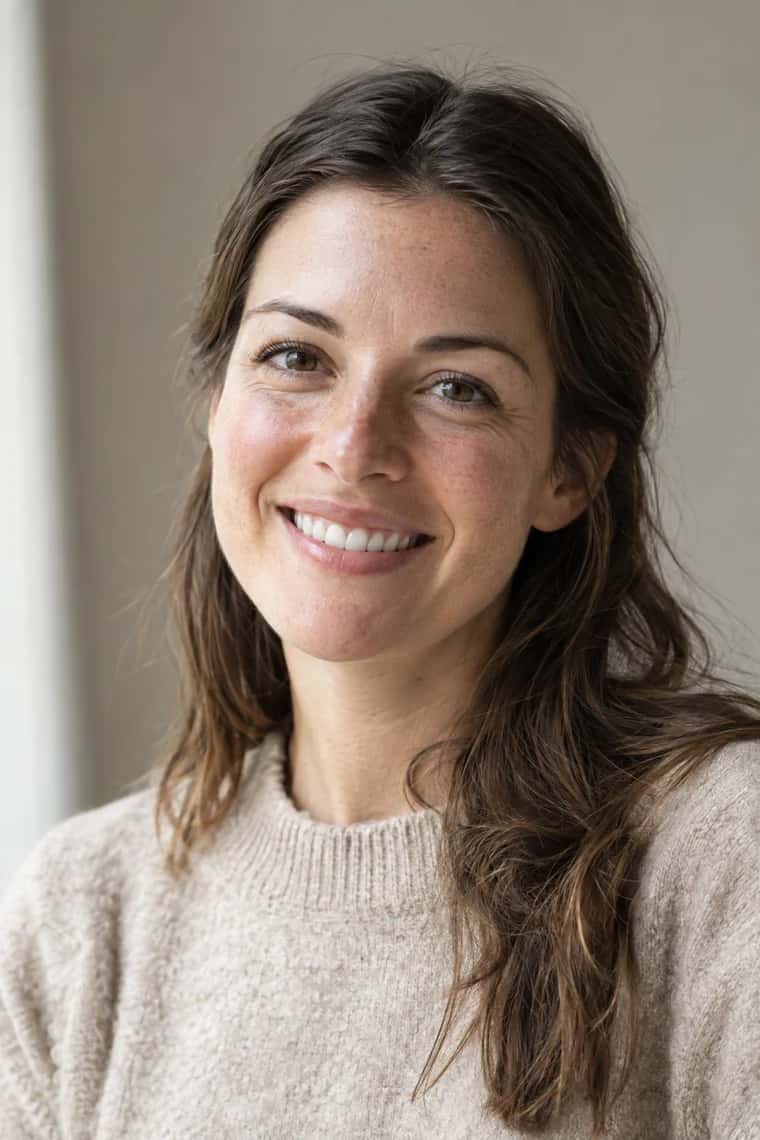
- Materials & medium. “Brushed aluminium,” “matte ceramic,” “hand-painted oil on canvas,” “flat vector illustration.” If you want a photograph, ask for “photorealistic” directly.
- Light & colour. Direction, softness and palette: “soft coastal daylight from the left,” “single hard flash,” “warm amber tones with deep shadows.” Lighting does more for realism than almost any other cue.
- Framing & camera as cues. “Medium close-up at eye level,” “wide establishing shot,” “shallow depth of field,” “50mm,” “top-down flat lay.” Treat lens specs as appearance hints, not exact optics.
- People & actions. Spell out body framing, scale, gaze and interaction: “full body, feet included,” “looking down at the open book,” “hands gripping the handlebars.”
- Atmosphere over adjectives. For wide, cinematic or low-light scenes, describe the scale and conditions instead of leaning on “epic” or “moody” alone.
- Say what to leave out. Exclusions are description too: “no text, no watermark, no extra people, plain background.”
Suggested Read: Best AI Headshot Generator Apps in 2026 (Tested & Ranked)
Get the text right
Legible, correct text is where GPT Image 2.5 pulls ahead of older image models — but it still needs help. Put required wording in quotation marks, say where it goes and how it looks, spell unusual words letter by letter, control the quantity (“no extra text”), and raise quality to medium or high for small or dense type. The poster below rendered its exact quoted copy cleanly:
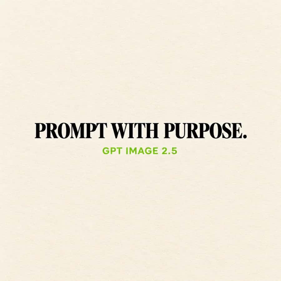
Always read the output back — even strong models occasionally drop or duplicate a letter, and a five-second check beats shipping a typo.
Editing: separate the change from what must stay
GPT Image 2.5 also edits existing images from a sentence. The trick is to be explicit about both sides of the edit — what changes and what must be preserved:
- State “change only X.” Then list what to keep: identity, facial features, geometry, layout, lighting, labels, background.
- Preserve identity on clothing swaps. “Keep the face, skin tone, hairstyle, body shape and pose exactly the same; change only the jacket.”
- Remove objects surgically. Name the object, and keep the person, pose, lighting and composition unchanged so the edit stays local.
- Insert a person into a scene. Preserve identity and proportions while specifying natural lighting, believable contact shadows and where they look.
- Sketch to render. Keep the layout and perspective, add realism via materials and lighting, and add “do not add new elements or text.”
- For pixel-identical regions, composite the approved edit back over the original — repeated edits can drift even when you ask them not to.
Note: transparent backgrounds are not available on GPT Image 2.5 on Pixazo — the background setting supports opaque and auto only, so plan cut-outs on a solid colour you can key out later.
Suggested Read: Best Image Editing APIs in 2026
Give your references a job
The editing endpoint accepts multiple images (up to 16). When you pass more than one, identify each by number and purpose and explain how they combine: “Image 1 is the subject, image 2 is the style, image 3 is the background. Place the subject from image 1 into the background of image 3, keeping their pose and face, using the palette and texture of image 2.” Assign every reference a role — subject, style, clothing, background — and say exactly what moves where. For style transfer, describe the new subject separately from the reference you’re borrowing the palette or medium from, so the model doesn’t copy the reference’s content by accident.
Sizes, aspect ratios and quality
Composition starts with the frame, so set size deliberately. GPT Image 2.5 supports square (1024×1024), landscape (1536×1024), portrait (1024×1536), 2K and 4K presets, plus custom sizes (each edge a multiple of 16, longest edge ≤3,840px, aspect ratio within 3:1).
- Portrait (4:5, 1024×1536) for people, products and social posts.
- Landscape (3:2, 1536×1024) for scenes, banners and blog heroes.
- Square (1:1) for avatars, icons and grid posts.
Then set quality to match the job: low for quick drafts, medium for previews, high for finished work and small text, max for hero and print shots. Higher isn’t automatically better — change one setting at a time and weigh cost against the improvement you actually see.
Suggested Read: 10 Best AI Image Inpainting Tools to Edit Photos Like a Pro
Flare or Sunburst?
GPT Image 2.5 comes in two versions on Pixazo. Flare is the small, fast model, with quality on par with GPT Image 2 — start here for high-volume or latency-sensitive work. Sunburst is the higher-quality model — reach for it on complex scenes, dense text and demanding edits. A good migration habit: start on Flare, and move a workload to Sunburst only if Flare’s quality falls short on your hardest prompts.
Copy-paste prompt recipes
Templates that follow the blueprint above. Swap the bracketed parts for your own, then paste them into GPT Image 2.5. The diagram below, for instance, came straight from the “diagram / infographic” recipe:
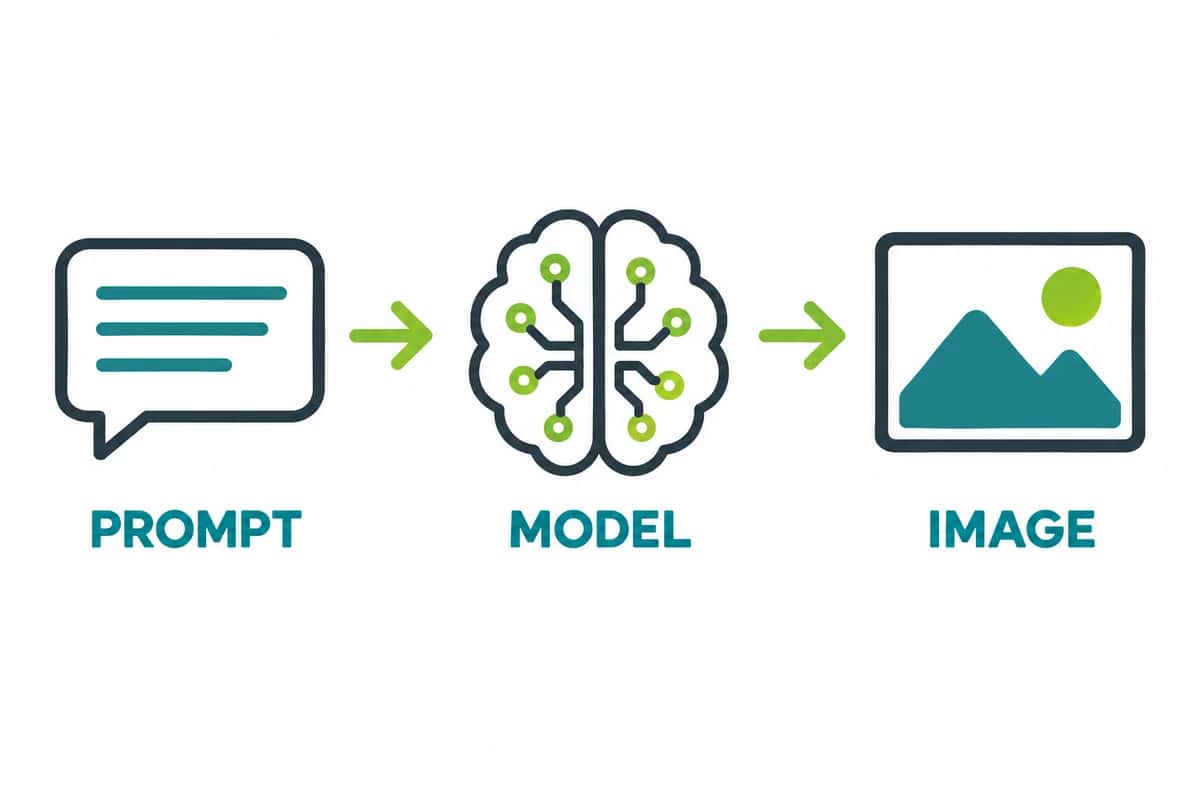
◉ PHOTOREAL PORTRAIT
A photorealistic medium close-up portrait of [person], at eye level, [soft natural window light] from the [left]. Visible skin texture and pores, natural expression, shallow depth of field, [warm neutral] tones, 50mm look. No heavy retouching, no text. Portrait 4:5, high quality.
◉ PRODUCT SHOT
A photorealistic product shot of [product] on [surface], [soft studio light] from the [left], subtle contact shadow, [material] finish, shallow depth of field, clean composition, commercial photography. No text, no logos. Landscape 3:2, high quality.
◉ POSTER WITH TEXT
A [minimalist] poster on a [cream] background. Bold [serif] headline centered that reads exactly: "[YOUR HEADLINE]". Smaller line beneath that reads exactly: "[YOUR SUBLINE]". Generous white space, crisp legible typography, print-ready. No other text. Square 1:1, high quality.
◉ LOGO MARK
A clean, modern logo for [brand], built from [simple geometric shapes], [two-colour] palette, centered on a solid [white] background with generous padding. Legible at small sizes, flat vector style, no photographic detail, no extra text beyond "[BRAND]". Square 1:1, high quality.
◉ DIAGRAM / INFOGRAPHIC
A clean flat infographic explaining [process] for [audience]. Show [3-4 steps] left to right with clear arrows, consistent icon style, readable labels that read exactly: "[STEP 1]", "[STEP 2]", "[STEP 3]". Plenty of white space, limited colour palette, no clutter, no stock photos. Landscape 3:2, high quality.
◉ UI MOCKUP
A realistic mobile app screen for [product] as if it already exists. Focus on layout, hierarchy and spacing with real interface elements: a top bar reading "[TITLE]", a list of [items], and a primary button reading "[ACTION]". Clean modern UI, legible type, no concept-art styling. Portrait 4:5, high quality.
◉ EDIT (CHANGE ONLY X)
Edit this photo: change only [the jacket to a red denim jacket]. Keep everything else identical — the face, facial features, skin tone, hairstyle, body shape, pose, background and lighting must stay exactly the same. Do not add or remove any other elements or text.
Suggested Read: Create Stunning Slides With Nano Banana Pro on Pixazo
Common mistakes to avoid
- Mood words instead of visible detail. “Beautiful, epic, stunning” tell the model nothing it can draw — describe what makes it so.
- Un-quoted text. If the exact words matter, quote them, or expect paraphrasing.
- Editing without preservation. “Add a hat” without “keep everything else the same” invites the model to redraw the whole face.
- Changing several things at once. You won’t know which instruction helped — move one lever per iteration.
- Over-stacking the prompt. Twenty competing clauses confuse the model. Cover the four parts, name what matters, stop.
- Wrong aspect ratio. A portrait subject in a landscape frame wastes half the image — set
sizebefore you generate.
Iterate deliberately
- Change one thing at a time so you can see which tweak helped.
- Feed the last output back in as the next edit’s input to keep continuity across a sequence.
- Repeat the constraints that matter. “Same style as before” carries context, but restate the critical ones if results drift.
- Keep established details — character, composition, styling — across generations so a set looks like it belongs together.
- Judge on a checklist: instruction-following, identity and product preservation, text accuracy, unwanted changes. Regenerate a few times to gauge consistency, not a lucky single result.
Frequently Asked Questions
How do I write a good GPT Image 2.5 prompt?
Decide the result first, then build the prompt from four parts — scene, subject, details and constraints. Name the visible specifics (materials, light, colour, camera cues), put any required text in quotation marks, and state what to exclude. Specific beats vague every time.
How do I get correct, legible text in an image?
Put the exact wording in quotation marks, say where it goes and how it looks, spell unusual words letter by letter, and add “no extra text.” Use medium or high quality for small or dense text, and always read the output back to verify spelling.
How do I edit an image without changing everything?
Say “change only X” and explicitly list what must be preserved — identity, geometry, layout, lighting, labels. For regions that must stay pixel-identical, composite the approved edit back over the original in an editor.
What sizes and aspect ratios does GPT Image 2.5 support?
Square (1024×1024), landscape (1536×1024), portrait (1024×1536), 2K and 4K presets, and custom sizes — each edge a multiple of 16, longest edge up to 3,840px, aspect ratio within 3:1. Pick portrait for people, landscape for scenes, square for avatars.
Should I use Flare or Sunburst?
Start with Flare for speed and high-volume work; its quality is on par with GPT Image 2. Move to Sunburst when a complex scene, dense text or a demanding edit needs the extra quality.
Does a higher quality setting always give a better image?
No. Higher settings render more detail but don’t improve every prompt. Compare quality levels on your own prompts, change one setting at a time, and use the lowest tier that meets your bar.
Deepak Joshi
Author · Pixazo
Deepak writes about generative AI models, APIs, and the workflows teams use to ship them. Reviewed by Abhinav Girdhar.