How to Make an Infographic in 6 Steps (With Examples)


An infographic turns a wall of data into something people actually look at — and remember. The good news is you do not need a design degree or expensive software to make one. This guide breaks it down into 6 simple steps, with examples, and shows you how to generate a finished infographic in minutes with the AI infographic maker. By the end you will have a repeatable recipe for turning any topic into a clean, shareable visual.
What makes a good infographic?
Before the steps, know what you are aiming for. A strong infographic does three things: it sticks to one clear topic, it has an obvious visual hierarchy so the eye knows where to start, and it lets the data do the talking through charts and icons instead of long paragraphs. If a reader can get the main point in five seconds and the detail in thirty, you have nailed it. Everything below is in service of those three goals.
Infographics earn their keep almost everywhere: in blog posts to break up text, on social media where visuals get far more shares than plain links, inside presentations and slides to explain a process at a glance, in reports and whitepapers to summarise findings, and even in print for flyers and posters. Because a single graphic can travel across all of those places, an hour spent making one clear infographic often does the work of a dozen paragraphs — and a quick grounding in the colour wheel will make every one of them look more intentional.
How to make an infographic in 6 steps
Start with one focused question your infographic answers. Collect the numbers, quotes and facts you need, and check your sources — an infographic is only as trustworthy as the data behind it. Trim ruthlessly: you want the five or six points that matter, not twenty. A tight topic is what separates a graphic people share from one they scroll past.
Match the format to the data. Statistics shine in a statistical infographic; a how-it-works story suits a process or timeline; two options call for a comparison; and a set of tips fits a list. Pick the type first and the layout almost designs itself.
Sketch the flow before you design: a strong headline, three to five sections that build in order, and one clear takeaway at the end. A good infographic reads top to bottom like a short story — setup, detail, conclusion. Doing this on paper first saves hours later, because you fix the story before you ever touch the colours or charts.
Keep it tight: two or three colours and no more than two fonts. Use one accent colour to highlight the most important numbers, and make sure there is enough contrast to read at a glance. A colour palette tool makes this painless.
Now turn data into graphics. Bar and line charts for trends, pie or donut charts for shares, icons to label sections, and plenty of white space so nothing feels crowded. Every visual should earn its place — if it does not aid understanding, cut it. A simple chart the reader grasps instantly always beats a clever one they have to decode.
Export at the right size for where it is going — tall for Pinterest and Instagram, wide for a blog or slide, high-resolution for print. Add a small source line and your logo, and it is ready to publish. If you plan to post it in several places, export a couple of sizes at once so you are not re-cropping it later.
Suggested Read: 41+ Best Infographic Examples Depicting Raw Data Into Graphics
Infographic types (with examples)
The type you pick shapes the whole layout, so it is worth seeing a few side by side. Here are three of the most useful types, each made with Pixazo’s AI infographic maker. Notice how the structure changes with the job — stats sit in tidy blocks, a process flows down the page, and a comparison splits into two columns. Use them as a starting point and swap in your own data:
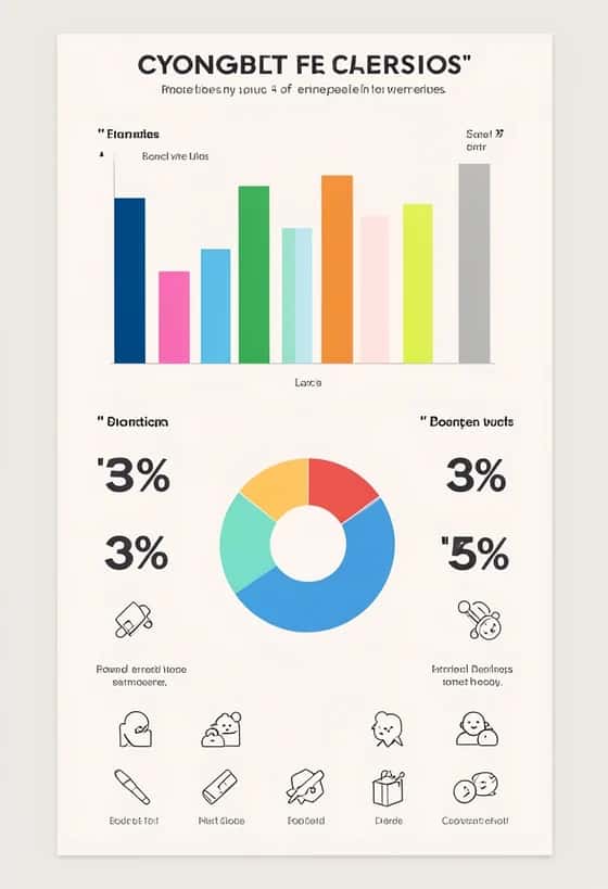
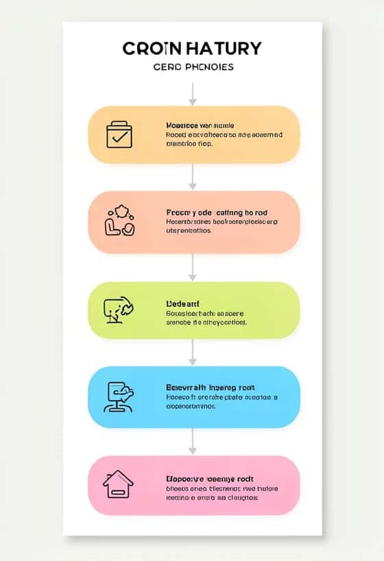
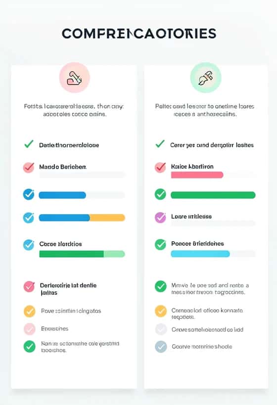
Want more inspiration? Browse these 41+ infographic examples for layouts you can borrow.
Suggested Read: Best AI Infographic Makers in 2026: Top Tools Compared
How to make an infographic with AI
- Open the infographic maker. Open the AI infographic maker and click Get Started. It loads a prompt-based infographic generator in the Pixazo playground.
- Describe your infographic. Say your topic, the type and the data points in plain words — for example, ‘statistical infographic on remote-work trends, five stats, blue and lime, clean’.
- Generate and refine. Hit Generate and the AI lays out a complete infographic for you. It uses a few credits, and new accounts get 300 free to start. Generate a couple of versions and keep the clearest.
- Download and publish. Download it at full resolution, then post it, add it to a blog, or print it. Reuse the same style so your infographics look like a set.
Suggested Read: 15 Best Color Palette Generators for Designers in 2026
5 tips for infographics that get shared
- One topic per graphic — if you need two messages, make two infographics.
- Round your numbers; ‘73%’ lands harder than ‘72.9%’.
- Use white space generously — crowding is the fastest way to lose a reader.
- Keep one accent colour for the key stat so the eye goes straight to it.
- Add a source line — it makes your data (and you) look credible.
Suggested Read: 11 Best Poster Makers to Explore
Turn your next idea into a graphic
Making an infographic comes down to six steps: pick a focused topic, choose the right type, outline the flow, keep your colours and fonts tight, let charts and icons carry the data, and export at the right size. Follow that recipe and any topic — a report, a how-to, a comparison — becomes something people want to share. When you would rather skip straight to the finished piece, describe it in the AI infographic maker and let it do the layout for you, free to start and ready in minutes. The more you make, the faster it gets: before long you will have a house style, and every new infographic will be a quick swap of data rather than a blank canvas — which is exactly how the brands with the most shareable visuals keep the quality consistent.
Suggested Read: 10 Best AI Presentation Maker Tools in 2026
Frequently Asked Questions
Q. How do I make an infographic for free?
Open Pixazo’s AI infographic maker, describe your topic, type and data points, then generate and download your infographic. New accounts get 300 free credits to start, and there is no watermark.
Q. What are the main types of infographics?
The most common are statistical (numbers and charts), process or how-to, timeline, comparison, list, and geographic or map-based. Choose the type that fits your data before you start designing.
Q. How long should an infographic be?
Long enough to tell one clear story and no longer. Most work well with a headline, three to five sections, and a single takeaway. If you have two messages, make two infographics.
Q. What size should an infographic be?
Match it to where it will live: tall vertical formats for Pinterest and Instagram, wide for blogs and slides, and high resolution for print. Export in the right size so nothing is cropped.
Q. What makes a good infographic?
One clear topic, a strong visual hierarchy so the eye knows where to start, tight colours and fonts, and data shown through charts and icons rather than long paragraphs. Readers should get the main point in about five seconds.
Deepak Joshi
Author · Pixazo
Deepak writes about generative AI models, APIs, and the workflows teams use to ship them. Reviewed by Abhinav Girdhar.