What Is a Color Wheel? A Guide to Using Colors in Design


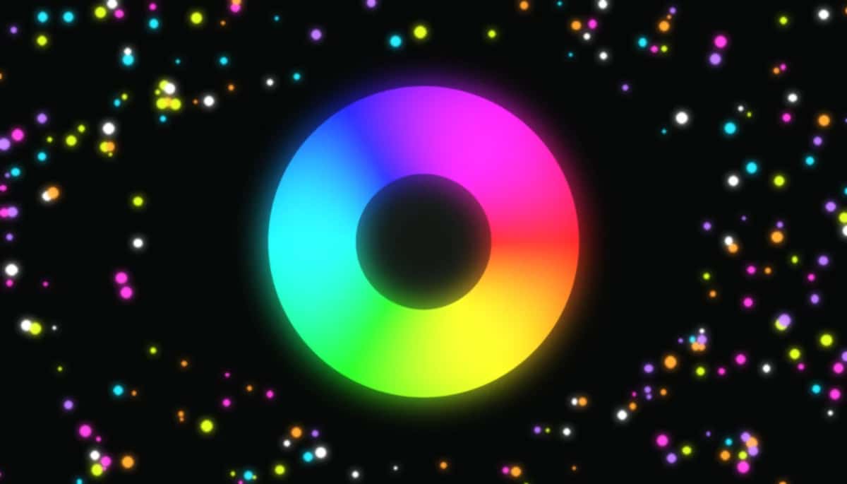
A color wheel is the single most useful tool in design — a circle of hues arranged so that the colors which look good together sit in predictable places. Learn to read it once and you can build a palette for a logo, a room or a website without guessing. This guide explains what a color wheel is, how primary, secondary and tertiary colors fit on it, and the harmony rules that turn it into a palette machine.
COLOR WHEEL
What is a color wheel?
A color wheel is a circular diagram of colors arranged by their chromatic relationship. First sketched by Isaac Newton in 1666, it bends the spectrum into a loop so that related hues sit side by side and opposite hues face each other. Designers use it to choose combinations that feel balanced instead of random.
Suggested Read: How to Change Background Color Using AI
A short history of the color wheel
The idea is more than 350 years old. Isaac Newton bent the spectrum into the first circle in 1666, joining red and violet so colour became a loop. In 1810 the writer Johann Wolfgang von Goethe added the emotional and psychological side of colour. A century later, at the Bauhaus, Johannes Itten drew the 12-spoke artist’s wheel that most designers still reach for today, and Albert Munsell built colour into a three-dimensional system of hue, value and chroma that underpins the digital colour pickers we use now. Different wheels, one goal: arrange colour so the relationships between hues are impossible to miss.
Primary, secondary & tertiary colors
The traditional artist’s wheel is built in three layers:
Primary — red, yellow and blue — can’t be mixed from other colors. Mix two primaries and you get a secondary:
Mix a primary with its neighbouring secondary and you get the six tertiary colors (red-orange, yellow-orange, yellow-green, blue-green, blue-purple, red-purple) — twelve hues in all.
Suggested Read: The Meaning of Shapes in Design
RYB, RGB and HSL: which wheel is which
The traditional artist’s wheel uses RYB primaries (red, yellow, blue) because it was built for paint. Screens mix light, so they use RGB (red, green, blue); print uses CMYK. On a computer you’ll most often choose a colour with HSL — hue (its position on the wheel, from 0° to 360°), saturation (how vivid it is) and lightness (how light or dark). HSL is the most wheel-like of the digital models: dialing the hue angle is literally spinning the wheel. The good news is that the harmony rules below work in every model, because they describe angles, not any one set of primaries.
Warm vs cool colors
Split the wheel in half and one side feels warm (reds, oranges, yellows — energetic, advancing) while the other feels cool (greens, blues, purples — calm, receding). Balancing warm and cool is the fastest way to control the mood of a design. A trick many designers use: let one temperature dominate — say warm for most of the layout — and bring in the opposite temperature only as a small accent. It adds depth and draws the eye without unbalancing the palette.
Suggested Read: 15 Best Color Palette Generators for Designers
The 6 color harmonies
A harmony is a rule for picking positions on the wheel. Each one gives a different feel — the white dots below show where each scheme lands:
Complementary
Two opposite hues. Maximum contrast and energy — great for calls to action.
Analogous
Three neighbours. Calm and cohesive, like nature; pick one to dominate.
Triadic
Three evenly spaced hues. Vibrant yet balanced — bold but not jarring.
Split-complementary
A hue plus the two beside its complement. High contrast, easier to balance.
Tetradic
Two complementary pairs. Rich and varied — let one colour lead.
Monochromatic
One hue, many tints and shades. Elegant, minimal and foolproof.
Suggested Read: Best Image Color Picker Tools in 2026
What different colors mean
Where a colour sits on the wheel is only half the story — each hue also carries emotional weight. Pairing the right harmony with the right mood is what makes a palette feel on-brand rather than merely balanced:
Energy, passion and urgency. Grabs attention — great for sales and calls to action, risky in large doses.
Warmth, friendliness and affordability. Playful and inviting without the intensity of red.
Optimism and attention. Cheerful in small hits; tiring as a dominant colour.
Growth, nature and calm. The easiest colour on the eye and a favourite for health and finance.
Trust, calm and professionalism. The most widely used brand colour for good reason.
Luxury, creativity and wisdom. Feels premium and imaginative.
So a wellness brand might take an analogous set of greens and blues for calm, while a sports brand reaches for a complementary red-and-green clash for energy. The wheel gives you the structure; psychology tells you which structure to pick.
3 color-wheel mistakes to avoid
- Using every colour equally. Even a triadic or tetradic scheme needs one dominant hue, one or two supporting colours and an accent — roughly a 60/30/10 split. Equal weighting looks chaotic.
- Ignoring contrast and accessibility. Two colours can be a perfect harmony and still fail as text on a background. Check contrast so your type stays readable.
- Forgetting neutrals. Blacks, whites and greys aren’t on the wheel, but they give your hues room to breathe. A palette is usually a couple of colours plus neutrals, not six loud colours.
Where you’ll use the color wheel
The same wheel shows up everywhere colour decisions are made. In branding, a complementary pair makes a logo pop; in web and UI design, an analogous base with one complementary accent keeps buttons obvious without clashing. Interior designers balance a warm wall against cool furnishings, fashion stylists lean on triadic combinations for bold outfits, and artists use complements to make shadows richer. Learn the wheel once and every one of these decisions gets faster.
How to use a color wheel in 3 steps
Pick a base hue that fits your brand or mood on the color wheel.
Choose a harmony — complementary for punch, analogous for calm, triadic for balance.
Copy the HEX codes and drop them into your logo, poster or website.
Suggested Read: Color Mixer Guide: How to Mix Colors Digitally
Conclusion
The color wheel turns colour from guesswork into a system: primaries build the hues, warm and cool set the mood, the harmonies hand you ready-made palettes, and a little colour psychology tells you which palette fits the message. You don’t have to memorise any of it — just keep a wheel open while you design and let the structure do the work. The free Pixazo color wheel lets you spin to any hue, pick a harmony and copy the HEX, RGB and HSL codes in seconds, so your colours always feel intentional.
Frequently Asked Questions
Q1. What is a color wheel used for?
It shows how colours relate so you can pick combinations that work — complementary, analogous, triadic and more — for logos, interiors, art and web design.
Q2. What are the 3 primary colors on a color wheel?
On the traditional artist’s wheel they are red, yellow and blue. Every other colour is mixed from these three.
Q3. What are complementary colors?
Colours directly opposite each other on the wheel, such as red and green or blue and orange. They create the strongest contrast.
Q4. What is the difference between warm and cool colors?
Warm colours (reds, oranges, yellows) feel energetic and appear to advance; cool colours (greens, blues, purples) feel calm and recede.
Q5. How do I pick colors that go together?
Choose a base hue, then apply a harmony rule on the colour wheel — analogous for a calm set, complementary for contrast, triadic for balance.
Q6. Is there a free online color wheel?
Yes — the Pixazo color wheel is free: pick a hue, choose a harmony and copy the HEX, RGB and HSL values instantly.
Deepak Joshi
Author · Pixazo
Deepak writes about generative AI models, APIs, and the workflows teams use to ship them. Reviewed by Abhinav Girdhar.