What is Asymmetrical Balance?


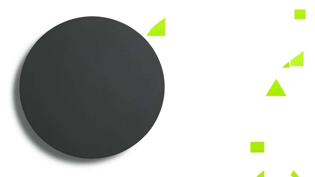
Asymmetrical balance is the design principle of arranging elements of unequal visual weight so a composition still feels settled and stable, without mirroring one side onto the other. It is also called informal balance, and it is the kind of balance behind most modern web pages, posters and magazine spreads. Where symmetrical balance repeats the same thing on both sides of a central axis, asymmetrical balance lets a large element on one side be answered by several smaller ones on the other, so the eye feels an equilibrium even though the two halves are different.
Create with Pixazo AI
Turn a prompt into studio-quality images and videos — free to try.
The payoff is energy. A symmetrical layout feels formal and calm; an asymmetrical one feels dynamic and current, because the viewer senses the tension being resolved. The trick is understanding what makes an element feel heavy, and then using those weights against each other on purpose.
What is asymmetrical balance?
Asymmetrical balance means the two sides of a composition carry roughly equal visual weight while containing different elements. There is no axis of symmetry, yet the design does not tip to one side. Instead of matching a shape with an identical shape, you match it with a different combination that pulls the eye with the same force. A single bold headline can balance a block of small body text; a large photo can balance a cluster of icons and white space.
Because it does not rely on repetition, asymmetrical balance gives you far more freedom than symmetry. It is harder to get right, since you are judging weights by eye rather than copying one half, but it reads as more sophisticated and more alive when it works.
Asymmetrical vs symmetrical balance
The two are opposite approaches to the same goal, a composition that feels stable. The difference is how they get there.
| Aspect | Symmetrical balance | Asymmetrical balance |
|---|---|---|
| Also called | Formal balance | Informal balance |
| How it works | Mirror the same elements on both sides of an axis | Offset different elements of equal visual weight |
| Feel | Calm, formal, stable, traditional | Dynamic, modern, energetic |
| Difficulty | Easier, you copy one half | Harder, you judge weight by eye |
| Best for | Logos, certificates, wedding invites, luxury | Web, editorial, posters, most modern layouts |
What is visual weight?
Visual weight is how strongly an element pulls the eye. Asymmetrical balance is really the craft of trading these weights across a layout, so it helps to know what adds weight.
- ▸Size: Bigger elements are heavier. A large shape outweighs a small one.
- ▸Color and contrast: Strong, saturated or high-contrast colors carry more weight than muted ones. A single bright accent can balance a large neutral area.
- ▸Value: Dark elements usually feel heavier than light ones against a light background.
- ▸Shape and complexity: Dense, detailed or irregular shapes draw more attention than simple ones.
- ▸Position and isolation: Elements near the edge, or isolated in white space, gain weight; a small item alone can hold its own against a larger group.
- ▸Texture: A textured area reads as heavier than a flat one of the same size.
How do you create asymmetrical balance?
You create it by placing elements of different weight so their pull cancels out across the composition. A few reliable moves:
- ▸Put the focal point off-center: Place the main element away from the middle, then answer it from the other side rather than centering everything.
- ▸Counterweight heavy with light: Balance one large, dark or bold element with several smaller, lighter ones grouped opposite it.
- ▸Use white space as weight: Empty space has weight too. A large quiet area can balance a small dense cluster, so let the layout breathe.
- ▸Trade color for size: A small patch of strong color can offset a much larger neutral shape, which is the fastest way to balance unequal sizes.
- ▸Vary angles and alignment: Mixing alignments and angles keeps an off-center layout feeling intentional rather than accidental.
Suggested Read: The Principles of Design
Where is asymmetrical balance used?
Almost everywhere modern, because it suits content that is not symmetrical by nature.
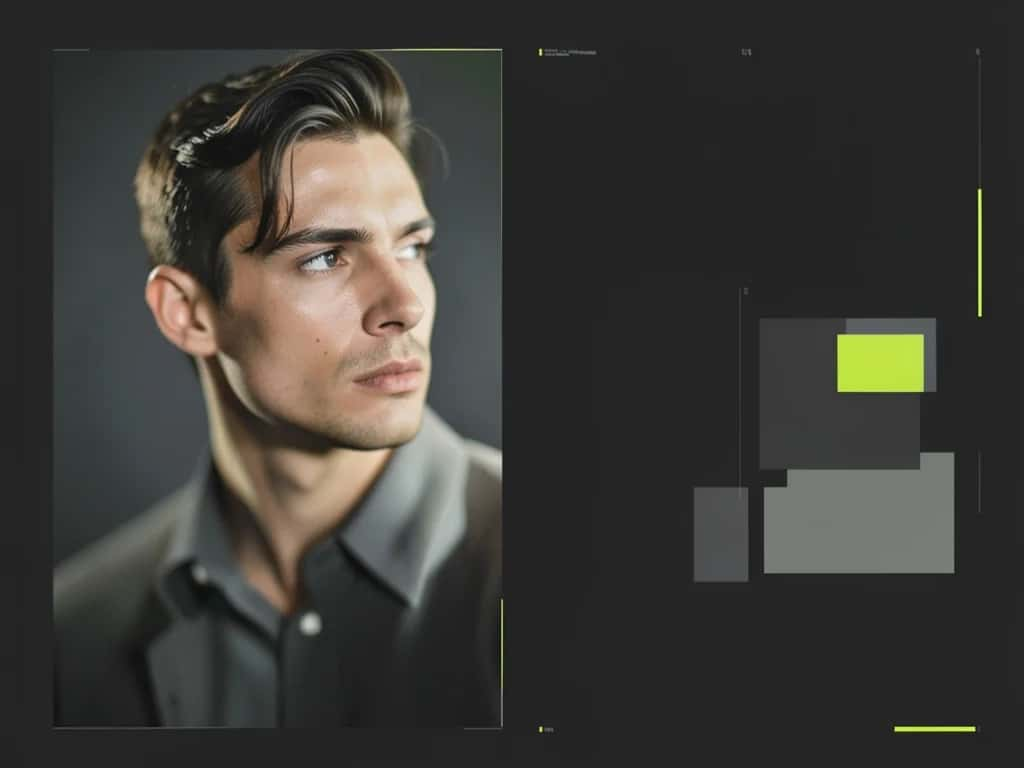
- ▸Web and app design: Hero images, off-center headlines and sidebars rely on asymmetry to feel current.
- ▸Editorial and posters: Magazine spreads and posters use a dominant image balanced by type and negative space.
- ▸Branding and packaging: Off-center logos and labels feel more modern than centered, formal ones.
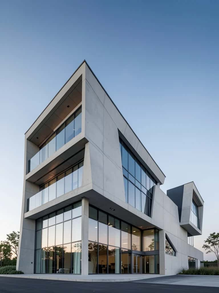
- ▸Architecture and art: From modern buildings to paintings, asymmetry creates movement and interest.
Suggested Read: Symmetry in Design
What mistakes should you avoid?
- ▸Confusing asymmetry with imbalance: Asymmetrical is not random. If one side clearly outweighs the other with nothing to answer it, the layout tips and feels wrong.
- ▸Ignoring white space: Treating empty space as leftover rather than a weight is the most common reason an asymmetrical layout collapses.
- ▸Too many focal points: Several heavy elements fighting for attention cancel the sense of a clear, balanced composition.
- ▸Forgetting the overall field: Balance is judged across the whole canvas, not element by element, so step back and squint to check it.
Suggested Read: Proximity in Design
Suggested Read: What is Symmetrical Design?
How does it relate to other kinds of balance?
Balance comes in a few forms. Symmetrical mirrors elements across an axis. Radial arranges them around a central point. Crystallographic, or mosaic, balance spreads equal weight evenly across the whole surface with no focal point at all. Asymmetrical balance sits apart from all three: it is the one that deliberately uses difference, trading unequal parts to reach the same stable result.
Suggested Read: Types of Balance in Art
Suggested Read: What is Crystallographic Balance?
Why does asymmetrical balance work?
It works because the eye reads weight, not symmetry. When a large, dark, or bold element on one side is answered by enough smaller, lighter, or more isolated elements on the other, the pull evens out and the composition feels resolved, while the difference between the two sides keeps it lively. Learn to see visual weight, counter heavy with light, and treat white space as a real material, and you can build layouts that feel both balanced and modern.
Suggested Read: Asymmetrical Balance in Art
Frequently asked questions
What is asymmetrical balance in simple terms?
It is arranging different elements of equal visual weight so a design feels balanced without mirroring the two sides. A big element on one side is answered by several smaller ones on the other.
What is the difference between symmetrical and asymmetrical balance?
Symmetrical balance mirrors identical elements across a central axis and feels formal and calm. Asymmetrical balance offsets different elements of equal weight and feels dynamic and modern.
Is asymmetrical balance the same as no balance?
No. A balanced asymmetrical layout still feels stable, because the unequal elements cancel each other out. An unbalanced layout tips to one side with nothing answering it.
What is visual weight?
Visual weight is how strongly an element draws the eye. Size, color, contrast, value, shape, texture, position and isolation all add weight, and asymmetrical balance trades these weights across a layout.
How do you achieve asymmetrical balance?
Place the focal point off-center, counter a large or dark element with several smaller or lighter ones, use white space as weight, and trade a small patch of strong color against a larger neutral area.
Why is asymmetrical balance also called informal balance?
Because it does not follow the strict, mirrored structure of symmetry. Its looser, off-center arrangement feels informal and relaxed compared with formal, symmetrical layouts.
When should I use asymmetrical balance?
Use it for web pages, editorial spreads, posters and most modern layouts, where you want energy and movement. Choose symmetry instead when you want a formal, calm or traditional feel.
Is asymmetrical balance harder than symmetrical balance?
Yes, because you judge balance by eye instead of copying one half onto the other. It takes more skill, but it reads as more sophisticated and more dynamic when it works.
Deepak Joshi
Author · Pixazo
Deepak writes about generative AI models, APIs, and the workflows teams use to ship them. Reviewed by Abhinav Girdhar.