What is Symmetrical Design?


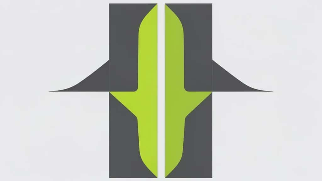
Symmetrical design is the principle of arranging elements so that both sides of a composition mirror each other around a central axis. It is the most intuitive kind of balance, the same one you see in a human face, a butterfly or a cathedral, and it reads instantly as ordered, formal and stable. Because the two halves match, the eye settles in the middle, which is why symmetry is the go-to for logos, luxury brands and anything that needs to feel trustworthy and timeless.
Create with Pixazo AI
Turn a prompt into studio-quality images and videos — free to try.
It is also called formal balance, the opposite of the informal, off-center approach of asymmetry. Symmetry is easier to achieve, since you design one side and reflect it, but used carelessly it can feel static. This guide covers what symmetrical design is, the types of symmetry, when to use it, and how to build it well.
What is symmetrical design?
Symmetrical design places elements of equal visual weight in matching positions on either side of a central line, so one half is a reflection of the other. That central line, the axis, is usually vertical, but it can be horizontal or run through a central point. When the two sides correspond, the composition feels balanced, resolved and calm.
The appeal is clarity and order. A symmetrical layout tells the viewer, at a glance, that everything is deliberate and in its place. That is why it signals quality and trust, and why it has anchored classical architecture, heraldry and formal print for centuries.
What are the types of symmetry?
Symmetry is not only left-and-right mirroring. Three types show up in design:
Most logos and layouts use reflection symmetry. Rotational symmetry suits emblems and badges, while translational symmetry drives patterns and architectural rhythm.
The two are opposite routes to balance. Symmetry mirrors; asymmetry offsets different elements of equal weight.
| Aspect | Symmetrical | Asymmetrical |
|---|---|---|
| Also called | Formal balance | Informal balance |
| How it works | Mirror matching elements across an axis | Offset different elements of equal visual weight |
| Feel | Calm, formal, stable, timeless | Dynamic, modern, energetic |
| Difficulty | Easier, reflect one half | Harder, judged by eye |
| Best for | Logos, luxury, formal, certificates | Web, editorial, posters |
Symmetry is not just a layout choice; it sends a message. Across cultures it reads as:
- ▸Stability and order: Matching sides feel settled and controlled, never accidental.
- ▸Trust and tradition: Formal balance signals establishment and reliability, which suits banks, law and luxury.
- ▸Elegance and harmony: Symmetry is the basis of classical beauty, from faces to facades.
- ▸Clarity: A centered, mirrored layout is easy to read and instantly legible.

Suggested Read: Symmetry in Design
When should you use symmetrical design?
Symmetry is the right call when you want to feel formal, premium or dependable.
- ▸Logos and emblems: Centered, mirrored marks are easy to recognise and feel balanced at any size.
- ▸Luxury and formal brands: Symmetry signals heritage and quality for fashion, spirits and finance.
- ▸Invitations and certificates: Weddings, awards and formal documents lean on centered, symmetrical layouts.
- ▸Architecture and packaging: Mirrored facades and front-of-pack designs feel grand and orderly.
Avoid leaning on it when you want energy or movement. Perfect symmetry can feel static, predictable or even dull, so for dynamic, modern layouts, asymmetry usually works better.
Suggested Read: What is Asymmetrical Balance?
How do you create symmetrical design?
- ▸Set a central axis: Decide where the line of symmetry runs, usually down the vertical center, and build around it.
- ▸Mirror the elements: Place matching elements in corresponding positions on each side so the weights balance.
- ▸Use a grid: A grid keeps spacing even and the two halves truly aligned.
- ▸Balance, do not clone blindly: Near-symmetry, where the sides match in weight but vary slightly, can feel balanced while staying alive.
- ▸Center the focal point: In symmetry the main element usually sits on the axis, so give it room and let it anchor the layout.
Suggested Read: Types of Balance in Art
Where do you see symmetrical design?
Once you look for the axis, symmetry is everywhere:
- ▸Logos: Countless brand marks are built on reflection or rotational symmetry.
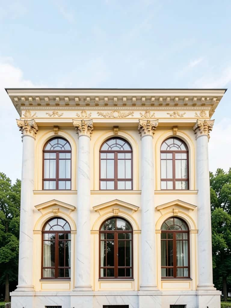
- ▸Architecture: Temples, cathedrals and civic buildings mirror around a central entrance.
- ▸Print and editorial: Title pages, certificates and formal invitations center and mirror their elements.
- ▸Nature: Faces, butterflies, leaves and snowflakes are symmetry’s original templates.
- ▸Interfaces: Centered hero sections and balanced navigation use symmetry for a calm, trustworthy first impression.
Suggested Read: The Principles of Design
Should your design be symmetrical?
Choose symmetry when you want order, formality and trust, a logo, a luxury brand, an invitation or a calm, classic layout. Set a clear axis, mirror elements of equal weight across it, keep spacing even with a grid, and center your focal point. If you want energy and movement instead, reach for asymmetry. Symmetry is the most stable kind of balance there is, and used with intent, it makes a design feel timeless rather than static.
Suggested Read: What is Crystallographic Balance?
Frequently asked questions
What is symmetrical design in simple terms?
It is arranging elements so both sides of a composition mirror each other around a central axis, creating formal, stable balance. A face and a centered logo are classic examples.
What are the types of symmetry in design?
Reflection (bilateral) symmetry mirrors across an axis, rotational (radial) symmetry repeats around a central point, and translational symmetry repeats elements at regular intervals.
What is the difference between symmetrical and asymmetrical design?
Symmetrical design mirrors matching elements across a central axis and feels formal and calm. Asymmetrical design offsets different elements of equal weight and feels dynamic and modern.
Why is symmetrical design used for logos?
Because symmetry reads as balanced, orderly and trustworthy, and centered or mirrored marks stay recognisable and stable at any size.
Is symmetrical balance the same as formal balance?
Yes. Symmetrical balance is also called formal balance, because its mirrored, centered structure feels formal, compared with the informal feel of asymmetry.
When should I avoid symmetrical design?
Avoid it when you want energy, movement or a modern, editorial feel. Perfect symmetry can feel static or predictable, so asymmetry often works better for dynamic layouts.
How do I make a design symmetrical?
Set a central axis, place matching elements in corresponding positions on each side, use a grid to keep spacing even, and center the focal point on the axis.
Is symmetry good or bad in design?
Neither; it is a tool. Symmetry is excellent for formality, trust and clarity, but it can feel static if overused, so match it to the mood you want.
Deepak Joshi
Author · Pixazo
Deepak writes about generative AI models, APIs, and the workflows teams use to ship them. Reviewed by Abhinav Girdhar.