12 Graphic Design Trends Defining 2027

Design trends rarely arrive on a calendar; they build, tip, and settle over years. Heading into 2027, the biggest force reshaping visual work is not a single aesthetic but a reaction. After a few years of fast, frictionless, machine-assisted output, audiences have grown fluent in spotting the default look, and designers are answering by reaching for warmth, craft, dimension, and deliberate intent.
Create with Pixazo AI
Turn a prompt into studio-quality images and videos — free to try.
What follows is less a list of looks to copy and more a map of directions gathering momentum. Some are maturing versions of ideas you already know; others are early signals worth watching. Read together, they describe a year when the question stops being what a machine can generate and starts being what only a designer’s judgment can shape.
The 2027 momentum spectrum
Twelve directions, mapped by how far along each one is, from early signals to looks already everywhere. Scan the spectrum first, then drop into any readout below.
1. Generative Brand Systems
Identities that render themselves, on brief
The AI story in 2027 is not one-off image generation but systems. Studios feed brand rules, tone, and reference libraries into models that output endless on-brand variations, so one identity flexes across thousands of touchpoints without a designer redrawing each. The craft shifts to writing the constraints and art-directing the output, curating rather than rendering. Expect brand guidelines rewritten as prompt frameworks and model settings, not just static PDFs.
appears on Brand systems / Campaign scaling / Design ops
2. Hyper-Expressive Serifs
Theatrical type carrying the whole room
Serifs keep moving away from safe and corporate toward theatrical. In 2027 the energy is in high-contrast display serifs with exaggerated ligatures, swashes, and ink traps pushed past function into ornament. They headline fashion, beauty, and editorial work that wants to feel human and crafted against a sea of neutral geometric sans. Designers pair one loud serif with restrained body type, letting a single headline carry a layout's entire personality.
appears on Fashion / Beauty / Editorial / Packaging
3. Kinetic Variable Typography
Type that breathes as you scroll
Variable fonts finally pay off in motion. Rather than swapping weights, 2027 type responds continuously to scroll, cursor, audio, and viewport, with weight, width, and slant shifting in real time. Performance budgets force restraint, so the best work animates one axis meaningfully instead of everything at once. The result reads as living text: a headline that breathes as you scroll, or a logo that thickens on interaction, all from a single font file.
appears on Web heroes / Title sequences / App onboarding
Suggested Read: 12 Timeless Web Design Trends for 2026 and Beyond
4. Analog Imperfection
Visible human marks as a trust signal
As machine output floods feeds, visible human-made marks become a trust signal. Grain, risograph misregistration, photocopied edges, hand-lettering, and honest paper texture read as proof a person was involved. In 2027 this is less an aesthetic whim than positioning: brands use tactile roughness to distance themselves from frictionless polish. The look pairs well with warm paper stock and deliberate printing flaws, celebrating the wobble instead of sanding it smooth.
appears on Packaging / Music covers / Indie branding
5. Recalibrated Maximalism
Controlled abundance over raw clutter
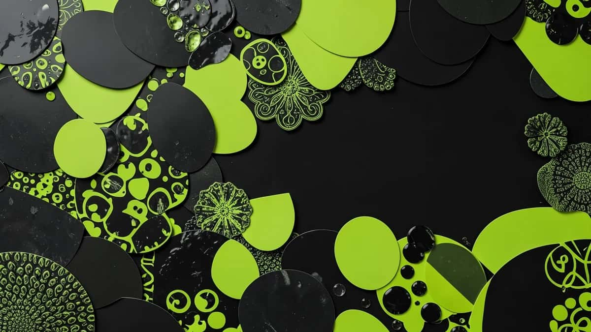
The dopamine-color wave matures. Instead of raw saturation everywhere, 2027 maximalism layers pattern, collage, and dense composition over a disciplined grid, so busy still feels authored. Designers build contrast by pairing one riotous zone against generous calm, giving the eye somewhere to rest. It reads as controlled abundance: lots happening, nothing accidental. The shift separates confident maximalism from early clutter, rewarding hierarchy and intent over sheer volume of elements.
appears on Posters / Event branding / Editorial
6. Carbon-Aware Palettes
Color that argues for lighter design
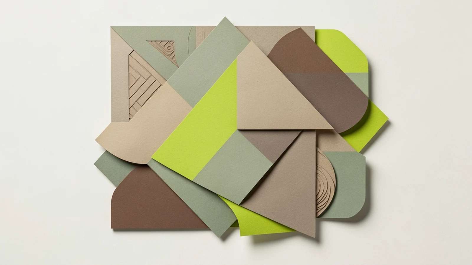
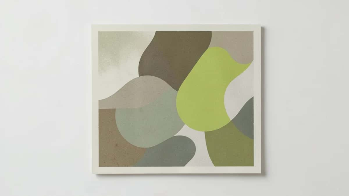
Color choices start carrying an environmental argument. Muted earth tones, soft greens, clays, and warm neutrals read as calm and human, but they also tie into lighter, lower-energy digital design, where restrained imagery and system fonts cut page weight. In 2027 sustainability becomes a palette and performance decision at once, not a logo badge. The look favors matte, natural, slightly desaturated tones over the glossy, high-saturation screens of the previous cycle.
appears on Sustainable brands / Wellness / Packaging
Suggested Read: Typography Design 101: Guidelines and Terms
7. Editorial Bento Layouts
Modular tiles that actually tell a story
Bento grids graduate from dashboard cliche to editorial tool. In 2027 the modular tile system carries real storytelling, mixing type, image, motion, and data cards at varied scales to guide a reading order rather than just tiling features. The discipline is rhythm: tile sizes create pace, and the whitespace between modules does the pacing. Done well it organizes dense information without feeling like a settings screen, which is the trap that sinks lazy versions.
appears on Landing pages / App onboarding / Annual reports
8. Spatial & Dimensional Design
The frame becomes a window, not a page
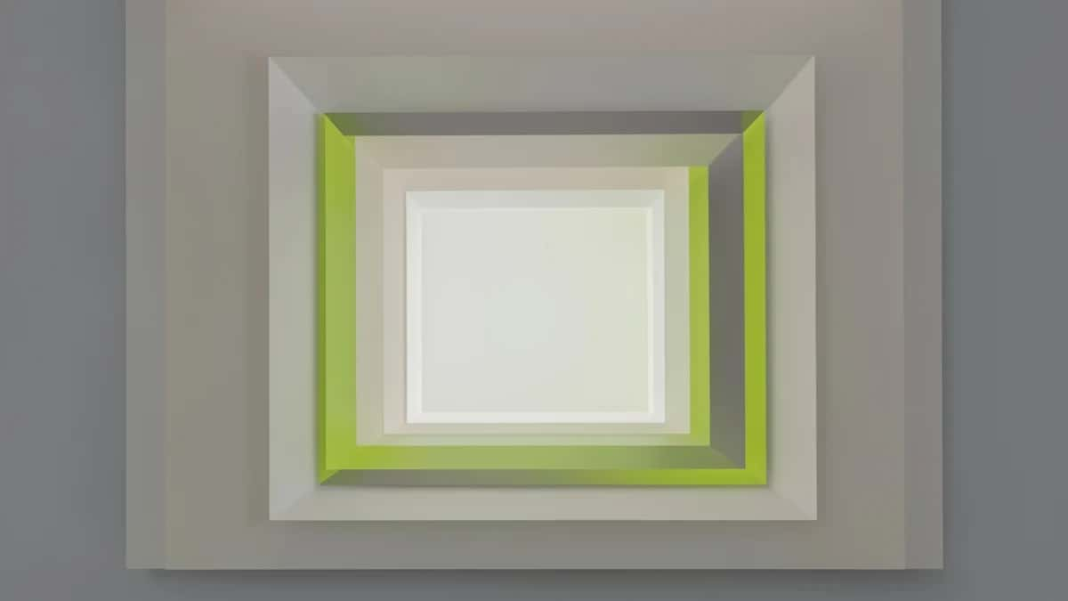
Soft 3D stops being decoration and starts anticipating spatial screens. With headsets and depth-aware interfaces maturing, 2027 designers think in layers, parallax, and real depth cues, not just rendered glossy blobs. Inflatable and clay forms give way to compositions that imply volume and can translate to immersive canvases. Even flat work borrows the logic, using foreground, midground, and background to build hierarchy. The frame becomes a window rather than a page.
appears on AR interfaces / Product launches / 3D branding
9. Generative Data Storytelling
Numbers that become the artwork
Data visualization turns expressive. In 2027 charts behave like identity, with generative systems turning live data into organic, artful forms that still read accurately. Think annual reports where the numbers literally shape the cover, or dashboards with a crafted visual voice instead of default library styling. The craft is keeping it honest: artful encoding that never distorts the underlying values. Data becomes a design material, not an afterthought bolted onto a layout.
appears on Annual reports / Dashboards / Infographics
Suggested Read: Top Business Card Design Trends for 2026
10. Real-Time Adaptive Visuals
One layout, reassembled for each viewer
Design stops being one fixed artifact and starts adapting per viewer in real time. In 2027, feeds, landing pages, and ads reassemble their imagery, color, and copy on the fly by audience segment, time of day, weather, or on-site behavior, so two people rarely see the same creative. The designer builds the kit, not the final frame: modular art, swap rules, and tone ranges that stay on brand however the pieces recombine. The skill becomes designing for variation without losing coherence.
appears on Personalized ads / Dynamic landing pages / Email
11. Intentional Friction
Anti-design grows up and gets precise
Anti-design grows up. The broken grids, clashing type, and raw brutalism of recent years get wielded on purpose, as deliberate friction that slows a jaded audience down and signals a brand is not trying to be frictionless. In 2027 the move is selective: one unexpected, almost uncomfortable choice inside an otherwise considered layout. It reads as confidence rather than chaos, and it works precisely because most interfaces chase seamless ease.
appears on Fashion sites / Portfolios / Culture brands
Suggested Read: 9 Best AI Book Cover Generators for Self-Publishers
12. Hybrid Nostalgia
Eras remixed into something that never existed
Nostalgia stops quoting a single decade. By 2027 designers remix eras into something that never actually existed, blending Y2K chrome, nineties rave energy, seventies warmth, and early-web naivety into one coherent mood. The point is emotional reference, not accurate revival, so the mix feels current rather than costume. It lets brands borrow familiarity while claiming a distinct voice. Executed badly it is pastiche; executed well it is a new aesthetic with deep roots.
appears on Streetwear / Music branding / Social content
Suggested Read: 15 Best Color Palette Generators for Designers
What 2027 design rewards
Across all twelve, one thread holds: 2027 rewards intent over output. When anything can be generated instantly, value moves to taste, restraint, and the human decisions a model cannot make on its own, which direction to push, what to leave rough, where to add friction or calm. The designers who thrive treat these trends not as filters to apply but as choices to argue for, building work that feels authored rather than assembled.
Suggested Read: The Present and Future of AI in Graphic Design
Frequently asked questions
What is the biggest graphic design trend for 2027?
The clearest throughline is a reaction against default, machine-made polish. Generative brand systems let one identity scale across thousands of touchpoints, while analog imperfection and expressive serifs add visible human craft back in. No single look dominates; intent and taste do.
Are 2026 design trends still relevant in 2027?
Yes, most 2027 directions are matured versions of 2026 ideas rather than replacements. Maximalism, bento layouts, and variable type all carry over, but with more discipline, more motion, and clearer hierarchy than their earlier, rougher forms.
Is AI replacing graphic designers in 2027?
No. AI shifts the work rather than removing it. Designers spend less time rendering each asset and more time defining constraints, curating output, and making the judgment calls, what to push, what to leave rough, where to add friction, that a model cannot make on its own.
What colors are trending for 2027?
Two directions run in parallel: muted, carbon-aware earth tones, soft greens, clays, and warm neutrals that read as calm and lower-energy, alongside confident, saturated maximalist palettes used with far more control than the raw dopamine-color wave that preceded them.
How do I use trends without my design looking dated?
Treat trends as directions, not costumes. Pick the one or two that fit your brand and audience, apply them to structure and hierarchy rather than surface decoration, and keep a strong, timeless foundation underneath so the work still holds up when the trend cools.
Deepak Joshi
Author · Pixazo
Deepak writes about generative AI models, APIs, and the workflows teams use to ship them. Reviewed by Abhinav Girdhar.