What is Crystallographic Balance?


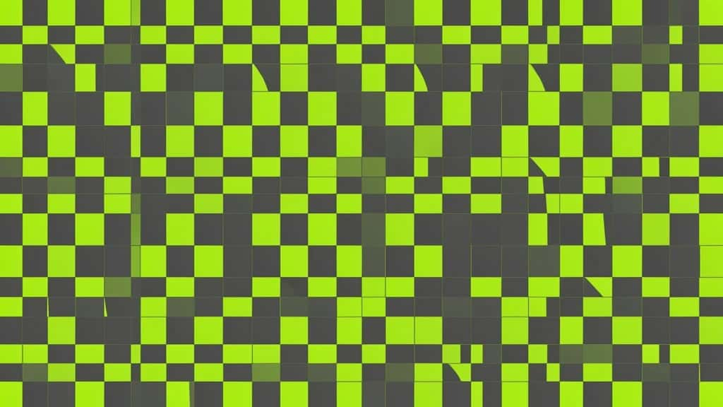
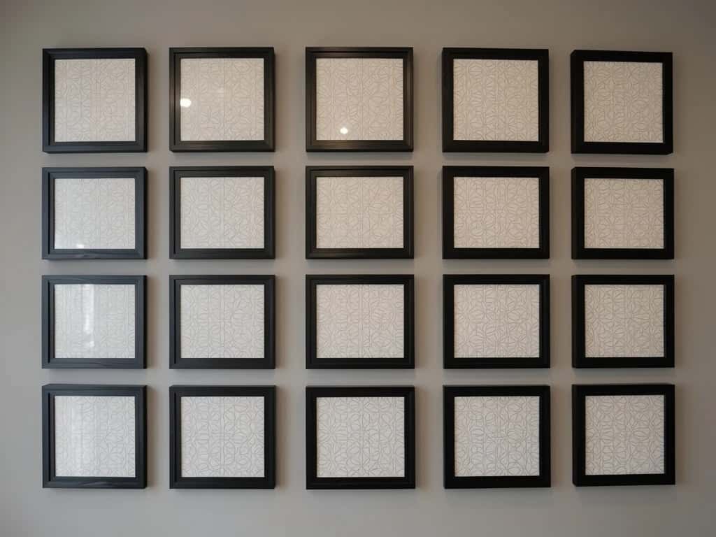
Crystallographic balance is a design principle in which elements of equal visual weight are spread evenly across the entire composition, with no single focal point. It is also called mosaic balance or all-over balance, and the name captures the idea: like the repeating units of a crystal, the whole surface carries the same weight everywhere, so your eye is never pulled to one spot. Think of a brick wall, a sheet of wallpaper, or a grid of identical framed photos. There is no star of the show, yet the composition feels complete and unified.
Create with Pixazo AI
Turn a prompt into studio-quality images and videos — free to try.
It is the one kind of balance that deliberately avoids hierarchy. Where asymmetrical balance trades a heavy element against several light ones, crystallographic balance makes every element count equally, turning repetition and consistency into a calm, rhythmic whole that some designers call organised chaos.
What is crystallographic balance?
Crystallographic balance distributes visual weight uniformly across a design so that no area dominates. Every element carries roughly the same weight, and they repeat across the full field rather than clustering around a center or an axis. Because the emphasis is everywhere at once, it is also described as all-over balance, and because the result resembles a tiled mosaic, it is often just called mosaic balance.
The name borrows from crystallography, the study of crystals. A crystal is built from a single repeating unit, the unit cell, copied over and over in every direction to fill space. A crystallographic composition does the same thing visually: one motif, or a small set of equal motifs, repeats across the whole surface so that any patch looks much like any other. That is why it reads as a continuous field rather than a picture with a subject.
The effect is unity through repetition. Individual elements may be simple or even busy, but seen together they form one even, patterned surface. That makes crystallographic balance ideal for textures, backgrounds and patterns, and a poor fit when you need to guide the eye to a single important thing.
How does crystallographic balance work?
It works by removing the focal point on purpose. A few traits define it:
Because there is no hierarchy, the viewer takes in the whole surface at once instead of reading it in a set order. That shifts the experience from following a message to absorbing a texture, which is why crystallographic balance feels restful even when the individual elements are lively.
Crystallographic vs other types of balance
Balance comes in several forms. Crystallographic is the one with no focal point at all.
| Type | How weight is arranged | Focal point |
|---|---|---|
| Symmetrical | Mirrored across a central axis | Centered |
| Asymmetrical | Unequal elements offset to equal weight | Off-center |
| Radial | Arranged around a central point | The center |
| Crystallographic | Equal elements spread evenly across the whole field | None |
The practical difference is where the eye lands. The first three types all create a focal point, somewhere the viewer looks first. Crystallographic balance removes that anchor on purpose, so it is the right choice for a surface and the wrong choice for a message that needs a hero.
Crystallographic balance in art and history
The idea is far older than the term. Artists and craftspeople have used all-over balance for centuries, long before designers named it.
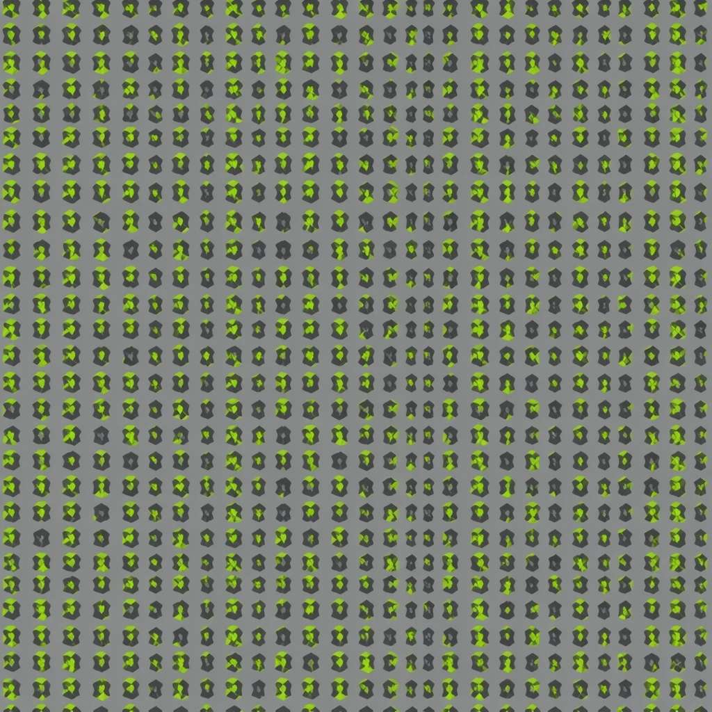
- ▸Islamic geometric art: Tessellated tilework and arabesques repeat a unit across entire walls, ceilings and domes, filling space with pattern and no center.
- ▸Tessellations: Interlocking shapes that tile a plane edge to edge, famously explored by M.C. Escher, are crystallographic balance in its purest form.
- ▸Textiles and wallpaper: Centuries of fabric and wall coverings are built as seamless repeats designed to continue in every direction.
- ▸Op Art: Mid-century works fill the field with repeated motifs that engage the whole eye evenly rather than directing it.
- ▸All-over painting: Andy Warhol’s repeated-image grids and Jackson Pollock’s drip paintings are classic twentieth-century examples with no focal point.
Suggested Read: Geometric Designs: Shapes and Patterns
Crystallographic balance in web and UI design
On screen, crystallographic balance appears wherever equal items tile a space. It is one of the most common layout patterns in digital design, even if few people name it.
- ▸Product and photo grids: E-commerce listings and galleries give every card the same size and weight, so the grid reads as one even field.
- ▸Dashboards and card layouts: Uniform tiles of metrics or modules spread attention evenly across the screen.
- ▸Background patterns: Subtle repeats add texture to a section without competing with the foreground content.
- ▸Icon and feature grids: Rows of equally sized icons or features present options as equals rather than ranking them.
- ▸Brand pattern systems: A repeatable motif tiled across packaging, social templates and site backgrounds extends a brand consistently.
Suggested Read: Graphic Design Trends
When should you use crystallographic balance?
Reach for it when the goal is a surface, a texture or a pattern rather than a message with a clear hero.
- ▸Backgrounds and textures: It fills space with interest without competing with foreground content.
- ▸Patterns, wallpaper and textiles: Seamless repeats are crystallographic balance by definition.
- ▸Grid-based layouts: Galleries, catalogs and dashboards where every item is equally important.
- ▸Brand pattern systems: Repeatable motifs that extend a brand across packaging and collateral.
Avoid it when you need hierarchy. If a design must push one headline, product or call to action first, an all-over field with no focal point will bury it. In that case reach for asymmetrical or symmetrical balance instead.
Suggested Read: Symmetry in Design
What are the strengths and limits of crystallographic balance?
Like every principle, it is a trade-off. Knowing both sides helps you choose it deliberately rather than by accident.
| Strengths | Limits |
|---|---|
| Unity through repetition, the whole reads as one | No hierarchy, you cannot highlight a single element |
| Scales and tiles seamlessly, continues beyond the frame | Can feel monotonous if the motif never varies |
| Calm, rhythmic texture that is easy on the eye | Can feel busy or noisy if elements are too complex |
| Easy to extend across a whole design system | Poor fit for message-first or conversion-led layouts |
| Treats every element as equal, which suits catalogs | Harder to direct attention where you want it |
Suggested Read: Why is Proximity So Important in a Design Layout?
How do you create crystallographic balance?
- ▸Start from a grid: Lay elements on an even grid so spacing stays consistent across the field.
- ▸Repeat equal elements: Use the same or closely related elements at the same size, so none outweighs the rest.
- ▸Keep contrast even: Hold color and value steady so nothing accidentally becomes a focal point.
- ▸Fill edge to edge: Extend the pattern to the margins so it reads as all-over, not as a centered motif.
- ▸Vary within limits: Small, even variation keeps it from feeling mechanical, as long as no single element dominates.
Suggested Read: The Principles of Design
What mistakes should you avoid?
- ▸Letting one element dominate: A single larger, brighter or more detailed element becomes an accidental focal point and breaks the all-over effect.
- ▸Uneven spacing: Gaps and inconsistent spacing make the field look accidental instead of deliberate; keep the rhythm regular.
- ▸Too much contrast: Strong contrast between elements pulls the eye to one spot, which is the opposite of what you want here.
- ▸Stopping short of the edges: A pattern that floats in the middle reads as a centered motif, not all-over balance; take it to the margins.
- ▸Using it when you need a focal point: If the design has to sell one thing first, an even field will bury the message, so pick another kind of balance.
It works because equal weight repeated across a whole surface reads as unity. With no focal point to chase, the eye takes in the field as one calm, rhythmic pattern, which is exactly what you want for a texture, a background or a tiling repeat. Keep the elements equal, the spacing consistent and the contrast even, let the pattern fill the frame, and you get a composition that feels complete everywhere at once.
Suggested Read: Types of Balance in Art
Frequently asked questions
What is crystallographic balance in simple terms?
It is balance with no focal point: equal-weight elements repeated evenly across the whole composition, like a brick wall or wallpaper, so every part carries the same importance.
Why is it called crystallographic balance?
The name comes from crystals, whose structure repeats the same unit evenly in every direction. A crystallographic composition works the same way, repeating equal elements across the whole field.
Is crystallographic balance the same as mosaic balance?
Yes. Crystallographic balance, mosaic balance and all-over balance are different names for the same principle: equal visual weight spread evenly with no dominant focal point.
How is crystallographic balance different from symmetrical balance?
Symmetrical balance mirrors elements across a central axis and has a clear center. Crystallographic balance spreads equal weight across the entire surface with no center and no focal point at all.
What are examples of crystallographic balance?
Tessellations and tile patterns, brick walls, wallpaper and textile repeats, grid-based web layouts, gallery walls of identical frames, and all-over paintings such as Jackson Pollock drips or Warhol repeated-image grids.
When should you use crystallographic balance?
Use it for backgrounds, textures, patterns and grid layouts where every element should be equally important. Avoid it when a design needs a clear focal point or visual hierarchy.
How do you create crystallographic balance?
Start from an even grid, repeat equal elements at the same size, keep contrast even so nothing dominates, and extend the pattern edge to edge so it reads as all-over.
What are the disadvantages of crystallographic balance?
It offers no visual hierarchy, so it cannot highlight a key element, and it can feel monotonous or busy if overused. It is a poor fit for message-first or conversion-led layouts.
Is crystallographic balance a type of pattern?
It is the balance principle behind many patterns. Seamless wallpaper and textile repeats are crystallographic by design, but the principle also applies to layouts and compositions, not just decorative patterns.
Deepak Joshi
Author · Pixazo
Deepak writes about generative AI models, APIs, and the workflows teams use to ship them. Reviewed by Abhinav Girdhar.