Why is Proximity So Important in a Design Layout?


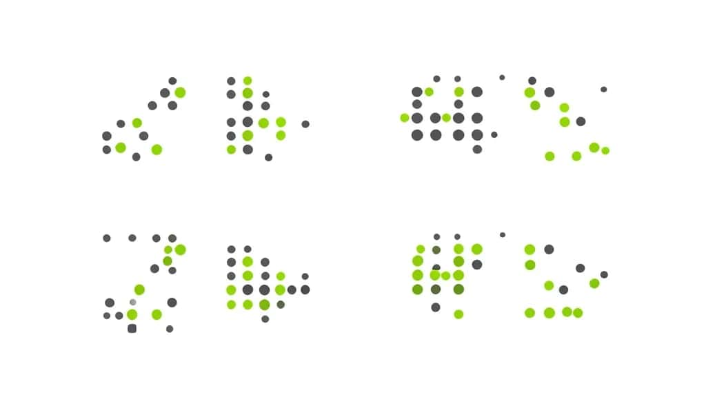
Proximity is the design principle that says related elements should be placed close together, and unrelated ones kept apart. It sounds almost too simple to matter, yet it does more to make a layout clear than almost anything else. The moment you group items by nearness, the viewer understands what belongs with what, without a single line, box or label. That is why proximity is one of the first principles designers reach for, and why a layout that ignores it feels confusing no matter how good the individual pieces look.
Create with Pixazo AI
Turn a prompt into studio-quality images and videos — free to try.
Proximity comes from Gestalt psychology, the study of how people perceive groups, and it is a core principle of design alongside alignment, contrast and hierarchy. This guide explains why proximity is so important in a layout, how it works with white space, where it matters most, and how to apply it.
What is proximity in design?
Proximity means grouping related elements together so they are seen as a single unit. When things sit close, the eye reads them as connected; when they are spread apart, it reads them as separate. A caption under a photo, a label above its input field, a price beneath a product: each works because closeness signals that the items belong together.
It is a Gestalt principle, which means it taps into how human perception naturally organizes the world. You do not have to explain the grouping; the viewer feels it instantly. That makes proximity one of the most efficient tools in design, because it communicates structure with spacing alone.
Why is proximity so important in a layout?
Proximity carries more weight than its simplicity suggests, because it does several jobs at once:
- ▸It organizes information: Grouping related items turns a wall of content into clear, digestible sections the eye can navigate.
- ▸It shows relationships: Closeness tells the viewer what connects to what, so a label, value and icon read as one idea rather than three.
- ▸It reduces clutter: Proper grouping removes the need for extra lines, boxes and dividers, letting space do the work and keeping the layout clean.
- ▸It improves scannability: Readers skim. Well-grouped content lets them find the section they need in seconds instead of reading every line.
- ▸It creates hierarchy: The gaps between groups signal structure, so proximity builds visual hierarchy without changing a single font size.
- ▸It lowers cognitive load: When the eye does not have to work out what belongs together, the design feels effortless and trustworthy.
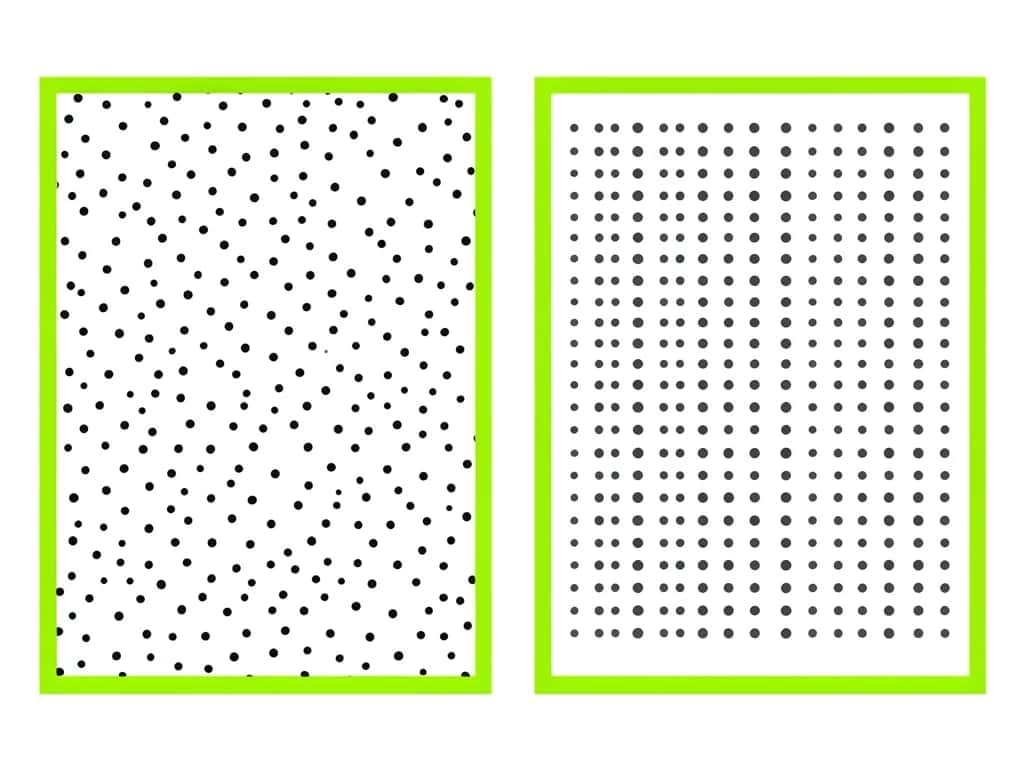
Proximity and white space are two sides of one coin. You group related items by reducing the space between them, and you separate unrelated groups by increasing the space around them. The space itself becomes the divider, which is why skilled designers can organize a complex page with almost no lines or boxes at all.
The practical rule: tighten the space inside a group, and widen the space between groups. If the gap within a group is the same as the gap between groups, the grouping disappears and everything reads as one undifferentiated block.
Suggested Read: Proximity in Design
Where does proximity matter most?
It matters everywhere, but a few places live or die by it:
- ▸Forms: A label must sit closer to its own field than to the next one, or users pair the wrong label with the wrong input.
- ▸Navigation: Menu items grouped by topic help users find their way; evenly spaced links feel like an undifferentiated list.
- ▸Cards and listings: Product cards group image, title, price and button so each listing reads as one self-contained unit.
- ▸Contact and footer blocks: Grouping address, phone and email together, apart from other links, makes each block instantly clear.
- ▸Captions and data: A caption, a chart legend or a figure number must hug the thing it describes to avoid confusion.
Suggested Read: The Principles of Design
What are common proximity mistakes?
- ▸Uniform spacing everywhere: Equal gaps between everything erase grouping, so the layout reads as one flat block with no structure.
- ▸Related items too far apart: Separating things that belong together, like a heading from its paragraph, breaks the connection the reader needs.
- ▸Unrelated items too close: Crowding separate groups together makes the viewer link things that are not related.
- ▸Relying on boxes instead of space: Adding borders to force grouping usually adds clutter; adjusting spacing first is cleaner and calmer.
Suggested Read: What is Asymmetrical Balance?
How do you apply proximity well?
- ▸Group what belongs together: Decide which elements form a unit, then pull them close so they read as one.
- ▸Separate what does not: Add generous space between groups so the boundaries are obvious without lines.
- ▸Keep spacing consistent: Use a repeatable spacing scale so inside-group and between-group gaps stay predictable across the design.
- ▸Pair proximity with alignment: Grouped items that also share an alignment feel doubly connected and tidy.
- ▸Squint to test it: Blur your eyes or step back; the groups should still be obvious as clusters of light and dark.
Suggested Read: Types of Balance in Art
How does proximity work with the other principles?
Proximity rarely works alone. It groups elements, alignment lines them up, contrast and hierarchy rank them, and white space gives all of it room to breathe. Balance, whether symmetrical or asymmetrical, then distributes those groups across the layout. Get proximity right first, though, and the rest become far easier, because the viewer already understands the structure before you style a single element.
Suggested Read: Graphic Design Trends
The quiet workhorse of clear design
Proximity is so important because it answers the first question every viewer asks, what goes with what, using nothing but spacing. Group related elements, separate unrelated ones, tighten the space inside groups and widen it between them, and a layout becomes instantly scannable, less cluttered and easier to trust. It is the least flashy principle of design and often the most powerful, because when proximity is right, the structure feels obvious, and when it is wrong, no amount of polish can rescue the page.
Suggested Read: What is Symmetrical Design?
Frequently asked questions
What is proximity in design?
Proximity is the principle of placing related elements close together and unrelated ones apart, so viewers instantly see what belongs together. It is a core Gestalt principle of perception.
Why is proximity so important in a layout?
Because it organizes information, shows relationships, reduces clutter, improves scannability and creates hierarchy, all using spacing alone. It answers what goes with what before the viewer reads a word.
How does proximity relate to white space?
They work together: you group items by reducing the space between them and separate groups by increasing the space around them, so white space itself becomes the divider.
What is an example of proximity in design?
A form label placed close to its input field, a caption under a photo, or a product card grouping image, title, price and button so each reads as one unit.
Is proximity a Gestalt principle?
Yes. Proximity comes from Gestalt psychology, which studies how people perceive separate elements as groups, and it is also a core principle of graphic design.
What is the most common proximity mistake?
Using uniform spacing everywhere. When the gaps within a group match the gaps between groups, the grouping disappears and the layout reads as one flat, confusing block.
How do I use proximity in a layout?
Group related elements tightly, separate unrelated groups with generous space, keep spacing consistent with a scale, and pair proximity with alignment. Squint to check the groups still read.
How does proximity differ from alignment?
Proximity groups related elements by closeness, while alignment lines elements up along a common edge or axis. They often work together, but they solve different problems.
Deepak Joshi
Author · Pixazo
Deepak writes about generative AI models, APIs, and the workflows teams use to ship them. Reviewed by Abhinav Girdhar.