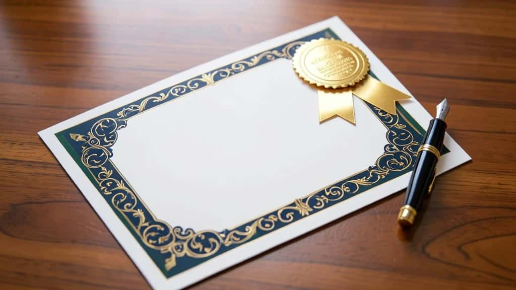
A certificate is a small public record of the organization that issues it. If you run a school, a training team, a course, a company awards program, an event or a nonprofit, its border, seal and typography reflect on you as much as on the recipient. These 30 certificate design ideas and free template concepts are for issuers creating awards for their own students, staff, members and attendees, and with an AI Certificate Maker you can build any of them and reuse the design across a whole cohort.
The ideas run from the most-issued certificate types through layout, seals, typography, color and print formats. Before the list, it helps to know what every certificate needs.
Lock one template per program, then change only the recipient details so a whole batch stays consistent.
Start here
What Every Certificate Needs Before You Design It
▸Title and subtitle: What is being awarded, in one clear line, with a short descriptive subtitle.
▸Recipient and issuer: The recipient name as the focal point, plus your logo or issuing body so the award is traceable.
▸Reason and date: What it recognizes and when, which is what people actually check.
▸Signatures and seal: One or two authorizers with printed name and role, plus a seal or badge.
▸Verification: A serial number or a QR link to a record you control, so a recipient can prove it and you can confirm it later.
Award category
Certificate Types and Use-Case Ideas
1
Course completion certificate. Lead with the course title and completion date, and name the instructor or program so the credential is traceable. Add total hours or module count when you track them.
2
Employee of the month. Keep it warm and brand-forward, with your logo, the employee name in large type and a one-line reason. A monthly series works best as one fixed template with only the name and month changing.
3
Professional training or workshop. Include the topic, the facilitating body and a competency line saying what the attendee can now do. State any CPD hours plainly rather than implying accreditation you do not hold.
4
Sports or tournament award. Use bold, energetic type and room for placement, event name, division and date, with a medal-style badge in the corner to reinforce the result.
5
Certificate of appreciation. A softer, centered layout with a personal reason line, suited to donors, partners and long-serving members where the relationship matters most.
6
Certificate of participation. Honest and non-ranked, confirming someone took part without implying they won or passed, which is right for conferences, hackathons and community programs.
7
Volunteer or service award. Name the cause, the hours or term served and the mission in one line, with a signed thank-you from a named officer to make it genuine.
8
Academic achievement certificate. For schools issuing to their own students, show the subject or grade level, the term and the standard met, with room for teacher and head signatures.
9
Internship completion certificate. State the role, the department, the dates and a short performance line, keeping the facts clean since interns attach this to applications.
10
Webinar or event attendance. Built for scale, with event title, host, date and a serial or QR link to your attendance record, designed to look right at small sizes on a phone.
Classic landscape with a double-line border. The default for formal awards, a thin inner rule inside a thicker outer frame with generous margins. It reads as traditional and prints cleanly.
12
Portrait modern minimal. Vertical format, lots of whitespace, a single accent rule and the name as the clear focal point. Suits tech training and contemporary brands.
13
Asymmetric accent bar. A colored vertical band down one edge holds the logo and seal, leaving the rest open for text and giving your brand color a defined home.
14
Ornamental corner flourishes. Decorative motifs in the four corners instead of a full border, which keeps the center light while still feeling finished.
15
Guilloche line border. The fine interwoven line pattern seen on official documents, used purely as a decorative, hard-to-recopy frame around your own certificate.
16
Full-bleed background with an inset panel. A soft textured or gradient background runs edge to edge, with a clean inset panel holding the text, strong for seasonal or event certificates.
Embossed gold foil seal. A circular seal with a faux-foil finish near a signature line is the single fastest cue that a certificate is a formal award.
18
Ribbon rosette badge. A medal with trailing ribbons, ideal for sports, competitions and tiered recognition. Reserve it for achievements that are actually ranked.
19
QR verification badge. A small QR square linking to a verification page you maintain. This is the honest way to make a certificate checkable, because the proof lives on your system.
20
Your own emblem or crest. Place your logo or a commissioned crest at the top center, using only marks you own or are authorized to use, never another body insignia.
21
Tiered skill-level badge. Bronze, silver and gold variants of the same badge for a progression program, keeping one template with three badge colors.
Elegant serif for the name. A refined serif at large size for the recipient name, with a quiet sans-serif for the details. Timeless for academic and formal awards.
23
Script signature-style name. A calligraphic script just for the name adds a handwritten feel. Keep every other field in a plain face so it stays readable.
24
Modern sans-serif corporate. Clean, geometric type throughout for a crisp, business-ready look that pairs well with minimal layouts and brand accents.
25
Dual-script bilingual layout. Two languages side by side or stacked for international programs, balanced so neither script looks like an afterthought.
A seal and a verification method do more for trust than any amount of decorative flourish.
Match your brand palette. Pull the border, seal accent and headings from your exact brand colors so the certificate reads as part of your organization. Limit it to one or two accents to stay formal.
27
Go monochrome and neutral. Black, grey and a single metallic accent for a restrained, high-trust look that ages well and prints reliably on any printer.
28
Use seasonal or themed color. A palette tied to an event or season for certificates clearly linked to a moment, kept high in contrast so the text stays legible.
Ship it
Format, Size and Print Ideas
29
Print-ready A4 or US Letter with bleed. Design to the standard page size with a small bleed margin so borders reach the paper edge after trimming, exported at print resolution for framing and mailing.
30
A digital and share-ready version. A screen-sized export for email, download and a LinkedIn post, ideally carrying the same serial or QR link as the printed one so both records stay in sync.
You do not need a designer. The AI Certificate Maker lets you pick a layout, drop in your own logo and seal, set the award text and then batch recipient names for a whole cohort.
01
Open the AI Certificate Maker. Choose a layout that fits the award, landscape for formal, portrait for modern.
02
Add your issuer details. Drop in your own logo or crest, your seal and the signature blocks.
03
Set the award text. Add the title, reason, date and a serial or QR for verification.
04
Batch and export. Vary only the recipient name per person, then export print-ready and digital versions.
▸Leaving out verification: A certificate with no serial and no link to a record you control is just a nice image. Add a QR or serial so recipients can prove it.
▸Overcrowding the layout: Heavy borders, multiple seals and long paragraphs bury the name, the reason and the signature. Protect whitespace and let the name lead.
▸Inconsistent templates across a cohort: Mixing fonts, seal placement or colors between recipients makes a batch look improvised. Lock one template and change only the per-person fields.
Wrap-up
Conclusion
Strong certificates start from the use case, lock the anatomy, then get styled. Decide what you are recognizing, include the elements people check, add a seal and a real verification method, and keep one template per program. Build it once in the certificate maker and a whole cohort stays consistent, on brand and easy to trust.
What are the essential elements every certificate needs?
A title, the recipient name, the issuing body, the reason for the award, the date, at least one signature and ideally a seal plus a serial or QR for verification. Missing any of these makes a certificate harder to trust or check.
Who should use an AI certificate maker?
Organizations issuing certificates to their own recipients, such as schools and colleges, training institutes, course creators, companies, event organizers and nonprofits. It is built for legitimate issuers, not for making credentials for yourself.
How do I make a certificate look official without copying another institution?
Use your own logo or a commissioned crest, add a seal and a guilloche-style decorative border, and include a verification method such as a QR code linking to a record you control. Never reproduce another body name, logo or insignia.
What size should a certificate be?
A4 or US Letter is standard for print, in landscape for traditional awards or portrait for modern ones. For sharing online, export a separate screen-sized version so it looks sharp in email and on social profiles.
How can recipients verify a certificate is genuine?
Add a unique serial number and a QR code that links to a verification page you maintain. The image itself cannot prove authenticity, so the real proof should live on your own system.
Can I create certificates in bulk for a whole class or cohort?
Yes. Build one template, then vary only the recipient name and any per-person fields while keeping the layout, logo and seal fixed, which keeps an entire cohort visually consistent.
Should I use landscape or portrait orientation?
Landscape reads as more formal and suits academic and corporate awards, while portrait feels modern and works well for minimal or event certificates. Pick one and keep it consistent across a program.